Introduction
Hi, Sketchfab! My name is Igor Kulikov, I am a freelance 3D artist from Vologda, Russia. I became interested in gamedev and started to study 3D in high school, but had to pause my hobby during education in Military Academy and then returned to it in 2015. My new 3D path started from some simple models that I had made as examples of furniture during my work as a graphic designer. I decided to leave my job in graphic design and to learn 3D as a new profession. After a year of YouTube tutorials I got my first paid jobs and since then I have worked as a modeller for games. You can see some of my work on my Instagram and ArtStation.
Why a sewing machine?
This question is often asked when I show the model to my family and friends. The answer is quite simple: because I liked it. But I should give a more wide explanation. After making a lot of stuff in low-poly flat or hand-painted styles, I wanted to do something realistic. The first model was a synth that was quite simple to make, it had basically only boxes and cylinders as base shapes, so next time I wanted to make something more complex and interesting. I started to look for references on the internet, but could not decide what to make. One day my mom visited my home to sew something on a machine that is standing in my living room, and I looked at it and thought: this is it!
References
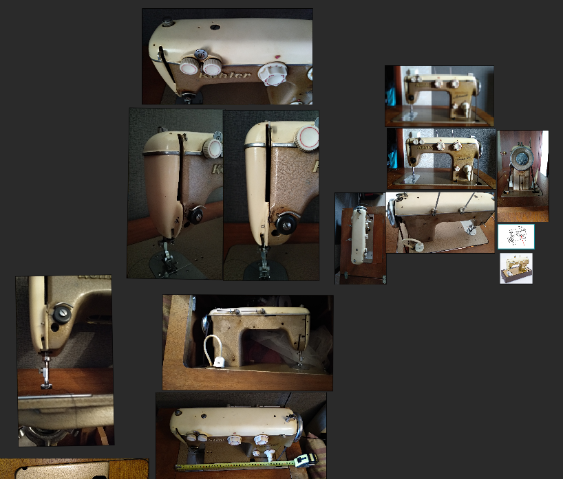
This was the simplest part of the work. My reference literally stands in my living room and all I had to do is to take some photos and measurements. I took about 20 photos which was more than enough.
Modeling
The model was made in a classical PBR pipeline. I used 3ds Max as the modelling software.
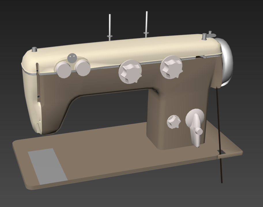
First step was a simple draft to figure out basic shapes, proportions and colors.
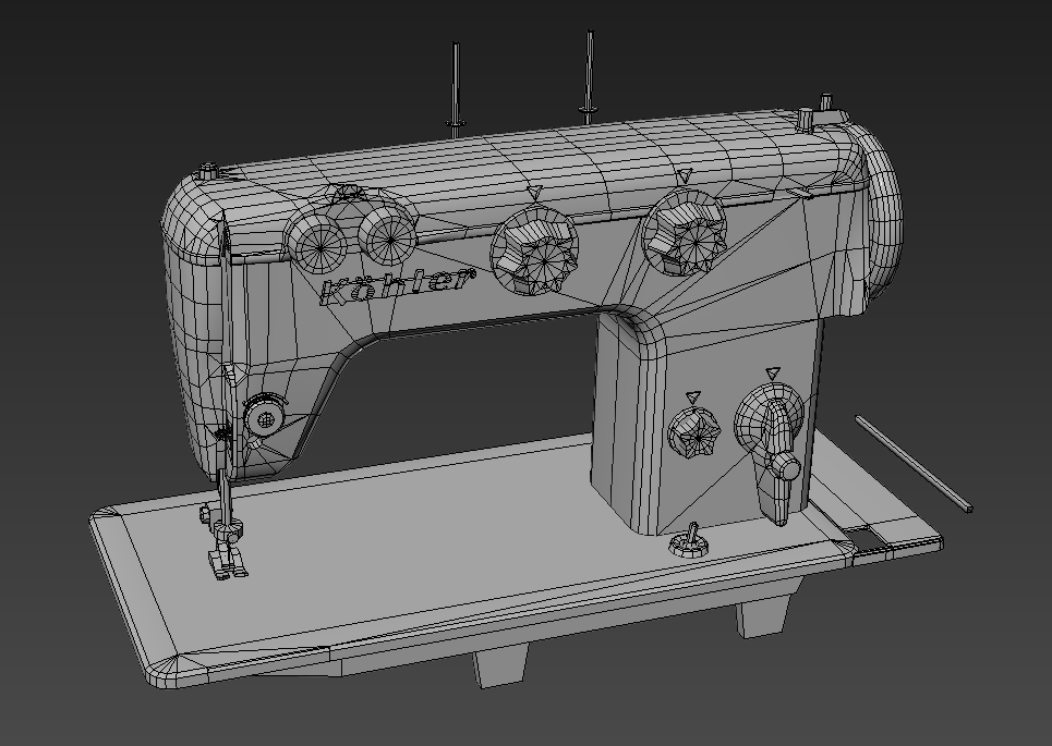
When I was satisfied I started to make a high-poly mesh, which took the most time. The high-poly was fully made in 3ds Max without sculpting. For support edges, I mostly used a chamfer modifier and, in some cases, bevel, or made them by hand.
Making the high-poly was not so difficult—I did not worry about clean quad topology while it didn’t have an effect on proper shading. Some parts weren’t stitched together, just submerged in each other, so after baking they looked as though they were one part. For making screws and little holes, I used floaters.
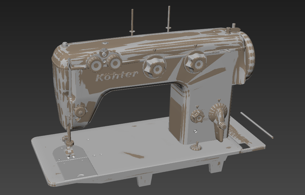
Some parts had different vertex colors that I baked into an ID map for quicker masking during texturing.
After the high-poly model was done, I copied it to make a low poly version. It was kind of a reverse process; I deleted the TurboSmooth modifier and deleted support loops. It is one of my favorite parts to simplify making the low-poly mesh. This model had no limits in detail, so I made it closer to mid-poly than low, I think.
Unwrapping UVs
The next step was unwrapping. First I unwrapped parts separately and made hard and soft edges while unwrapping. It is important that UV seams should be marked as hard edges, so I combined these steps together to save time. Then I united them into one mesh to resize UV islands in the same texel density. I gave more texture space to some parts if I wanted their textures to be a bit more detailed. Usually, these were the parts that attracted more attention. First I wanted to place everything in one UV set, but it seemed insufficient, so I divided it into two UV sets: a 4K set for the body and a 2K set for the details.
The last step before texturing was baking. For that purpose, I used baking groups, which made baking a very simple process. I just gave bake groups proper names and divided them so that they would not be projected on each other. Maybe it is not the most fun part but proper work will save you from the headache of cleaning bake issues.
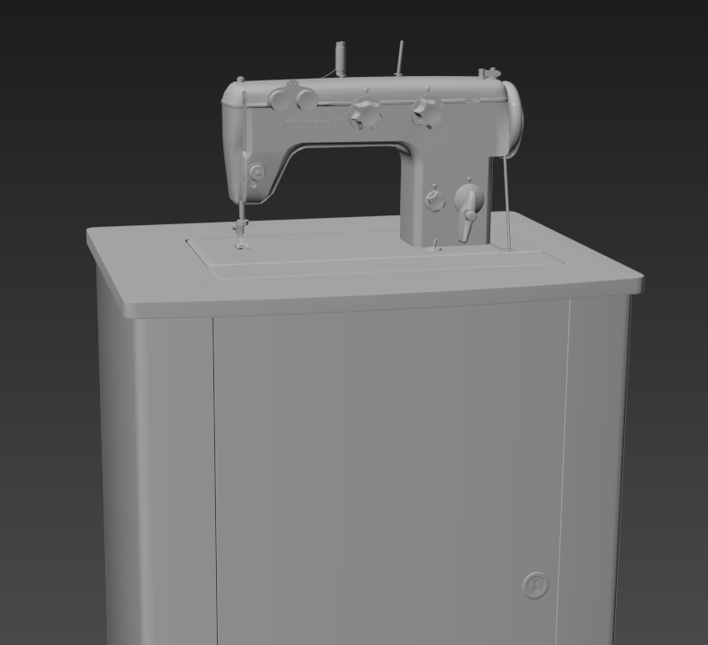
Usually this type of machine is set in a wooden cabinet with an attached spinning wheel and treadle. I decided that I didn’t need to model the whole cabinet and modeled only the table that is seen in the frame.
Actually, I made the full exterior of the cabinet, but this made the composition too huge and required extra time for making the inner parts of the cabinet.
For the desk I didn’t make any high-poly, just made chamfers.
Texturing
I think this is everyone’s favorite part. For both baking and texturing I used Substance Painter.
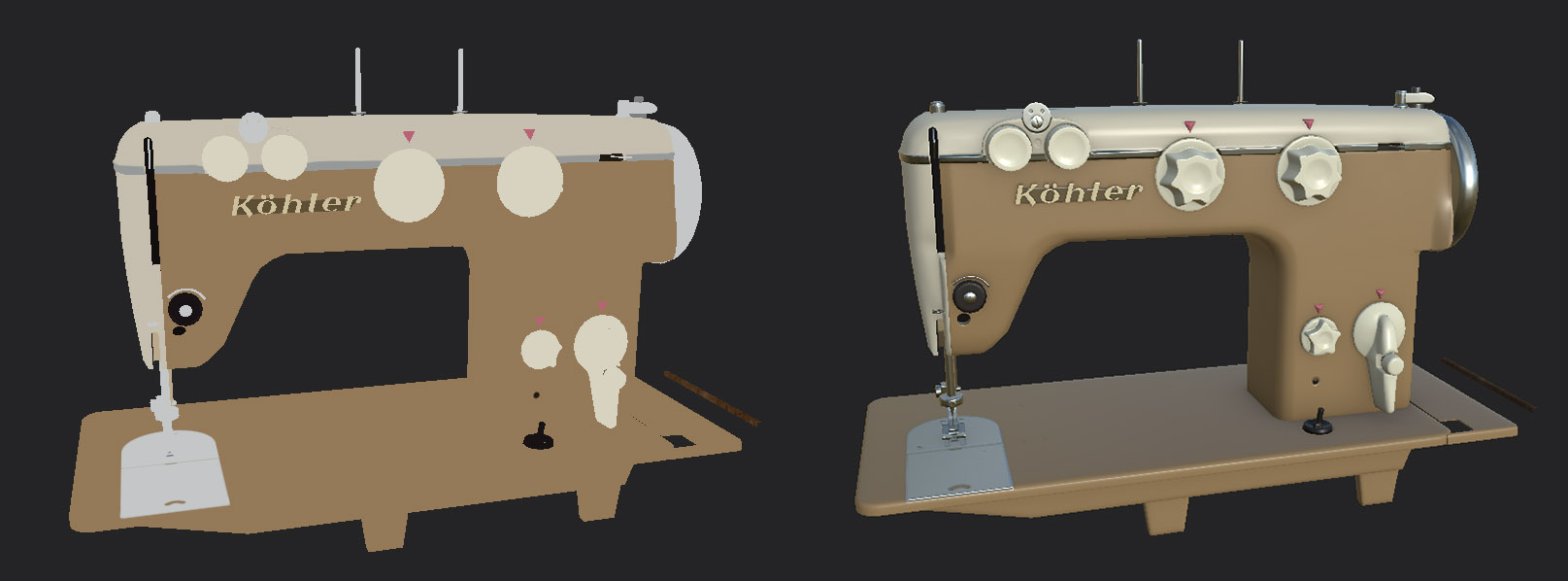
After all maps were baked, I started with assigning base colors and materials for metal parts. I usually set colors in unlit mode to see the rough base color.
In this video I show a little breakdown of some of the most interesting moments for me. Turn on subtitles!
And, not to be boring, I’ll just turn on some layers one by one:
The common algorithm is the same for different materials. I added just a base color or basic material (metal, wood, etc.), then I used generators I or grunge fill I to make basic weathering like dirt or edge wear. After that I used Paint or/and Fill layers to make the weathering look less procedural. To make surfaces with flat colors less boring, I like to add some stains with shades of this color. Some layers I used only for one map, e.g., Base Color, Height, or Roughness. Sometimes I needed more control separately from the color mask.
Working on textures, I tried to notice what makes a material look like itself. The way it reacts to different types of damage, like scratches or color fading with age. Good references always help to make texture more realistic, but real life sometimes is not as “artistic” as is needed, so don’t be afraid to sacrifice realism for art.
Sketchfab setup
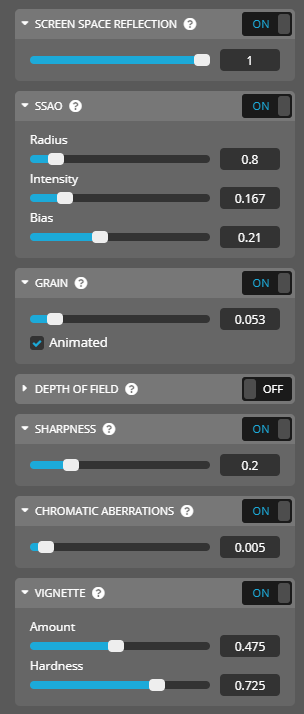
Uploading the model to Sketchfab I used moderate post-effect settings just to make the model look a bit more sharp and saturated. SSR makes the model look very realistic, I always use it when uploading non-stylized models. SSAO is a great instrument to make details sharper, but be careful, large shadows may look weird. Adding a little grain gives a more interesting look. I like to make it animated. Chromatic aberrations also give some sharpness, but this instrument should be used very carefully. As you see, the value is very low in my setup. Usually, I don’t use depth of field, because it obstructs looking at details. In this setup, Tone Mapping is just Linear with 0.01 of contrast.
And… that’s it!

