The theme chosen for Lady Isabella is the old phrase that talks of Death. When the time comes, Death is welcomed as an old friend. But what if Death were welcomed as an old flame or a lover? What would that look like?
Lady Isabella is a second warm-up piece following on from Captain 2134. Aside from being fun to explore new themes and ideas, its purpose was to further explore creative themes in meaning, character, environment, colour and composition.
It proved to be a highly valuable learning experience and it’s a pleasure to share what I hope you’ll find the most useful findings.
Collage
When growing ideas, I tend to work as a collage artist. Reference images are compiled, and I let my imagination run wild trying to discover what an interesting combination might look like. If I get excited about it I’ll then work out how it might work as a realised piece.
In our internet age we have so much imaginative content available to us that we can explore combining old and new ideas in any way we find compelling. Most of the time I find the collage can’t grow beyond the seed of idea, but with patience and careful practice, collaging ideas together can create something compelling, new and yet somehow entirely familiar.
Amongst the many reference images I compiled for Lady Isabella, The Manga, BLAME! By Tsutomu Nihei is a profound work well worth picking up. One of the many aspects I found interesting about the art style are the elongated proportions that emphasise the femininity and yet cyborg/alien nature of the female characters. They suggest power and yet elegance at the same time.
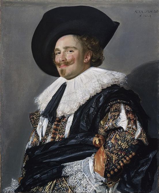
Other references include 17th -18th century paintings that were intended to create a sense of prestige around the subject. The paintings often used symbolism to convey messages, thereby providing more depth to the finished work. The low “camera” view combined with the considered poses also create a sense of elegance combined with power. By looking at combining these images into one character I hoped to give the theme of Death, elegance, beauty and yet effortless power.
Modelling
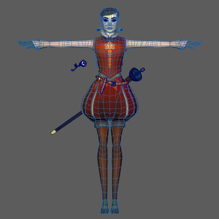
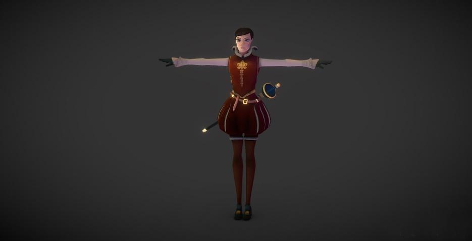
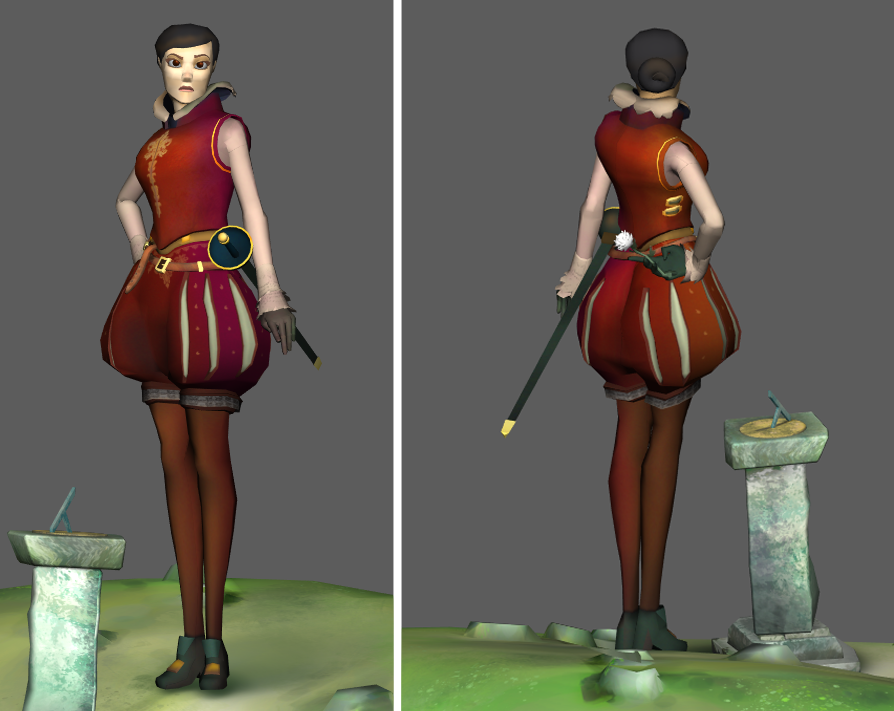
Practically speaking, Lady Isabella has been modelled to human anatomy principles and standard topology, for example the outer calves are higher than the inner calves, the knees and elbows are modelled to deform convincingly. And yet, as in the inspiration images above, the proportions are exaggerated. Not quite to the same level as the BLAME! character referenced above but to a point where the final proportions are pushed to express more elegance.
UVs were separated in order to create hard edged lines in the texture. This can create facets in the mesh on close inspection, however the objective was to maintain a crisp look when posting the final asset in Sketchfab. Detail was added where needed and kept simple where not. Whilst the stripes in the pantaloons could have been flat textured, I felt modelling them in would create a depth that would lend itself to creating a believability in the final model…the choices we make.
Chiaroscuro
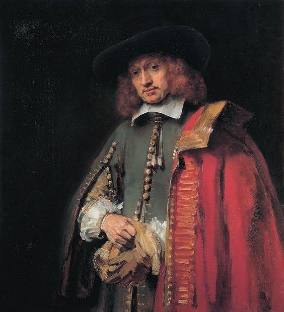
Originally, I had the intention to explore creating a final piece for Sketchfab that utilised the chiaroscuro method so powerfully used by artists such as Caravaggio and Rembrandt. Essentially the lighting is painted in a way where the background is in full darkness whilst elements of the foreground are pronounced. It can be used to create tension, drama and powerful paintings as they demonstrate so effectively here.
- The Calling of St. Matthew by Caravaggio, c.1598-1601 (oil on panel) (Source)
- Portrait of Jan Six by Rembrandt, 1654 (Source)
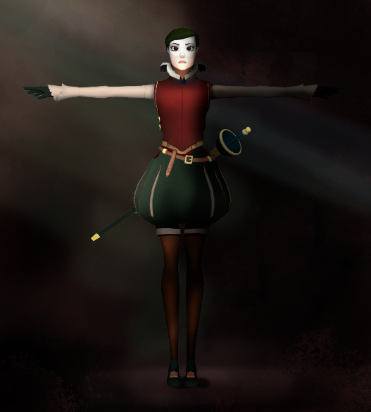
As the character was being modelled, I took a screenshot and painted over it to see how it would feel. I often quickly and roughly paint over models as a way of quickly trying ideas out to see if I like them. I’m looking to see if it will work to create the effect I’m after and if it creates an attention-grabbing image.
As this test upload to Sketchfab suggests, I think this could have worked but there was something about the mood that didn’t reflect myself or what I hoped to see. Something subconscious was pushing me away from it…more on that below.
Colour & Lighting
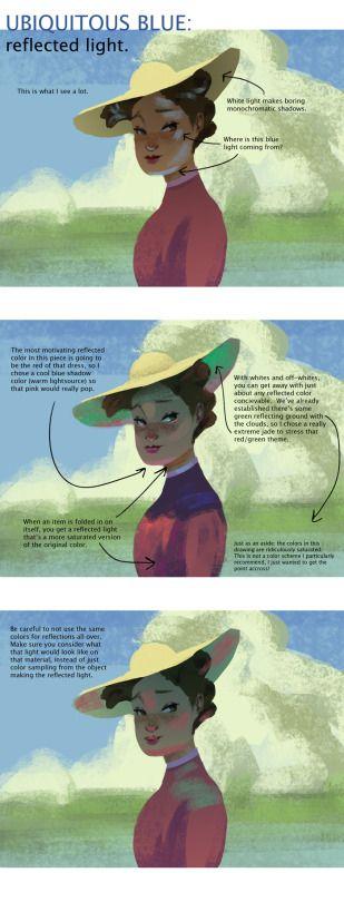
Shadows aren’t black. When looking at paintings by impressionists like Degas, Sorolla or Monet it’s completely clear that shadows have colour and temperature as well as value. The image below illustrates this clearly. As I was working towards the chiaroscuro version of the character, I used a purple on what would become the dark side of the character on the right and a warm yellow on the left.
The Pivot
Whilst Lady Isabella was being made the weather had picked up, the sun was shining, the trees and greenery were blooming. It felt like a great opportunity to explore light and colour, but it meant pivoting away from the chiaroscuro approach.
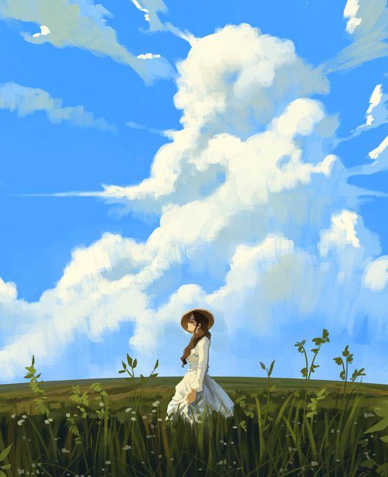
The background was going to be dark, dramatic and moody – but now I felt it should be light, bright and vibrant. A big change in direction, but all part of the fun. I found the image below captured something like I was seeing and helped inspire what would become the final background image.
Background and Clouds
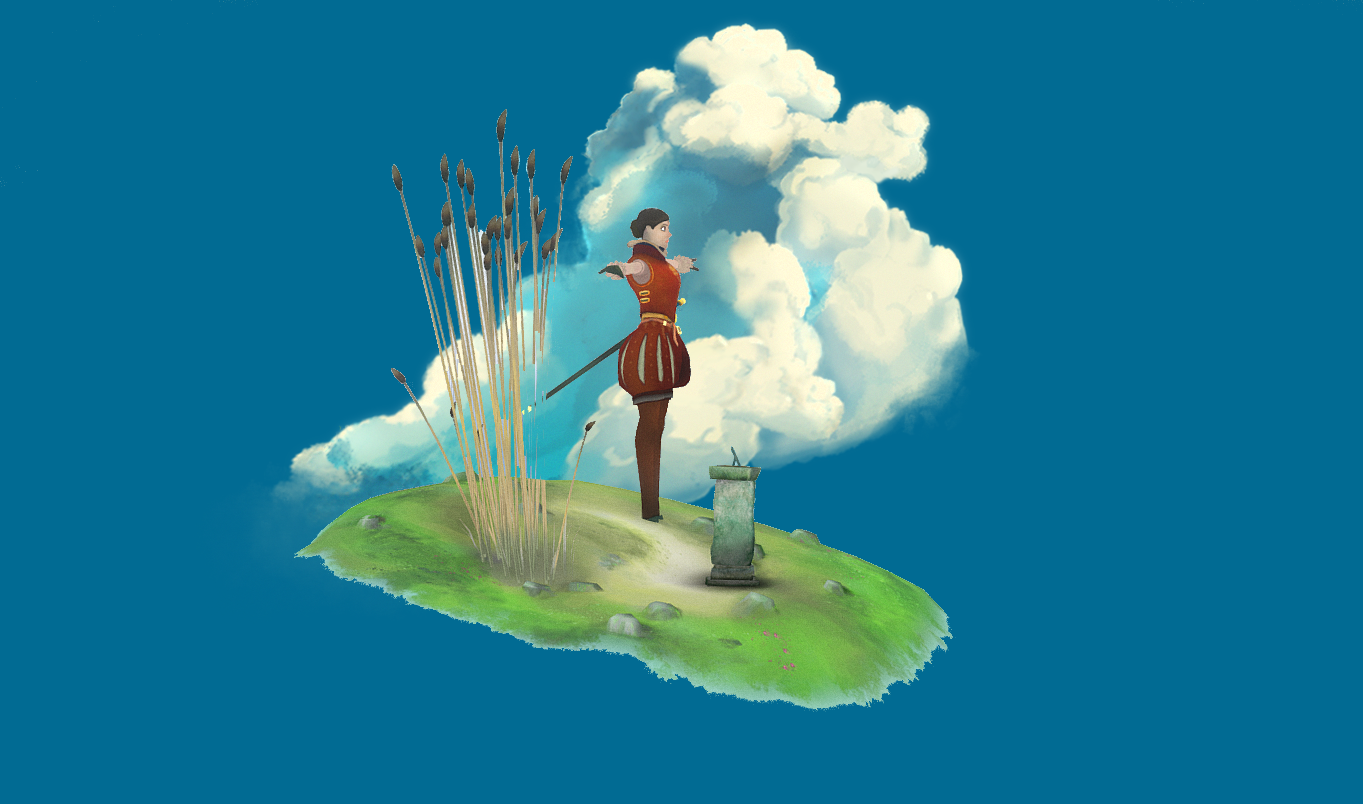
In developing the background scene, the composition came together quite quickly. The paint over below provided a V shape vertically and a < shape from right to left, emphasising where the character is looking, as if watching someone from a distance. The sundial was placed in the scene to ground the scene and to create a sense that someone’s time was up. The dial part was also used to point directly at the character, thereby leading the viewer’s eye back into the image.
What also became apparent from the paint over above is that a basic roughly sketched cloud was never going to cut it. To really tie the viewer, the background and the character together it needed a cloud with shape, depth and character itself.
It took around five iterations to develop a compelling cloud. This became the most challenging, yet rewarding, part of the process.
Below is a real photo of a real cloud. It’s easy to forget how beautiful nature is. A little time spent researching cumulus clouds and how they are actually shaped and coloured led me to photographing the clouds myself and getting an impression of these transitory yet beautiful giants we often fail to appreciate.
 Colorado Clouds by Tony Oliver
Five iterations later…. using Photoshop, this cloud came into being…
It was painted in a way that, when placed in the scene, it helped bring the whole concept together as the rough paint over below shows.
With the whole concept coming together the time came to consider the final pose of Lady Isabella.
The Contrapposto Pose
Contrapposto is a pose wherein the hips are at an opposite angle to the shoulders. People do it all the time without realising particularly when they look around themselves.
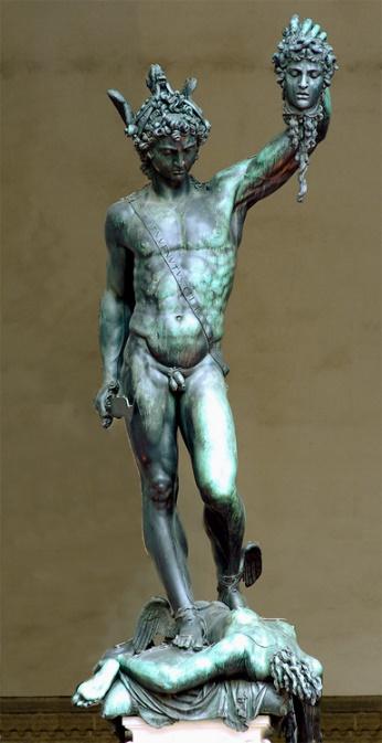
The ancient Greeks were the first to use it in their sculptures to show off their athletes to great effect. Michael Angelo’s David, below left, uses it to create a powerful, yet relaxed pose that is highly appealing.
Lady Isabella incorporates the effect to make it appear as if she is posed naturally with elegance and yet about to move at any moment creating a sense of a dramatic transitory moment captured in time.
I had to be careful not to push it too far in the body as technically she’s wearing armour which would not flex in the way the body does at all. I tried to ensure that the pose works from all angles as the viewer can move the camera to any viewpoint.
The pose is designed to create a sense of a transitory moment where Lady Isabella is about to move forward, greet someone and give them the flower she has concealed behind her back. The sundial leans towards her in order to create a more appealing triangular composition.
Sketchfab Setup
Sketchfab is a wonderful tool to work with when populating assets. It offers a beautiful render whilst an expanding array of effects help refine the beauty of the art.
Camera Field of View
For this piece I deliberately set the FOV to be very low. Somewhere around 10 degrees. By doing this is creates a portrait photo effect and focuses the attention on the character which is where it should be.
Grain
Adding a grain to the overall images creates a sense of movement, depth, atmosphere and helps tie the whole image together. It’s not always appropriate but here it works.
Sharpness
This is the most useful effect when working with an anime-esque character. Sharp lines and clear delineations help with the tonality and focus of the scene.
Bloom
A subtle bloom effect helped to emphasise the effect of the sun on gold/metal areas of the character. It’s an effect that should be felt and not seen, otherwise it distracts from the focus.
Unlit
For this piece I wanted to have full control over the light and colour and using unlit materials enabled me to do this. In a static scene this is possible but in a dynamic animated scene it’s usually unsuitable.
Opacity
Where the ground fades away producing a pleasing gradient effect merging the image together. The kind of opacity I chose here is expensive in terms of CPU processing performance.
Meaning via symbolism
Everything is the way it is for a reason. But it is Art, driven by feeling, that gives meaning and thereby provides the reasons for being.
I’ve attempted to provide some meaning for the viewer beyond the direct suggestion that the text in the captions provide. Death (Lady Isabella) is coming for an unseen protagonist and the symbolism in the scene is intended to support that notion.
- The reeds are at their elegant peak and about to die
- The light cumulus cloud is intended to suggest a transition from one plane to another
- The composition is precarious and suggests reality is about to fall over
- The colour red, armour, pale complexion and yet femininity suggest a beautiful yet spider like appearance and hint at a violent end.
- The white chrysanthemum (hidden like a gift) with its symbolism referring to the end of life or a funeral in many European countries.
The reasons for all the decisions as to why things are the way they are, are considered and driven by the intended meaning. Death is welcoming an unseen protagonist in the guise of an old flame.
Failures
It may seem odd but the biggest successes are in the myriad of failures. In striving to reach so high she has helped illuminate all the failings and problems that can be improved upon in the next piece. Below are listed a few improvements to make; I’m sure there are more, and I hope to discover more flaws in future pieces.
Comic Captions
Whilst these add an interesting element that is clear to understand. They do detract from the whole piece creating more issues.
The captions are detrimental to the whole composition and draw attention away from the silhouette of Lady Isabella.
Strong tonality
If the image is desaturated the tonality is too even, making it difficult to see where the focus of the image should be.
Simplicity pass
By removing all that is unnecessary, a stronger concept will reveal itself.
Whilst simplicity isn’t simple it’s always worth striving for as it always results in more effective work.
Technical performance
As a warmup piece, there are many inefficiencies in how this model was put together.
It could have used fewer lower resolution textures
The topology could have been simpler and tidier, which would have led to the character deforming more effectively when posed.
Stronger unity
By more effectively working on the failures listed above, I hope to be able to produce stronger, more refined art with more compelling meaning leading to art with stronger unity.
Thank you for reading this evaluation of Lady Isabella. It’s been a privilege to have been asked to write for the Sketchfab blog and a pleasure to share concepts and ideas I’ve learnt and always continue to discover in Art.
My next piece is significantly more ambitious, and I look forward to sharing it on Sketchfab.

