About
Hi! I’m Paweł Tarnowski, more commonly known under my name “quaz30”. I come from Kraków, in Poland. I became interested in 3D art during my middle school years. My passion for 3D grew out of my love of modding Fallout 4. I particularly liked creating new world spaces and player bases. You can find all of them on my account on Nexus Mods.
The constant desire to differentiate my creations from other house mods led me to create custom models to incorporate into them. I started from rather boxy models using default F4 textures. The images of these models can be seen on my Nexus account as well, if you are interested in looking at some boxy furniture.
Eventually, I stumbled upon Sketchfab and models created by Renafox. I absolutely fell in love with them and wanted to mimic their look and eventually create models of the same quality.
That is how I started modeling vehicles, which are what I mostly model now.
Two years ago, I joined two Fallout 4 mod projects—Fallout 4 New Vegas and Miami. I no longer work on the first one. I remain in Miami, however, and that is why I created this tour bus—Miami needs a variety of vehicles that Fallout 4 simply does not provide.
Inspiration
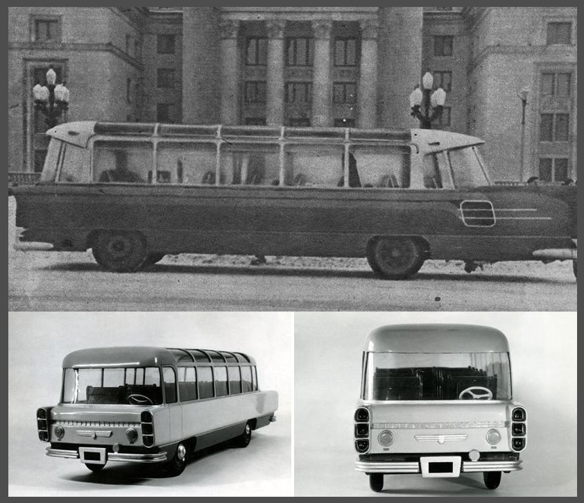
The idea for this model arose when the tour bus model our team had was deemed unsuitable by the project leads. It was great news because I already had a suitable candidate for the base of the model. I’m very interested in old futuristic vehicles, and I had known for some time about a certain Polish bus prototype from 1958, the SFW-1 Sanok. It was a great fit for the task—a retrofuturistic tour bus, with lots of glass and an unusual shape, making it look like a very oversized American highway cruiser. I didn’t take much inspiration from the actual prototype, though; I decided that one of the early mock-ups was more fitting.
Modeling
I modeled this model entirely in 3ds Max. I started by collecting reference images. In the end, there was only one suitable photo floating on the web, one of the bus’s right side. The rest was my own interpretation and guessing the right proportions, like the width.
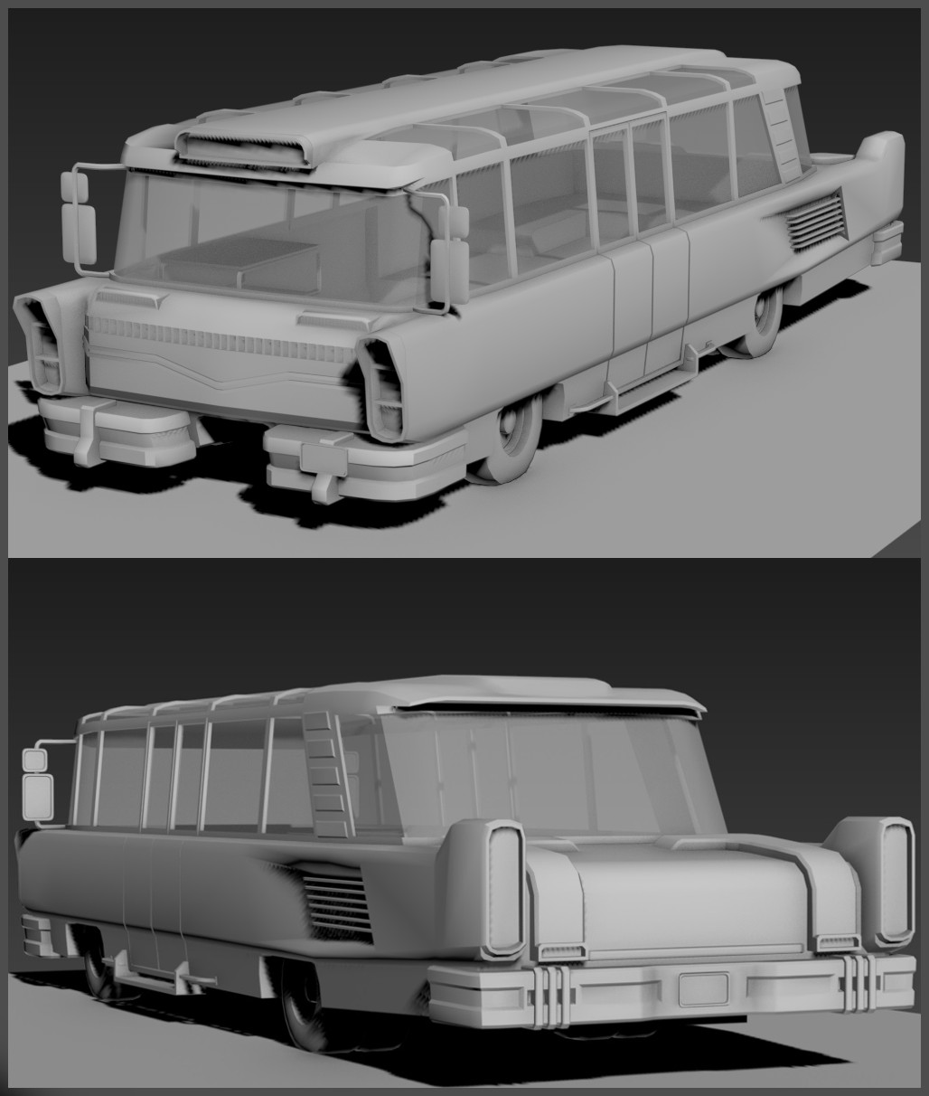
Once I had created the base low poly shape, I moved on to modeling the details. Because I could only find one frontal photo of the mock-up online, only the front is similar to the original design.
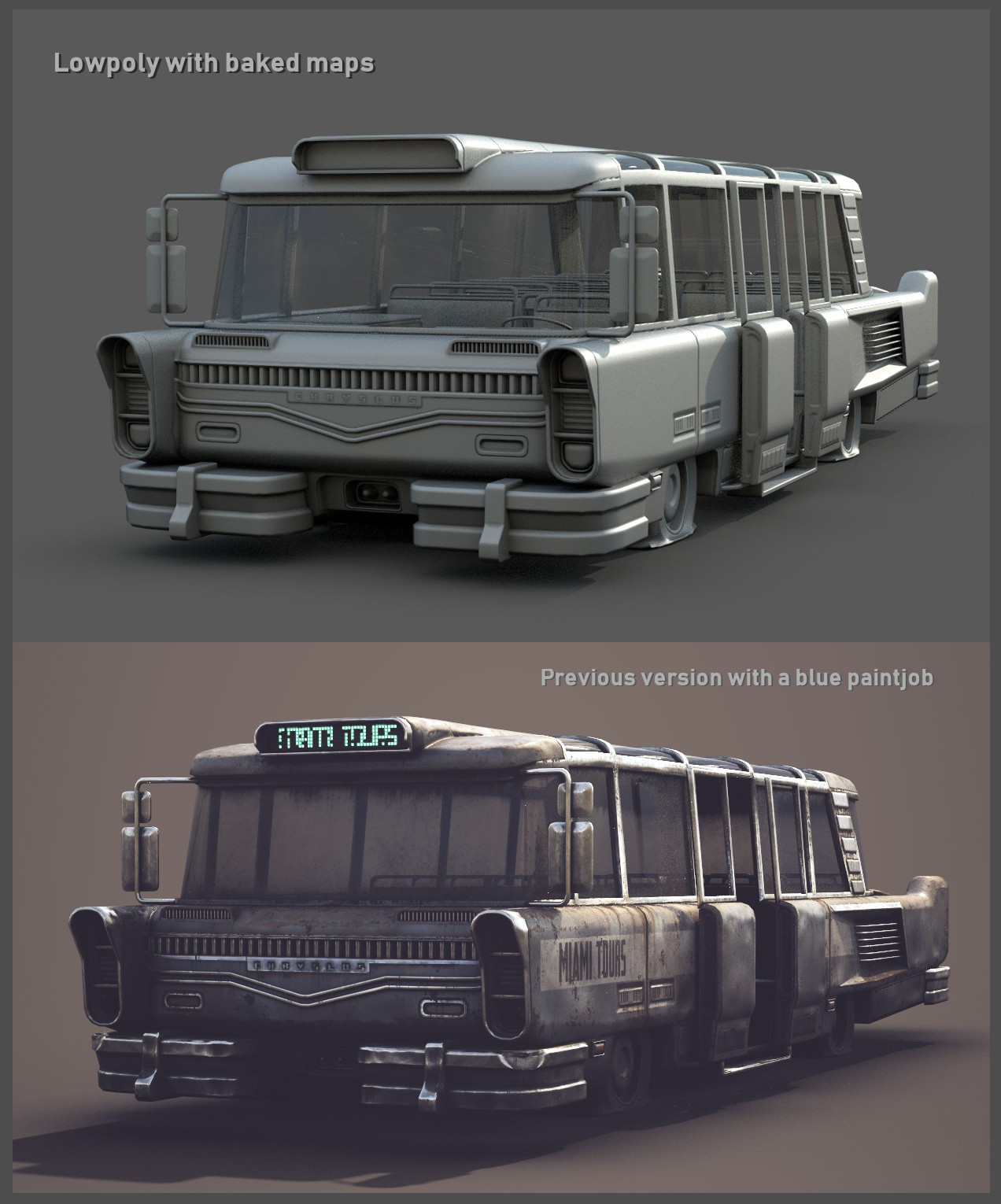
The original design wasn’t, of course, perfectly suitable. It didn’t have that robust and massive feeling that Fallout vehicles have. I fixed that by adding some tail wings, thicker tires, double tires in the rear, large bumpers, and big mirrors. Essentially, I just cranked up every original detail to 11, including the chrome. The bus is also intentionally quite wide—wider than any other Fallout 4 vehicle.
Once the details were done, I cloned the model and moved on to creating the high poly. It’s important to note that I strictly maintained quad geometry and clean loops on the low poly to ensure easy high poly creation. It’s a must-do when using the low poly to high poly workflow.
Most of the details of the high poly were actually modeled into the vehicle. I don’t use floating geometry on models like these since I don’t find the detailing work too time-consuming or challenging.
I also added lots of dents in the body, to ensure a busy normal map.
UV Mapping and Texturing
I used the built-in 3ds Max UV unwrap tool, aided by PolyUnwrapper. It’s a very useful plugin.
I mapped every UV island by hand, except for some very simple objects. I also packed them by hand, using Polyunwrapper to maintain a consistent texel density. In the end, I was left with 4 texture sets for the entire bus. I used Polyunwrapper’s automatic smoothing, which creates smoothing groups based on your seams.
The model was then dropped into Substance Painter. I baked every texture in 2048×2048.
I used the PBR Metalness workflow, as its output maps are the easiest to convert to textures that Fallout 4 can use.
Because of the dents in the normal map, creating textures was a blast—I barely had to do any hand-painted rust and such.
I started by adding a flat color fill layer and added a color noise filter, stylized baked lighting filter and finally a gradient filter. For me, stylized baked lighting is great for automatically highlighting edges and darkening cavities. It can also be used for adding a fading effect to the paint color.
I generally used a lot of stacked filters, up to 6 per layer, plenty of mask generators, and grunge masks, often combining both of the latter by grouping the generator layer in a folder with a grunge map as the mask.
The chrome bits were made to be in stark contrast to the rest of the model for variety. The paint itself also has some shiny areas. I find that even if this is unrealistic, I cannot yet find a way of making a very matte metal surface not look like cardboard.
Once I had done all of the base work, I started painting extra normal details and using anchor points. I can’t stress enough how useful they can be, especially when creating surfaces like fabric or leather. Attaching them to generators and filters allows me to make various patterns “pop”. I used this on the upholstery in the interior.
Uploading to Sketchfab
After having done all of the above and making sure the model looked fine in-game, I decided to upload it to Sketchfab as a part of my portfolio. I love how easy it is to set up a neat looking scene without having to worry much about lighting and environments. For this scene, I chose the Kirby Cove environment. As for post-processing, I used low levels of chromatic aberration (0.005) combined with sharpness (0.401) and also added some SSAO.
I boosted the value of the emissive textures to 10, because combined with bloom with high threshold, you get a glow effect without affecting other parts of the mesh.
Sketchfab’s a great tool for making your portfolio more interactive. People interested in your work can see every little detail you might’ve not been able to show with screenshots.
ArtStation / Nexus Mods Profile


