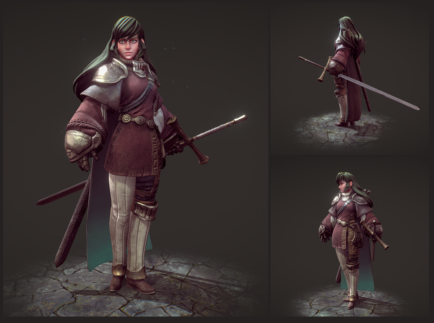
About Me
Hello there! My name is Jack Hamilton, from the brilliantly creative coastal city that is Brighton on the south coast of England.
My jam is all things hand-painted, richly modelled sculpts, and wonderfully crafted PBR materials. The Fantasy genre, with sword n’ board vibes is my go-to theme for inspiration, and my love of games ranges from Animal Crossing through to God of War (2018). I absorb and love all of it.
I have been a character artist for 6 years now, working for an indie studio where I’ve been working professionally as a 3D artist for the last 2-3 years, with a previous 4-year focus on concept art and illustration at the same company.
Alongside my work, I also take on personal 3D projects at home where I participate in challenges (both on ArtStation and here on Sketchfab) as well as projects that focus more on learning.
The latest of these projects is what I will be sharing with you today, and I am super pumped to have the opportunity to do so!
Inspiration
Twitter, Sketchfab, 80 Level, and Artstation. These are the 4 main heavyweights in my daily life that inspire me and allow me to keep tabs on what’s going on within the entertainment industries. My Twitter feed, specifically, has become a joy to scroll through; it’s filled with a wide variety of artwork as well as tutorials and insights. All of this posted and shared by both hobbyists and professionals, from indie to AAA. It all mixes together in one place and is often very enlightening and fresh.
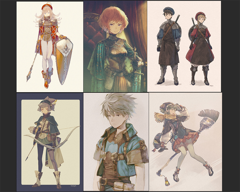
Inspiration for this model came from Twitter, in the form of a shared post that showed off the artist Moryo and their work. This was the first time I had seen their work and I instantly fell in love with the style and designs.
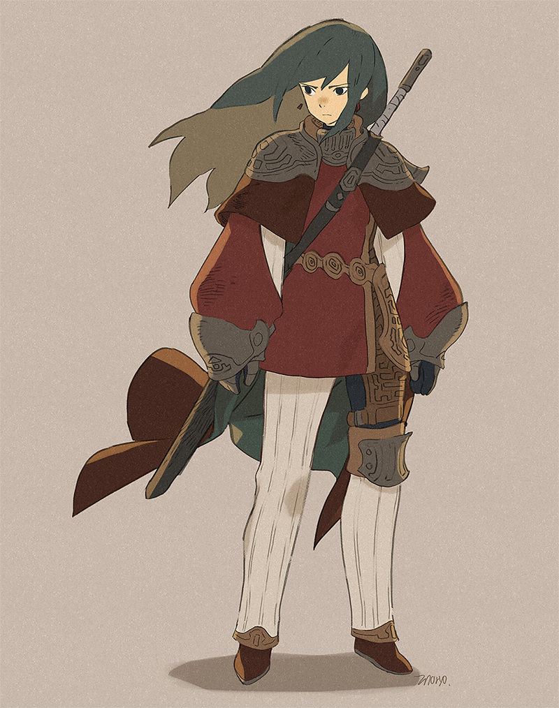
Below, I’ve listed a few pieces from their Tumblr which I just love, followed by the actual character design I ended up choosing.
I chose this character, not only because I found the design satisfying with its chunky arms, asymmetrical layering, and stoic personality, but also because it coincided with a few pre-existing goals for a new project I had in mind:
- Starting a new project, one that wasn’t a hand-painted model.
- Creating a fantasy-themed model.
- Working with a minimally detailed design to keep the project easy to manage.
- Experimenting with blending stylised shapes and proportions with realistic materials and details through ZBrush.
- And finally, get hands-on with a PBR pipeline and learn Substance Painter.
I knew I wanted to keep the anime look of the concept, but because I also wanted to work on my sculpting skills and learn how to use Substance, I thought it would be really fun to mature the character’s look. I imagined that by keeping her face and outfit proportions fairly anime I could work with a realistic colour palette and material spread that would ground her design in an interesting way.
For example, this piece from the artist Master Geass shows a brilliant blend of realistic materials and detail whilst maintaining the anime look through the face and proportions.
So I sent Moryo a message, expressed my love for their work and asked if they would mind me using their design as a basis for my 3D project. Moryo was was more than happy to hear this and gave me their blessing to do so.
Tutorials and Building Confidence
For this project, I turned to Marc Brunet’s (a games artist who I know for his easy to understand tutorials and high-quality artwork) 3D career guide over on Cubebrush.
I knew this project was going to be a heavy onboarding process and at times, incredibly overwhelming due to the number of new practices I would be learning, especially with the technical aspects of this pipeline. So having Marc’s processes to lean on when I got stuck was a huge mental crutch in helping me turn all of the unknowns in my head into knowns. Victory.
Software
The software used on this project and a brief summary of their use:
- 3ds Max – Initial blockouts, rigging, and skinning + final scene for exports
- ZBrush – Sculpt work
- Blender – Retopology
- Substance Painter – Texture and smart materials
- Photoshop – Edits to textures and final polish
Project – Getting Started
When starting a project, I like to make sure I’m looking ahead a few steps in order to reduce any problems that might arise, be they artistic choices or technical difficulties.
For example, because this project was using another artist’s concept for the design, I took the time to deconstruct their work and pick out any areas that I thought would be troublesome or needed expanding on.
As you can see below, I deconstructed the visual language of the piece to figure out the patterns on the armour; I could often see one side of it and I felt like it would work as a flipped pattern.
Reference
When gathering references, I like to use Pinterest and Google images which are both great platforms for discovering references based on similar image data. In addition to these two, PureRef is a tool I use in order to easily and visibly store everything that I find.
As previously stated, I wanted this project to focus on a more realistic approach to materials, and because of this, I knew that material identity was going to be key. So I gathered references that covered specific things such as stitch/seam work, how different types of fabrics and leathers fold when worn by a person, as well as broader things like fantasy-driven fashion and outfits.
Blocking out the model
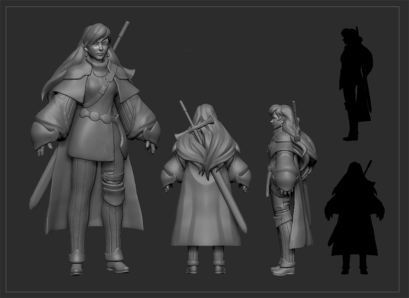
Once I gathered a healthy amount of reference, I jumped right into ZBrush where I started blocking out the shapes and silhouettes and identifying how many elements the model would consist of. By the end of this process, I had a list of separate objects: the hair, head, trousers, leather shawl, waist armour, etc. This part of the process helps me to highlight the complexity and content of the model, which in turn, forms a rough estimate for what the model will require in time and resources going forward.
Here you can see the stage where I had blocked out all of the parts of the model required to be considered a complete package. I also find looking at the silhouette helps refresh my eyes and lets me see the larger shape of the model.
Once the blockout of a model is done, I like to work the elements up in levels, making sure that everything is brought up to the same level of detail. If you work on the model in stages and work up all the elements together, you:
- See the overall look of the model constantly, which helps highlight areas that might be too detailed or not detailed enough.
- Mentally, you feel more comfortable as no part of the model is left behind and nothing has to be revisited at the point of finishing the polish pass.
That said, it’s not a rule, and it’s not uncommon for things to go wrong. In my case, it was the hair. Hair is always tricky, and it wasn’t until after roughly 20+ variations of hair that I stumbled upon a look and method that worked for me by using the Bend Curve tool.
Hair: Using the Curve Bend Tool
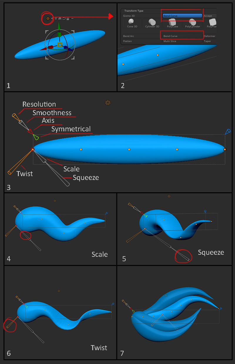
I’ll briefly explain the tool and how I used it to get results that might be of use to people who also struggle with hair and are looking for different ways to approach it.
- In order to get the most out of this tool, you will want to create a sphere and scale it on two axes so that it resembles a length of straightened out hair.
- The Bend Curve tool can then be accessed by clicking the cog on the transpose gizmo, followed by selecting Bend Curve. There are two locations for the option, but when you make your first Bend Curve it will most likely be in the lower position.
- The Bend Curve essentially draws out an invisible spline that you can freely move by repositioning the vertices and then alter the form via the arrowheads, which are your manipulators.
The Object manipulators include: The resolution, which affects how many vertices you can play with and ultimately ties in with how much flexibility you want (I don’t often use the smoothness option myself). Then there is the axis, which you may be looking to adjust based on your object’s rotation (this changes the axis along which the spline is drawn). Lastly, you have the symmetrical option which is self-explanatory.
Next are the vertex manipulators, which affect the selected vertex: Scale, Squeeze and Twist. - Here you can see that I can create a taper by adjusting each vertex’s scale.
- Squeeze is great for flattening out the clumps of hair as it will literally squeeze the object on one of two axes depending on which way you use the manipulator.
- Using the twist manipulator will twist the spline at the vertex it’s used on. This is great for matching the angle of the hair to the flow in a highly editable way.
- I did this clump in a couple of minutes and, personally, I find this method worked really well for me and hopefully it might be of use to others!
By the end of this process, I was able to have a zero fuss set of subtools that made up the hair in a way that I felt was easy to edit, if I needed to, and created a strong solid base look to work on. The hair was the final thing for me to finish off and once it was done, this was the end result for the high poly sculpt:
Brushes
Most of the brushwork was done using tools from ZBrush’s main tool kit, such as:
- Standard + Dam Standard
- Move + Move Topological
- HPolish
- Inflate, etc.
However, I also bought a few packs to help with the finer, more specific details which I have listed below:
- JROTools 35 Seam/Stitch Brushes
- Michael Vicente’s Orb Brushes pack
Retopology
With the final sculpt done, I moved on to retopology where I ended up using Blender as my choice software. I tried out TopoGun and 3ds Max as alternatives, but I found Blender had some brilliant retopo tools that made the whole process a lot easier to manage and handled the sculpt data a lot better.
It’s also free, which is great for anyone who is keen to see what it can do, much like I was!
I had never used Blender before, so I followed this retopo tutorial by FlippedNormals on YouTube to streamline the onboarding process. It gives a crash course on how Blender functions and shows off some recommended tools. The tutorial is easy to follow, too, as it features an on-screen ‘button pressed’ overlay.
With the low poly model completed, the next stage was to unwrap the UVs, which I tackled in 3ds Max. Detail was key to this model, so I decided to aim for a 4096 texture sheet comprised of 4x 2048 maps. With that in mind, I went about separating out the model elements into 4 groups that would each be assigned one of these 2048 maps.
This next image highlights the 4 groups that I split the model into for the textures.
 Each colour group represents the content for 1 of the 4 texture maps. For clarity, the missing elements such as the hands and feet will be mirrored, so only one side needed to be unwrapped.
If you wish to see the UVs, I have enabled the texture inspector in the model viewer, which can be found at the end of this article.
Baking the Maps
Once the retopology and UVs were done I could move on to baking the sculpt data onto the retopologised mesh. For this process, I tried out a few options (xNormal, TopoGun, and Substance Painter) to see what gave me the best results. All of them worked with varying degrees of results, but ultimately I went with Substance Painter purely because that is where I was going to be spending all of my time for the texture work. I find it far easier to manage files and outputs when I can minimise the amount of software I have to use.
So, to prepare for baking I ‘exploded’ my mesh, which is the process of separating out the model’s individual elements and spacing them away from each other so they don’t create locally baked shadows on one another. The problem with locally baked shadows, for example, is that if you had a shadow from the arm baked onto the torso, when they lift their arm up in-game, that shadow would remain on the torso, which would look incorrect.
There are two avenues you can take for exploding a mesh; in most cases, you can rely on Substance Painter’s auto explode option, provided you set your model up correctly. However, I opted to do it manually for this project so that I could see what was being lumped together for the bake.
Essentially, I opened both the sculpt mesh and the retopologised mesh in 3ds Max, where I then began spacing out all the elements, making sure to keep the high and low poly couples together, as shown below.
NOTE: Make sure you keep the original, non-exploded version of the model as a new file because this exploded state is only for the bake. Once you have the bake data you will go back to working on the non-exploded model!
With that done, I could go back into Substance and begin baking the main map channels, the normals map, and ambient occlusion. From the first bake, I checked for any baking problems and adjusted the bake settings accordingly to see what could be fixed with another pass. If adjusting the settings didn’t work then I would manually fix the maps in Photoshop.
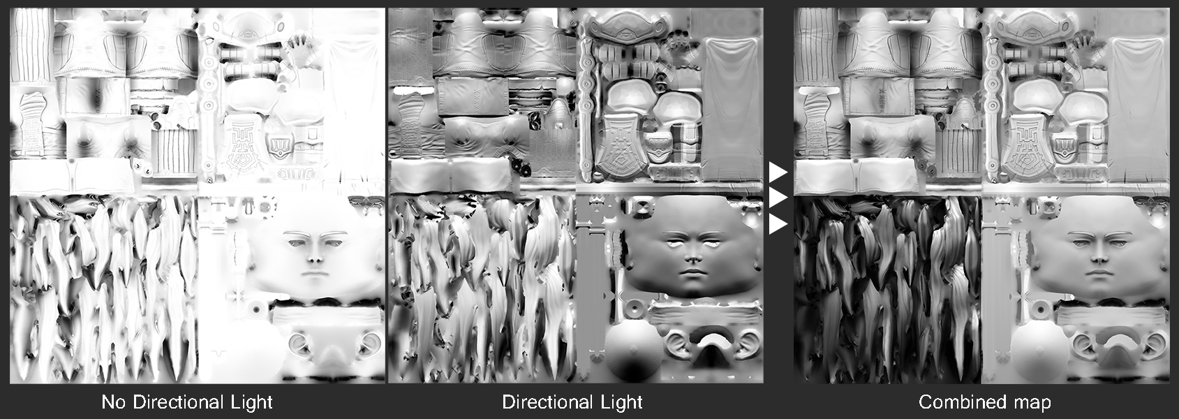
What I wanted to create first was the ambient occlusion (AO) map, to do this I baked two different AO maps with the intention to then merge them for a more refined result. One was baked with a non-directional light-based pass, while the other was baked with directional light, projecting light down onto the model.
Both versions of the AO maps become the base information that I then merge in Photoshop, forming the greyscale image for applying the base colours.
Combining the two was just a case of setting the directional map to multiply and then lowering the opacity to reduce the amount of directional light and achieve a softer range of values, then adjusting further with a levels layer.
Next, I set up the material IDs, which define the UV islands for quick selection in Photoshop. These are then used in Substance Painter to easily mask off the areas that I want to have different material parameters.
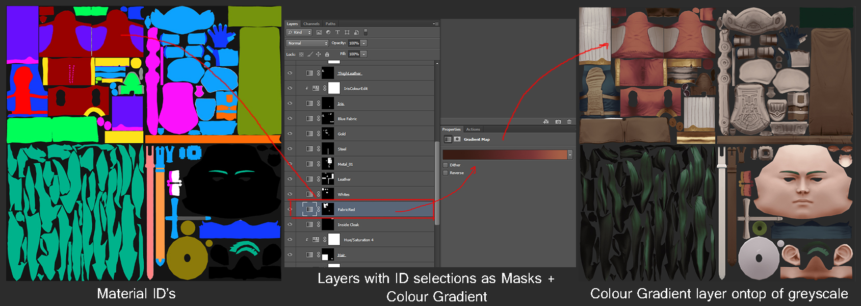 This image shows the connection between the material ID of the red fabric and using that material ID to generate the mask which is then applied to a gradient map that sits on top of the greyscale image.
Here you can see the Material ID image that I made in Photoshop and how I colour-coded each UV island, plus any internal section that I wanted to be a different material (the starker contrast, the better because in Substance Painter you select from this map and the software will select based on the colour of the pixels).
Each ID is then used to make a mask for a gradient map, which I then used to define the colours on the greyscale map. The benefit of doing it this way is that it makes editing colours incredibly flexible and non-destructive as you can always dynamically adjust the gradient colours. This method also adapts to any changes you make to the greyscale!
Working up the Texture
Now that I had my main maps (normal, ambient occlusion, material ID, and albedo) ready, I could move on to the next stage and apply these to my Substance scene with the original, pre-exploded low poly mesh loaded in, and begin working up the textures and materials.
Quick Tip!
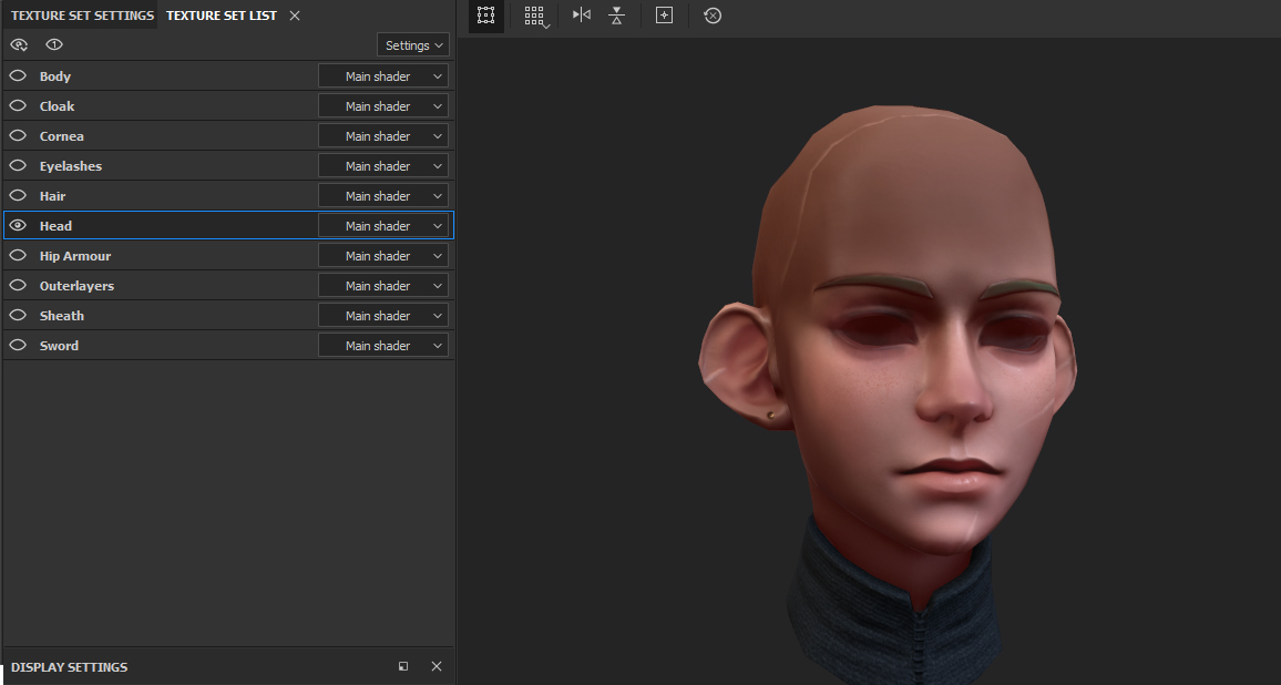
In order for work in Substance to be more manageable, I would recommend setting up your model in a way that lets Substance register object visibility. In the image below you can see on the left that I have 10 listed objects—these objects can be toggled on and off allowing you to focus on as many or as few of them as you want. Here I just have the head visible, making it easier to see the whole surface, unimpeded by hair or clothing.
In order to achieve this functionality, you will need to assign within Maya or Max the model’s material IDs, which will define what Substance then reads as a separate object. So, my model in Max is made up of 10 material IDs, defining the Body, Cloak, Hair, Head, etc.
So, with the maps plugged in and the model with defined segments set up, it’s then a case of adding to the albedo map I made from the greyscale and refining the look. The refinement process covers a lot of areas at this point:
- Painting further colour into the skin tones.
- Painting in varying levels of roughness on the skin.
- Using Substance’s materials and smart materials to apply fabric and leather details as well as the use of metallic materials.
- Taking those materials and then editing them to better work with what you have in mind.
- Combining materials to get new results.
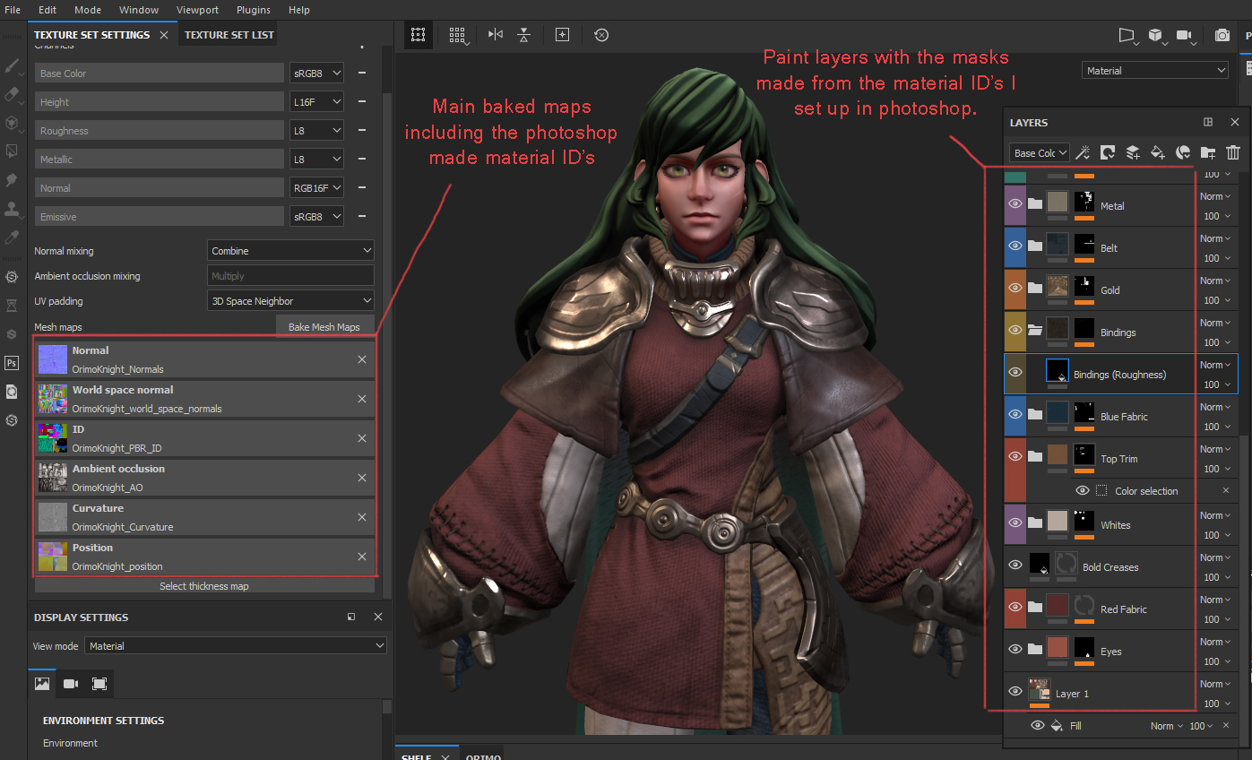
The above image shows the main maps being used on the left-hand side that I originally baked in Substance, as well as the material IDs that I set up in Photoshop. On the left of the image, you can see the layers panel where (similar to Photoshop) all the further texture data is stored and distributed based on the masks that use the colours from the Material ID map to identify what to mask out.
For every part of the model that has a different material, such as leather, skin, and armour, I created a group with a corresponding mask so that I could manage each material’s properties with more ease.
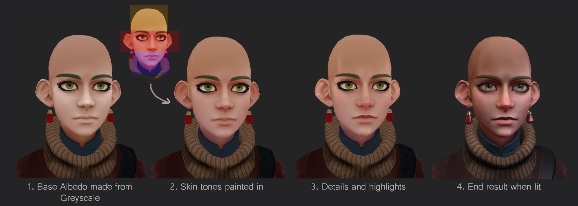
In a few cases, I would tackle a material with a more painterly approach, such as the skin. Below is an example of how I painted up the face using the base albedo that I made in Photoshop and how I built upon it. The first 3 examples show the head unlit, with the 4th head affected by lighting.
- Base albedo map where the skin looks flat and lifeless.
- I painted in 3 main colours we find in our faces, red for blood vessels, yellow for the skin tightest over bone and purple for shadow.
- At this point, I brought out features with highlights in areas such as the chin, nose, cheeks, and ears. I also added in details like freckles, scarring and defined the lips.
- The same head as 3 but with lighting turned on. I also have an emission map in play which gives the illusion of subsurface scattering. I’m aware that there are features available to do it properly, but I went for the quick and easy route this time.
In addition to this painted layer, I also have the roughness map, which I painted in alongside the colours to define the levels of shininess on the face. The glint in her eyes is achieved by creating a cornea mesh set to have transparency and high reflectivity so that it reacts to the lights in the scene. This was essentially the process that I applied to varying degrees across the whole model; I took the base albedo and worked it up as much as needed. In most cases, the materials and smart materials supplied by Substance Painter did a lot of the leg work for the fabrics and materials.
A lot of the end result comes from the normal map of my sculpt and the data from Substance Painter’s materials. The most painterly work was done on the face and hair, as well as adding better colour definition to the outfit. Outside of that, it was a case of altering material patterns, their roughness and metalness channels and trying to bring better clarity to the representation of material types.
 Side-by-side example showing how much of the end result comes from the maps that make use of light data.
That pretty much sums up the texturing method and how it all fits together in Substance Painter. I encourage folks to check out the Sketchfab model and all the different channels via the model inspector!
Posing the Model
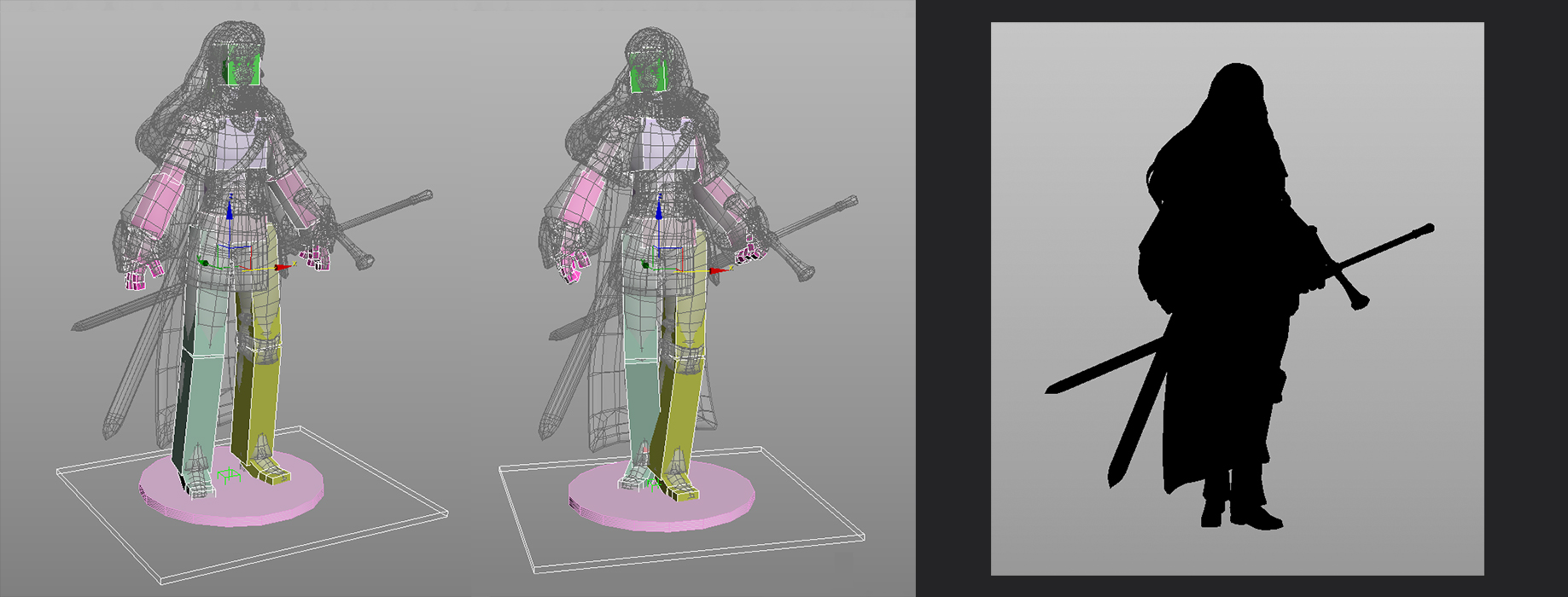
To wrap up the project I wanted to pose the model, so I used 3ds Max to build a VERY basic rig using the CATRig tool. I knew she was going to be pretty tough to put into a dynamic pose due to the hair being uniquely positioned and the arms being pretty big, but ultimately I was more keen on making sure the model was in a pose that showed it off best.
So I went for (what I hope) looks like a strong feminine standing pose that created a cool and interesting silhouette.
So here is the rig I made and on the right is the angle of the pose I really fell in love with. I loved how the sword and sheath break up the silhouette here as well as the lemon shape she gives off which helps push the bulkiness of her sleeves and hair.
I did originally have her holding the sword forward from the hilt in her right hand, but the length of the sword traveled too far away from the body of the model and it made framing her really difficult. So I opted to have her holding it backward in the left hand like a temporary sheath, whereby she could use her right hand to grab the hilt when needed. I think in the end it created a more striking pose and silhouette!
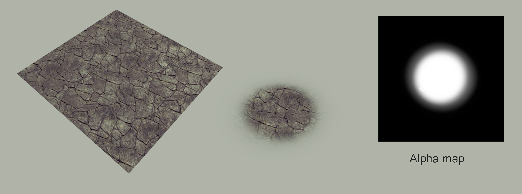
To top it all off I added a base for her to stand on—nothing fancy, just a bit of visual flavour to ground her in the scene. I first started with a 3D platform, but it made her look a bit too much like a toy or a figure, so I instead opted for a flat ground with an alpha fade. The stone floor was sourced from Substance Share, which is essentially a user-made library for materials.
Uploading to Sketchfab
I’d like to point out that the process of uploading to Sketchfab, for me at least, happens more often than just once at the end. I really like uploading the low poly mesh (once baked) to Sketchfab early on to get an idea for how it will look when published. Then, as I complete map textures and the posing, I will upload every now and then so I’m always seeing the result that everyone else will see.
More often than not, working between software and different viewport settings means you will get different results, but the only look that matters is how it looks at the end, in the model viewer.
So I start getting the model ready by selecting the PBR renderer setup followed by simply applying all the map textures that I exported from Substance and then adjusting values to get it looking and behaving as it does in Substance Painter.
Lighting
Lighting is such a large part of selling the model’s look, and I will fiddle with it numerous times before I settle on something. Generally, though, I start by turning off the environment light so that I can clearly see the effects that a light will have on the model. Below you can see the 3 lights I used without environment lighting turned on.
- Directional – This is the main fill light used to show the front of the model.
- Directional – I placed a light behind to bring out the edge of the body and some of the sword. I also attached it to the camera so that as you rotate the model, there is a constant soft rim light.
- Spot – This spot light brings a focal light to the bust and head.
- All 3 – Here you can see all the lights turned on together, I liked how the shadows fell over the surface and gave depth, so I decided to go with this.
Next, I would turn on the environment lights which would fill in as the ambient light, removing the pitch-black shadows. For this part, I tend to just go through all the environments and see what colours they push, as well as the different levels of contrast. This is where metallic materials really pop as they reflect the environment’s image.
I ended up using Kirby Cove, which offers a fairly neutral/earthy colour palette as well as containing mid-contrasting values that work nicely on the metals. I then adjusted the orientation until I found a degree that settled nicely across the model. This is the result of both the 3 lights and environment light turned on.
Post Processing Filters
This part of the viewer is always super fun to play with, but it’s also the section that can quickly turn your model into a soup of effects if you’re not careful. My go-to filter is always Sharpness in order to bump the clarity, and then, after that, depending on the model type (in this case PBR), I will fiddle with SSAO to increase ambient occlusion at run time and then toy with Bloom to make the metals give off that nice glint effect.
A new feature that I hadn’t used before, but now have, is the Screen Space Reflection, which, again, works really nicely on metallic surfaces as it just helps to add colour and interest to the surface of the metal. Vignette then helps focus the eyes on the model in the middle of the screen, and darken out the harsh corners of the model viewer. I don’t often use Chromatic Aberrations, but in this case, I decided to use the smallest amount just to make her volume pop a tiny bit more. And lastly, I play with the Tone Mapping and Colour Balance sliders; these two filters often make the biggest difference in visuals and feel, but it’s a fine line between looking subtle and over-filtered.
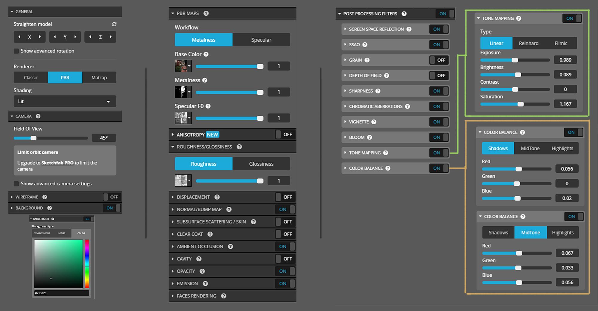
As you can see, the no-filtered vanilla look is a lot greener and dusty looking, so I very slightly adjusted values to try and harmonise the colours and overall contrast. Below I have taken a screenshot of these values so you can see how minimal the changes were and how much of a change it makes despite this.
I’ve also included an image of the maps used in the materials panel as well as the settings in the general setup tab.
Field of View
Field of view is something that generally falls into best-used values, and those values are dependent on what you want the model to represent.
- Usually, for a single, centred character model I find 30-45 degrees works best. You can have the camera close without getting a noticeable fisheye effect and it’s not so low that it looks flat.
- For my Loish piece, however, that I wanted it to look more like an illustration than a 3D model, I lowered the field of view to 5 degrees, which takes the depth out of the viewer making it look more like it was drawn.
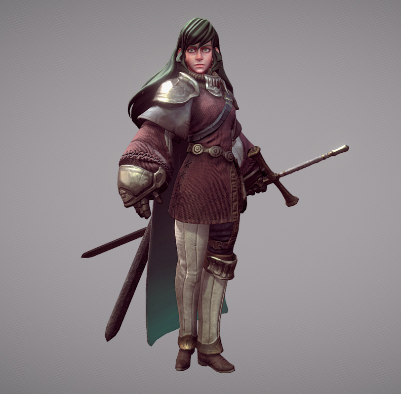
And here is the model itself. Please have a look, check out the inspector and I hope you like her! She’s been the largest home project I’ve done and has contained some of the hardest challenges to date, but I’m really proud of how she turned out.
Sketchfab is a platform that I have used since roughly 2011 I think, and it’s been a tremendous asset to my work over the years in providing a space for me to collectively publish all of my models. The rate at which they have been updating and bringing in new tech for the community to show off their more advanced models is amazing and their efforts in showcasing a large variety of Sketchfab artists on social media is wonderful to see. It’s a great community that continues to thrive and I love being a part of it!
The Power of Collaboration
Just a small addition, but I thought it was worth mentioning as this next image totally made all the challenges and hardships of the project worth it.
When I finished the model and showed it to Moryo, they enjoyed the final result so much that they decided to draw an image commemorating the collaboration. Our two versions of the same character coming together, and it absolutely melted my heart to see. This alone is reason enough for why asking permission to use someone else’s concept is always for the best as you might just inspire them to also do something in return!
 Moryo’s tribute to my model and their design as seen on Twitter.
Thanks for Reading!
And with that, I think that covers pretty much the whole process for this project! If you have stuck around to the end, I applaud you, thank you for taking the time to read through this lengthy document. I hope more than anything that it offered some useful insights into the PBR pipeline and I am more than happy to answer any further questions or go into more detail via the comments or a PM.
A big thank you to Abby for inviting me to talk about this project, I’ve very much valued this opportunity. And in general, a thank you to the Sketchfab team and community for being such a great place to share and experience all the amazing creativity that’s out there.
If you liked this project, you might like some of my other works over at ArtStation, and Twitter where you can follow me for project updates as well as lots of artist sharing.
Have a lovely day!

