About Me
My name is Ben Stevens, I’m a 3D Environment Artist and I live with my beautiful family in Southeast London.
I was fascinated by art, design and videogames from an early age but came to 3D pretty late, studying BA (Hons) Digital 3D Design as a mature student at The Kent Institute of Art and Design (UCCA). I graduated in 2005.
I started my first games job at Kuju London in 2006 and was excited to make my debut on a Nintendo published title, ‘Battalion Wars 2’ on Wii. I left Kuju in 2009 and, since then, have worked on various projects at Rockstar Games, UTV Ignition and The Creative Assembly. I am currently working with Lucky Mountain Games and trying my hand as a freelance 3D generalist.
The Project
Having previously worked with Lucky Mountain on ‘Racing Apex’, (recently announced as ‘Hotshot Racing’), I was approached by the studio to create a prototype level environment and characters for a new, exciting, unannounced project.
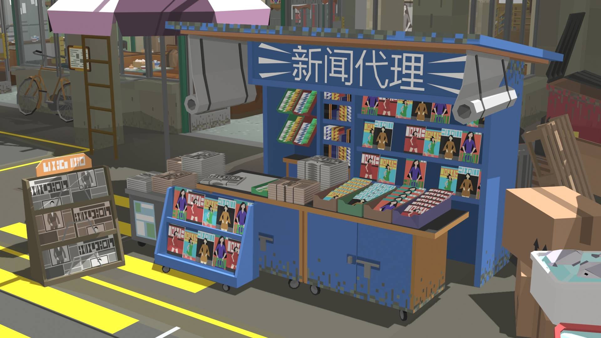
Lucky Mountain games have a signature, ‘retro 3D’, low-poly visual style, utilising faceted geometry and flat vertex colouring. This intentionally ‘lo-fi’ aesthetic, whilst technically unremarkable, presents the creative opportunity to work within stringent stylistic and technical limitations to achieve a result that is simultaneously sympathetic to its inspiration and engaging to a modern audience. I enjoy working within such challenging limitations; exploring methods to describe objects and surfaces in an appealing way with as few vertices as possible and without textures forces you to find creative solutions.
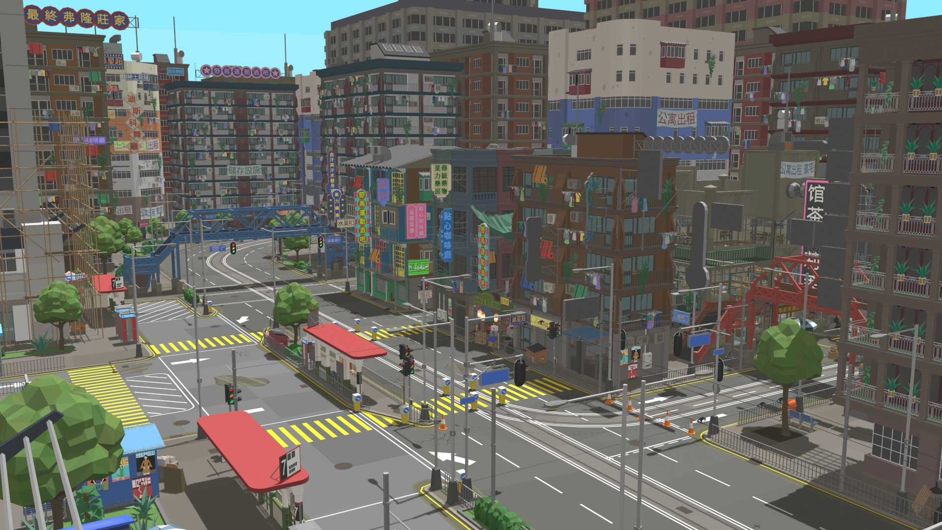
I approached the brief in the hope of evoking the sunny, rose-tinted memories that gamers-of-a-certain-age have of classic, 90’s arcade games; crisp, faceted geometry, bright colours, and blue skies.
Process
In terms of process, the art style demands a different mindset to that of contemporary, high-resolution game graphics, e.g., from using as many vertices as necessary for a curve to appear smooth, to using as few verts as possible to ‘suggest’ a curve. With this in mind, I not only concentrate on silhouette and form as I would with anything I model, but am also mindful to reduce the vertex count as much as I can, wherever possible. As an old-school kind of guy, I’ve always favoured disciplined, optimal modeling, so reducing the poly-count to the absolute minimum is not only something that I find enjoyable but can also be creatively satisfied when the result achieves a stylistically appealing and effective balance of economy and form.
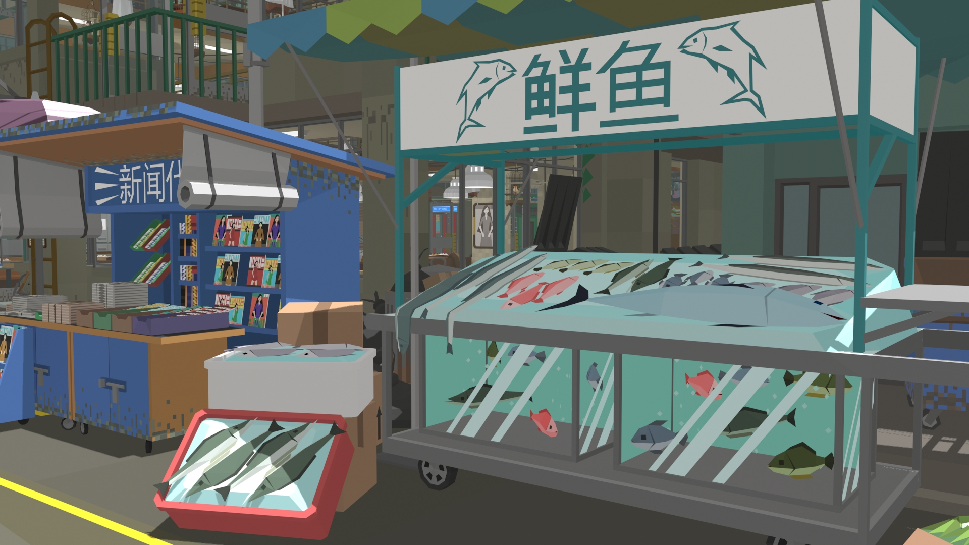
The art style utilises flat, non-blended, vertex colouring with a bright and colourful, but not overly saturated, palette. Again, this is quite challenging in terms of modeling; I effectively use vertices to ‘draw’ the outlines of fill areas of colour and balance the low-resolution geometry requirement with the minimum colour information needed to adequately describe an object. There are obviously examples that compromise this methodology; a tiled wall or crate of produce requires a lot more geometry than an equivalent low-poly, textured example, but I adhered to it as closely as possible.
Once modeled, I hand colour each object to block out the hue and rough shading and to define any relevant detail. I then apply a radiosity bake to the vertices as an overlay to add highlights and more subtle shading, being careful to retain the non-blended colouring.
I used these methods to generate a large suite of prop objects and buildings that I then composited and dressed over the level greybox. Once the level is fully optimised, signed-off on, and ‘final’, I apply an additional vertex radiosity bake as a ‘multiply’ layer to ground all objects in the world.
The angular, unsmoothed geometry and flat, block colouring is both a signature of the visual style and also what gives the project personality. I hope that these ‘limitations’ lend the result a distinctive, characterful abstraction that feels like an artful celebration of the humble polygon!
Inspiration
The core inspiration for this level environment is John Woo’s Hard Boiled, a classic 90’s, Hong Kong, ‘Gun Ballet’, action movie.
https://www.youtube.com/watch?v=crY_HlF5z9w
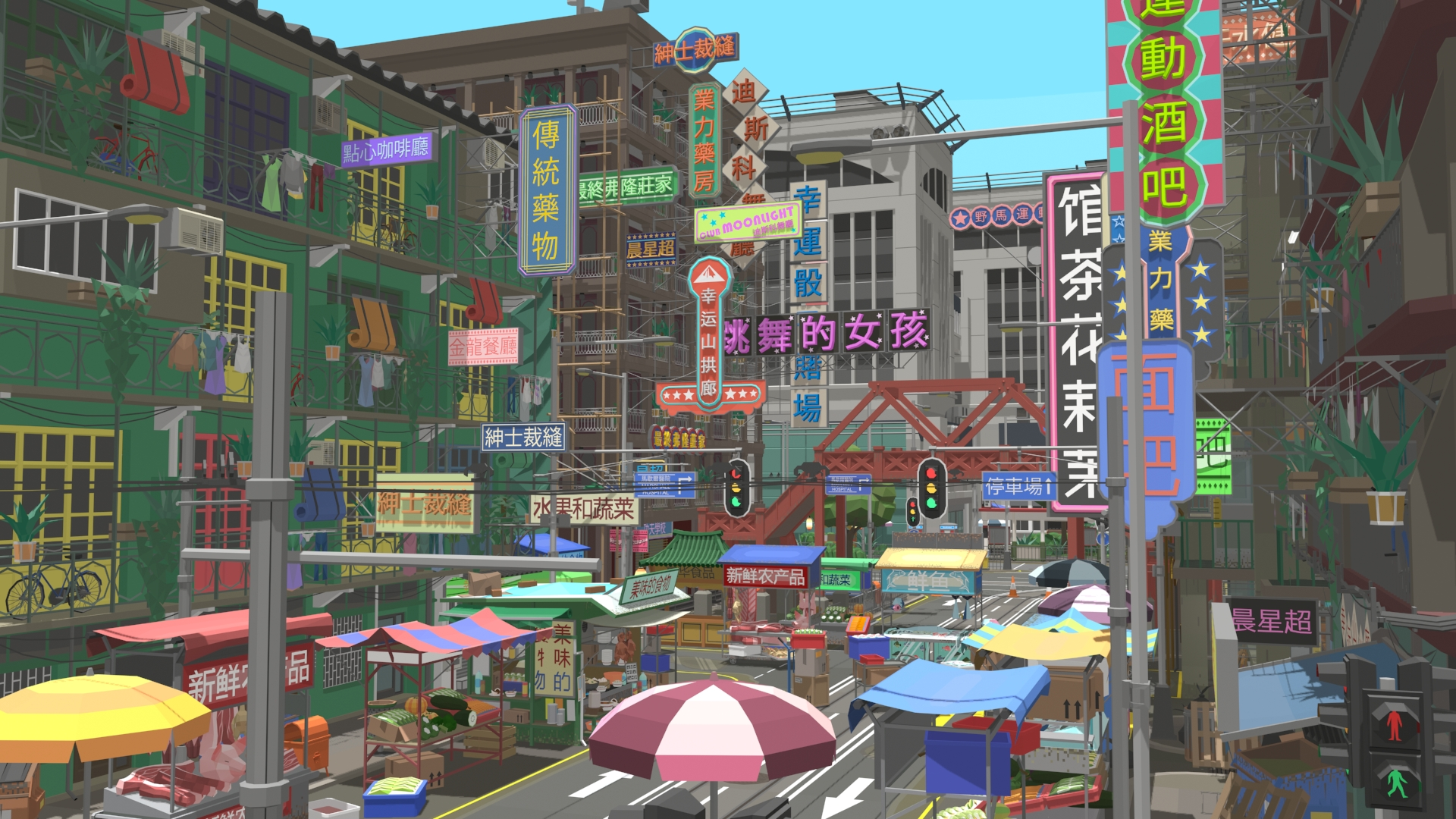
The bright, colourful, daytime atmosphere of the model scene differs from the seedy, nighttime vibe of the film, the reference primarily informing the location choices and some of the details seen here and in the more extended level. The market, teahouse and hospital are all iconic of the source material and fans of the film may even find one or two easter eggs in the scene.
Whilst the art style is super stylised, I was still very focused on creating an environment that had an authentic feel and captured an, admittedly pared-back, essence of the location. For additional street detail and ‘flavour’, we did extensive reference gathering online, specifically looking for anything to do with 90’s Hong Kong. A particularly fruitful source of reference material was the wonderful Toma Miniatures company, which builds incredibly detailed physical models of Hong Kong Street scenes.
Tools
I primarily used 3ds Max for this project, using Google Translate and Illustrator to generate the Chinese language vectors for the extensive signage in the scene.
Sketchfab
With my more conventional 3D work, I usually love spending time tinkering with all the lighting and post-processing options in Sketchfab to get the best from my detailed normal maps and PBR materials, but for presenting this particular scene, I’m afraid the setup is super basic! With only diffuse switched on and no materials to speak of, the scene doesn’t really benefit from PBR, so I’m using the classic renderer with a default lighting setup. I have indulged myself with SSAO to enhance the depth of the scene and a little bloom to sell that late afternoon haze. I’ve also used sharpening to offset some of the softening and retain the hard-edged style.


