About me
Hello everyone, my name is Pedro Damasceno. I’m a 3D artist, Brazilian, currently living in Belo Horizonte / MG. I graduated in Digital Game Design from the Pontifical Catholic University of Minas Gerais and during the course I had contact with all the stages of game development, programming, game design, technical art, 3D, etc.
I have worked in the area since 2015 and since then I have participated in the creation of interactive books, advergames, interactive applications with emerging technologies, and games. I have also taught “Games, Ethics and Society” and “Game Design” – one of the richest experiences I’ve had during my professional life.
About the Berserker Axe
In September 2018, I decided to focus my studies on stylized modeling, mainly hand-painting. I chose to create a project called Calamities, in which it would be possible to apply what I was studying in personal works, models in which I would develop a lore based on cursed weapons. The Berserker Axe was the second of these models.
Before developing each prop I create a small background for each one. At first, the story developed for the ax was:
Berserker Axe, created to prevent the invasion of what was called a civilization.”
“And Master, Why do we not use it in this war?”
“Bathed in the blood of the greatest warrior of each of the two tribes, he had long been drunk on the blood of his victims. It became so accustomed to blood that it began to consume its own user.”
Doomed to never again be used, its thirst is deafening.
As the idea of this project is to do something extremely experimental and mutable (that changes according to the process), I always have in mind a focus for the weapon, and for this specifically the focus was “an axe that has its own soul / life”.
References
I have a great appreciation for humanistic matters, such as Anthropology, Philosophy and History, so I will leave here a quote from a Platonic philosopher, for those who are still afraid to use references.
We are like dwarfs on the shoulders of giants, so that we can see more than they, and things at a greater distance, not by virtue of any sharpness of sight on our part, or any physical distinction, but because we are carried high and raised up by their giant size.”
Bernard of Chartres
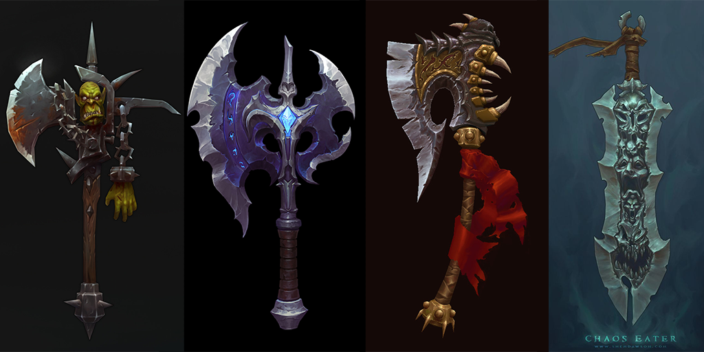
I always try to have different references, but I have in mind some main ones, and those were the ones that most influenced the final result of the project.
Process
First of all, the main idea of the project was to be a study, mainly of painting, so throughout its development I had in mind a thought: do not let the fear of error overwhelm my pleasure to experiment. With that thought I threw away stuff, re-built others, and learned a lot.
My process for this personal projects is:
- Search for inspiration, create a story, or find inspiration on some theme.
- Search for references.
- Organize the project
- Modeling. I do not have a rule for this, but I do about 90% hard surface blocking in Blender 3D, 10% in ZBrush. This is reversed when it comes to organic modeling.
- Fine details, UVs. There are some models that I shoot the UV’s before, to use alphas, to create details in the geometries through textures.
- Painting (3D-Coat, Photoshop)
- Final composition, effects, etc. (Blender)
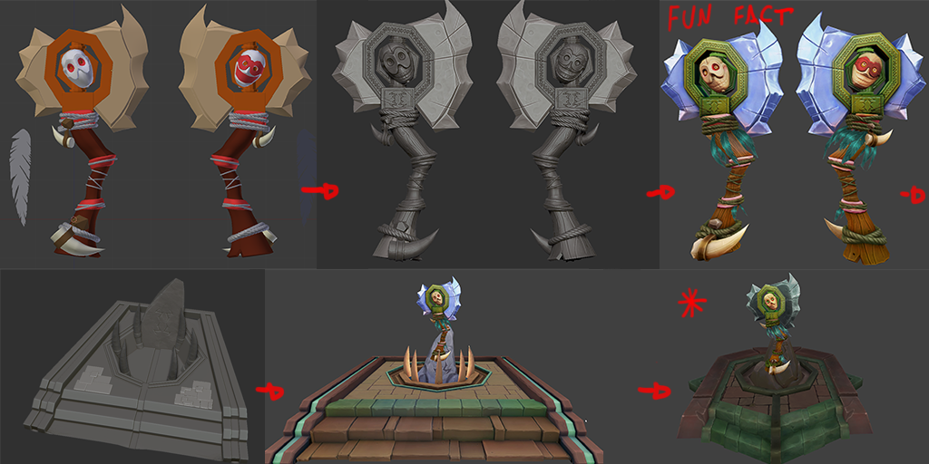
In the image below you can see some punctuated moments.
Fun Fact: The name of this texture was: Text_BerserkerAxe_Final
In this video, as you can see, I believed I was coming to the final stage. I had redone the texture of the axe about 4 times. At first, I used the bakes produced through the High Poly model, since it was the workflow I was used to, but since the idea was to get the most out of my comfort zone, I quickly discarded the idea.
To learn the materials, I worked on other projects – some of them can be seen in my ArtStation. I tried first to apply this knowledge of materials by painting the textures only in black and white, thus streamlining the process, since the idea was to work with light and reflection, not colors.
Throughout the project I counted on great friends and without them I certainly would not have arrived where I arrived.
Besides the feedback they gave me about the painting, such as that there was very high saturation and very small details that did not contribute to the reading of the model, one of them noticed that I was losing myself: I had missed the tribal theme, and the axe was becoming something very medieval. Then came the need to redo everything (remember: do not let fear of error overwhelm your experimentation), especially the textures. I made the conscious decision to remove everything tribal and make the axe medieval.
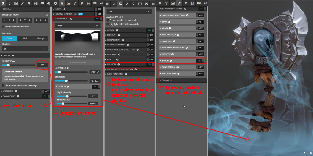
Sketchfab
Final Considerations / Learning
During the project, I noticed a considerable progression in two areas: painting and composition. The first was a direct necessity – I started the project precisely to remedy a deficit in hand painting; the second was something that the project demanded indirectly.
In each area I think it’s essential to talk about at least three topics.
Painting:
- Variation of hue. I noticed that at the beginning of the project there was a lack of color variation throughout my model. One of the things that I used to help me with this was this Marco Bucci video.
- Illumination / Shadow: Naturally warm light generates cold shadow and cold light generates warm shadow.
- Materials: To learn a little about the behavior of the materials, I chose to train in grayscale. In this way I was able to absorb faster because I did not worry about the colors.
Composition:
- The importance of shapes: Language of shapes really influences the cohesion of the model; try to repeat the shapes so that the model has consistency and to use of patterns like corners for aggressive objects.
- Pareto Principle: Apply the rule of 80/20 – for example: if an object is aggressive, 80% of your model should refer to this and 20% should not. For instance, if everybody is a superhero, soon, nobody is a superhero.
- Saturation: Guide the viewer through colors, light, shadows, through “excess” or “lack.” Your focal point does not necessarily need to have a higher saturation than the scene, only a saturation ratio different from that of the rest of the scene. Example: scene with high saturation, focal point with lower saturation.
A special thanks to all who helped me! And to the Sketchfab team, which in addition to providing us with this incredible platform, gave me the opportunity to pass some of my knowledge forward.
I hope you enjoyed!
You can find out more about me on my social networks.
Twitter / ArtStation / Instagram


