About Me
Hello, world! My name is Felipe Gall and I live in Florianópolis, Brazil. I’m currently a senior 3D artist at animation studio AnimaKing, and I’ve been working in the game industry for 11 years. I’m a generalist, I’d say; I can’t settle down and specialize because I just love doing a bit of everything (I might be a bit of a control freak). I love 3D but I also dabble in 2D and I have a degree in graphic design, so that comes in handy as well, at times (logos, UI, etc). My latest project is a game called Keen—One Girl Army, soon to be released by Cat Nigiri. It’s a puzzle/adventure hybrid in which you play as a badass little girl called Kim; it’s got tactical combat, challenging puzzles and catchy storytelling! I did almost everything visual, from backgrounds to character sprites and animations, GFX, UI and logo design, etc. It’s a very personal project and I’m grateful to Cat Nigiri for the liberty I had in the project, it’s something that doesn’t come often in the industry!
Inspiration
During my time at Cat Nigiri I focused mainly on 2D work. Last time I had touched 3D I was at Hoplon working on the prototype version of Heavy Metal Machines! I’ll be honest here, 3D work at the time wasn’t a lot of fun for me. I dreaded things like retopology and UV unwrapping, texturing/authoring maps for inconsistent shaders was a pain, and the clunkiness of 3ds Max was slowly wearing me out. The shift to 2D was a relief, but as I focused on drawing cute ass-kicking little girls, I saw the 3D workflow change completely as things like PBR and Substance Painter came onto the scene. My work on Keen then ended and I realized that I had a LOT of catching up to do! I set out to work on personal projects with the intent of learning not only PBR but also…Blender 2.8! I was fed up with 3ds Max and had been wanting to jump the ship for quite some time. Once I saw what 2.8 brought to the table, I had to try it out and it was love at first sight. I’ll just say it: Blender 2.8 made me love 3D again!
Anyway, I looked for inspiring concept art, focusing on small projects I could tackle in a week or so in order to see results quickly and keep some traction. I tend to prefer stylized art over realistic, but still, I looked for something less ‘graphic’ and more realistic in terms of materials/rendering so I could try out PBR.
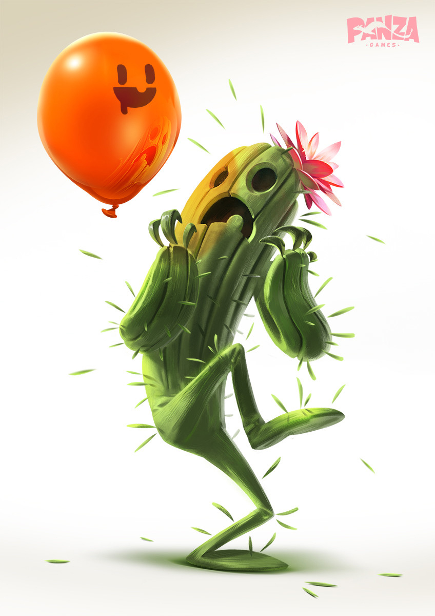 Artwork by Illuga Studio for Panza Games.
This illustration immediately caught my attention. It was simple enough not to take much production time, materials were well-defined and looked like they would translate well to 3D, and more importantly…character and storytelling. The pose is very dynamic, creates a strong silhouette and I love how the spines sell the idea that the cactus is afraid (also the ones in the air look cool in 3D).
Modeling
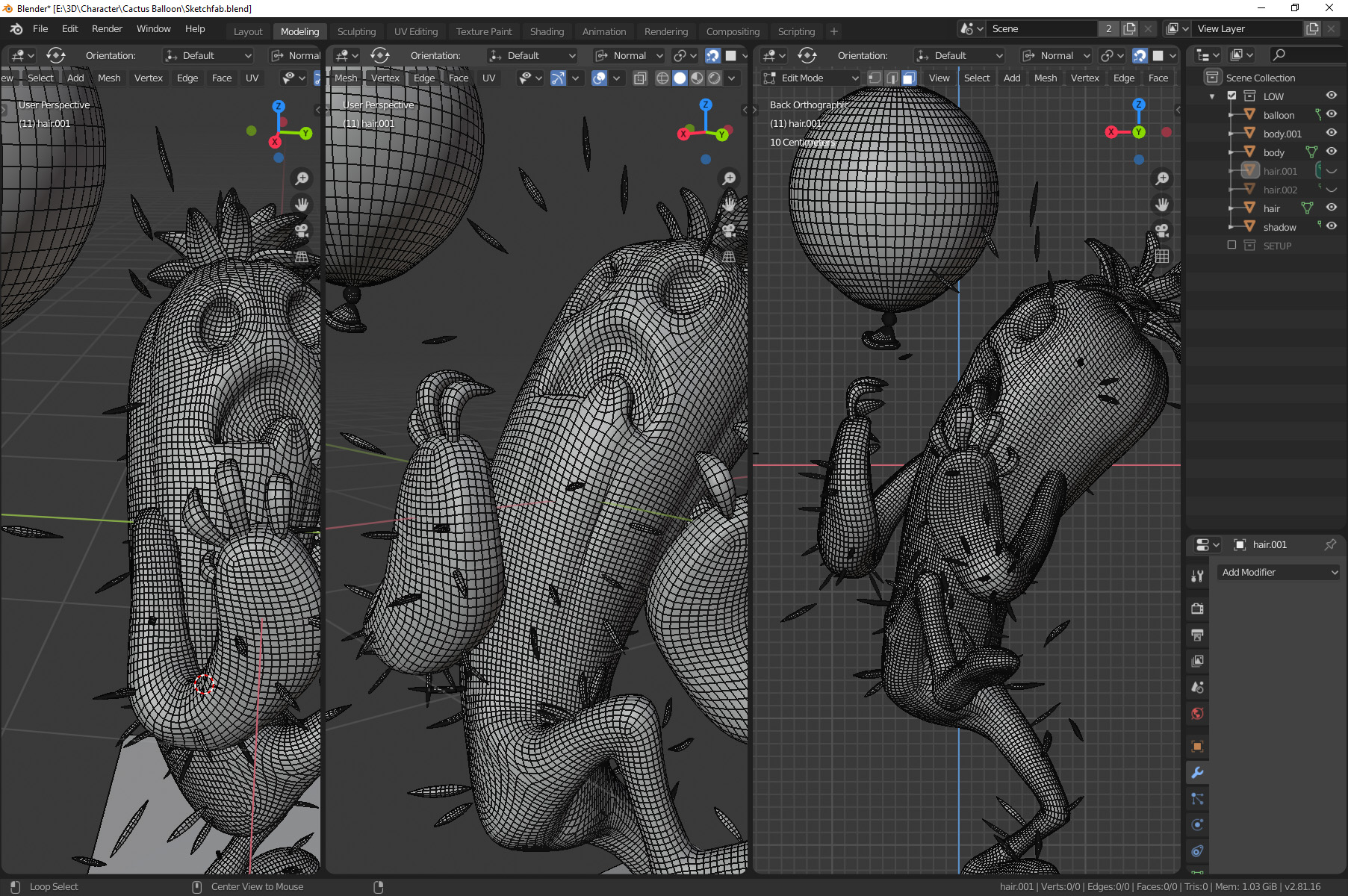
I began with the balloon because it’s just so simple I wanted to get it over with quickly and have it as something to compare the cactus character to later on. It’s basic modeling all the way—start with a sphere for the main part and deform it to shape. Another tiny sphere for the knot and for the tip I started from a single edge loop and extruded out the shape loop-by-loop using Move and Scale to form the cone, lip, and the inside cone. I used Proportional Editing (the equivalent to 3ds Max’s Soft Selection) to carve into the knot and bend the tip into a more interesting shape. Another alternative is switching to Blender’s sculpting mode and using the Grab or Elastic Deform tools to push things around!
For the cactus, I went straight to ZBrush to see if a quick ZSphere rig would do the job. I began with a symmetric rig but quickly realized that working this way would do me no good—this wasn’t a character being made for animation or anything, so working asymmetrically straight on the final pose felt like a better way to do it. Unfortunately I don’t have any pictures of the process, but it’s pretty basic stuff.
ZSphere rig for the base mesh, shape it up, Dynamesh it, rinse and repeat. I abuse the Move brush—I’ll usually try to get the shapes right as far as possible with it before sculpting anything. I like using ClayBuildup and then the Smooth brushes to create volume. DamStandard for the hard creases and lots of polishing with hPolish and TrimDynamic to break the smoothness a little and make the surface feel a bit more ‘handworked’. For folds, I like to carve in with DamStandard then use Inflate to tighten up the gaps a bit.
The nails were done in Blender—I exported a decimated version of the sculpt, imported to Blender for position reference, modeled the shapes and brought them back to ZBrush for sculpting (mostly just polishing and beveling the edges with TrimDynamic).
For the flower on his head, I modeled one petal, UV unwrapped it, then duplicated it several times and arranged the flowers into a nice little bundle. As with the balloon, I used Proportional Editing and some of Blender’s sculpting mode tools to help shape the piece.
For the spines, I modeled one single spine and UV unwrapped it, making sure the origin (pivot) of the ‘master spine’ was near one of the tips. I then turned on snap, set it to face and checked ‘Align Rotation to Target’, which made the task as simple as duplicating the base model (Shift+D or Alt+D to create an instance), and positioning them on the cactus. I tried to follow the concept as closely as possible and used the sculpt mode to shape them all up as a whole after positioning them all.
The hardest thing was getting the pose to feel right from angles other than the original. I’d often spend precious time trying to force the shape into the concept art and while it would look good from that specific point of view, it ended up destroying the model from other angles. At one point I kind of just dropped the concept art for reference and tried to understand the shape in my own terms, then tweaked the model a LOT until I felt the pose was solid.
Eventually, I finished the body sculpt, so it was time for retopology. As this character wasn’t being made for animation I didn’t worry too much—I used ZRemesher, playing around with the guide lines and settings until I had something I liked. I wasn’t too worried about polycount as it’s not exactly game art, it’s just real-time, so I got the polycount down to a level where the silhouette still felt smooth and round while still being manageable.
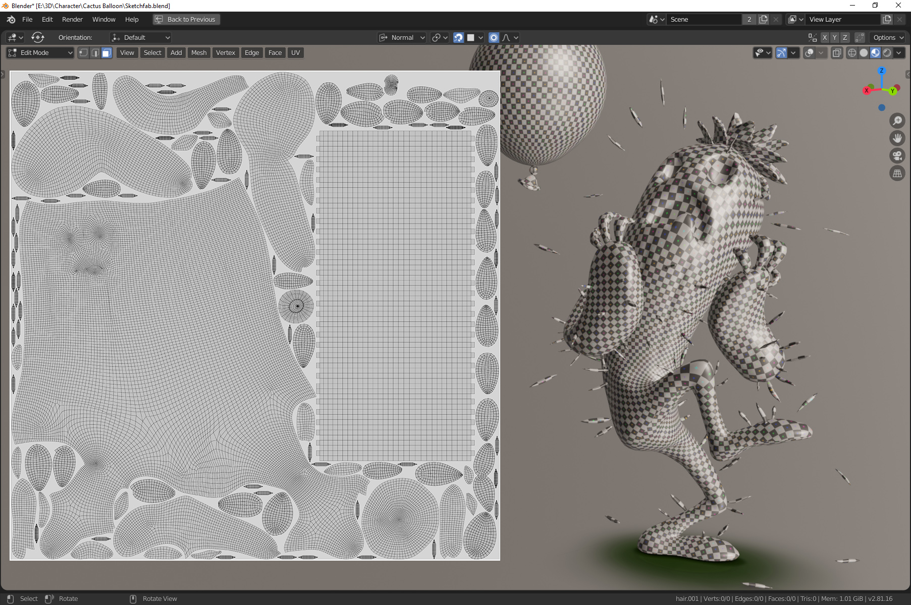
For the UVs, it was a simple unwrap, trying to place seams in loops that made sense, but not worrying too much about it because Substance Painter deals super well with seams (though I’d later regret not giving island orientation a bit more consideration). I used an amazing Blender addon called UVPackmaster to help me optimize the packing—since I had lots of little parts because of the many spines and petals, this was a great solution to give every part of the model its own space in the UV map without worrying about manually arranging the whole puzzle.
Texturing
With that out of the way, it was time for texturing. I exported both low and a high poly versions, separating the model in key pieces (balloon, body, arms, nails, spines, flower), naming them accordingly and adding ‘_low’ and ‘_high’ as a suffix. I do this to get cleaner bakes in Substance Painter as it keeps parts from interfering with each other. With all of this set, I brought the low poly model into Painter and baked away!
PRO TIP: Eventually I noticed I had baking artifacts in some places, but was already deep into the texture work and didn’t want to get all the way back to rebaking, so I needed a way to paint directly on the baked maps—case in point, the normal and AO maps, where the artifacts were showing up. You can do this in the Texture Set Settings, just change the normal/AO mixing mode to Replace, then add a fill layer. For the normal map you’d turn on normal in the Material settings of the fill layer, then load the baked map as the input (it’s located in the Project folder, inside the Shelf). For the AO, same thing, just make sure you’ve added an AO channel in the Texture Set Settings.
The balloon was really straightforward—it’s a base fill layer setting value for all channels (I made it slightly metallic to get a bit of colored specular), another fill layer on top with a brighter orange, masked by a 3D Linear Gradient generator, and the face on top. At first, I painted directly on the model and even got the shape alright, but realized it was positioned a bit off, and, since you can’t really move strokes around in Substance Painter, I found it was much easier to just have the face done in Photoshop and project it onto the balloon. This way I had way more control over the size of the face and its position on the mesh.
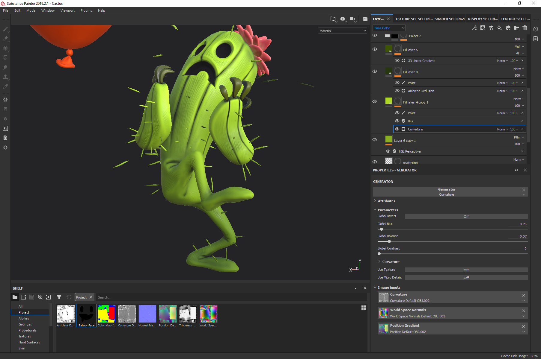
The cactus isn’t too complicated, either—as usual, I start from a base fill layer where I set base values for all channels and build up from that. On top of the base layer there is a lighter green fill layer with a curvature mask to highlight the bulgy parts, a darker green layer to enhance crevices and, on top of it all, a dark green 3D Linear Gradient on his whole body, coming from the ground.
Now, in the concept art the cactus material has this subtle fibrous microdetail that I felt was essential to the piece, and would fit the ‘stylized with realistic rendering’ feel I was aiming for. I created fill layers and used the built in Grunge Map 005. Now, this was the moment that rushing the UV layout came back and bit me in the ass. Had I taken a bit more care of island orientation and straightened the arms and legs UVs a bit more according to the grid, the fibers would have all run beautifully along the topology of his body. Instead I had fibers going everywhere. They looked ok on the torso and head cause the UVs were fairly straight, but they were all over the place everywhere else. My solution was to mask out areas that didn’t look OK, duplicate the layer and tweak the projection settings (scale, rotation) to cover as much of the model as possible, then rinse and repeat. I got away with four layers, but that’s something to keep in mind for future projects.
Texturing of the petals was just like the other parts—base layer and some additional colors masked by AO/curvature. I mixed the colors a bit with the Smudge tool by creating a paint layer on top and setting the blending mode to Passthrough.
Rendering
With the texturing done it was time to bring it all into Blender and make it shine! The lighting setup is super simple—a main yellowish Sun light, a light blue Sun light coming from the back as rim light, and a small orange spot right next to the face to simulate the light bouncing off the balloon.
At this stage I faced another roadblock—I had been setting up the scene lighting under Look Dev/Material Preview mode in Blender, using the stock HDRI’s as the ambient light source. Turns out there’s no simple way to just replicate this setup for the final render but, upon digging around, I stumbled upon the elegant solution below.
If you’re new to nodes, don’t worry, this is simple to set up (I’m a node noob myself). Long story short, this lets you load two different HDRI’s, one for the background only, and one that actually lights the scene models. This way you have complete control of the scene lighting and how the models and the background interact, and the possibility of having different images for each one is great for more graphic/less realistic situations like this one.
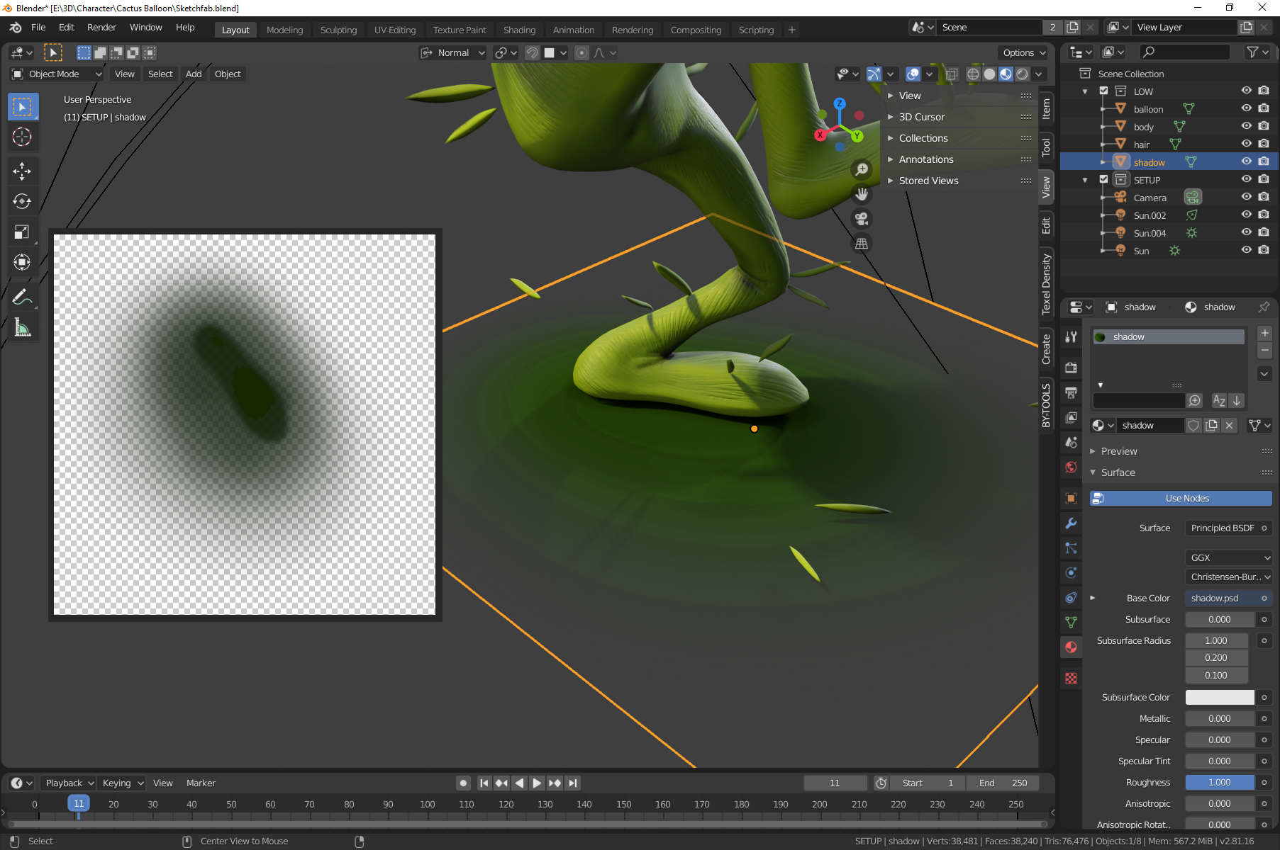
For the shadow, I tried playing with the actual projected shadows from the model using a ground plane as shadow catcher but that just wasn’t working out. To get the stylized look right, I ended up just painting a fake blob shadow in Photoshop and adding it to a plane. Remember, it’s not wrong if it looks right.
I didn’t get the petals to look like I wanted to—softer, with more subsurface scattering going on. Not exactly sure what happened, perhaps the light directions didn’t help or there’s a setting I’ve overlooked somewhere. In the end, though, I thought it looked sufficiently fine and called it a day! Here is the final result, rendered in Blender EEVEE (more shots at ArtStation)!
Sketchfab
In Sketchfab, I tried to replicate the setup as closely as possible. Nothing fancy, simple PBR materials, the same lighting setup (main light/rim light/orange spot for the balloon) and a subtle layer of post-processing to glue it all together.
And the final model on Sketchfab!


