Background/Intro
Hey there! My name’s Blake and I currently work as a lead artist at Dinosaur Polo Club in little wee New Zealand. My recent work includes Mini Motorways and Valleys Between (both games where I decided I needed every colour possible in them apparently).
I previously worked and studied as a graphic designer for a few years before fully giving in to my nerdy impulses and moving into games. I’d ended up studying game art in New Zealand which ended up being a rather broad mix of pretty much every 2D and 3D skill you can imagine. From there I found myself often wrapped up more in the art direction side of things than the actual asset creation side of the work—which was what I truly loved. As a result, I wanted to go back to upskilling in 3D work because I was seriously out of practice and feeling pretty rusty.
Course Work
This led me to look for potential courses I could take while I was working. I did a bit of searching around and landed on this course run by CGMA.
It seemed like a pretty perfect way for me to get back into doing 3D more regularly, and it was! It was pretty tough managing it with full-time work and small amounts of contract work, but I managed to come through relatively unscathed. The Ramen shop, then, was created over a 4 week period as part of the large assignment you do in the 10-week course. Sadly I ended up being overseas for the first week so I had to scramble things together for the last wee bit. Ashleigh (who runs the course) was also a fantastic help for this piece, offering tonnes of sage advice on fixing my god awful composition.
Inspiration
I think it’s fair to say I wore my inspiration on my sleeve a bit for this one. I absolutely adore Ghibli films, and I had recently watched Spirited Away for the millionth time. I also had recently been traveling around Japan and was in love with the types of buildings I ran into both in rural Japan and in the heart of Tokyo. Within Tokyo itself I loved the little hole in the wall restaurants you’d run into – oftentimes feeling so understated and tucked away that you could miss them if you weren’t looking close enough. In the more rural areas, I kept finding buildings and houses that were very much lived in but had all sorts of foliage covering them. They had tonnes of character, which I adored, so I wanted to do a small little love letter to each of these things in the short timeframe I had.
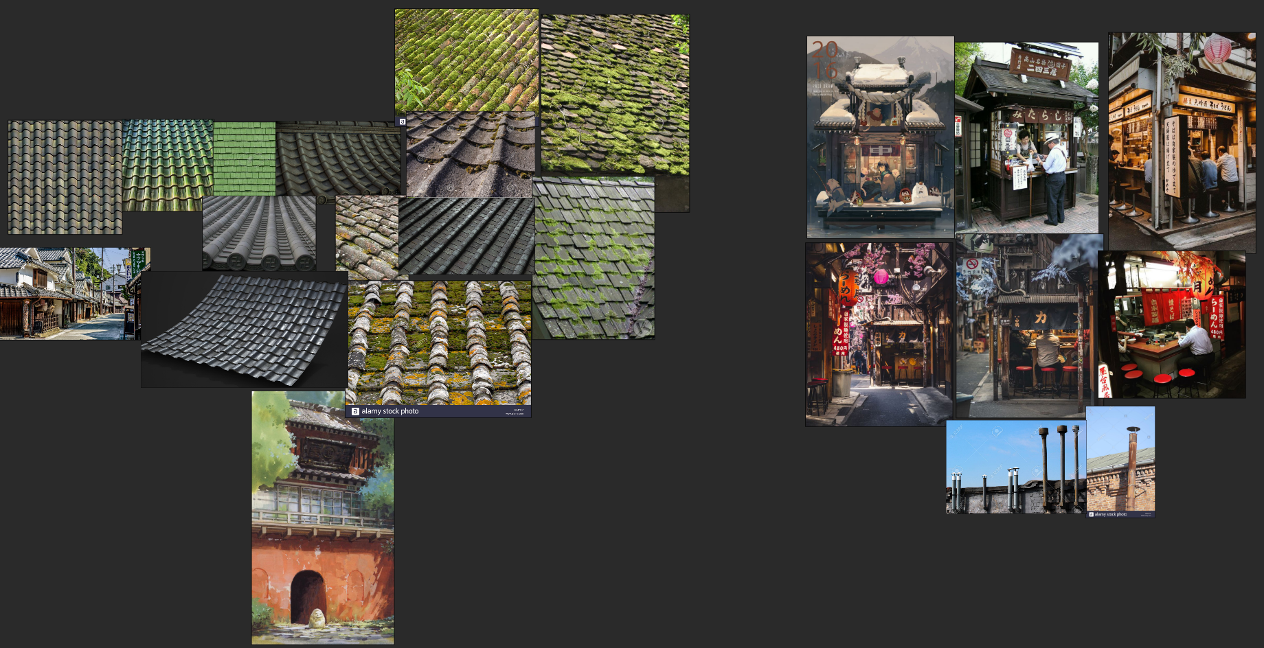
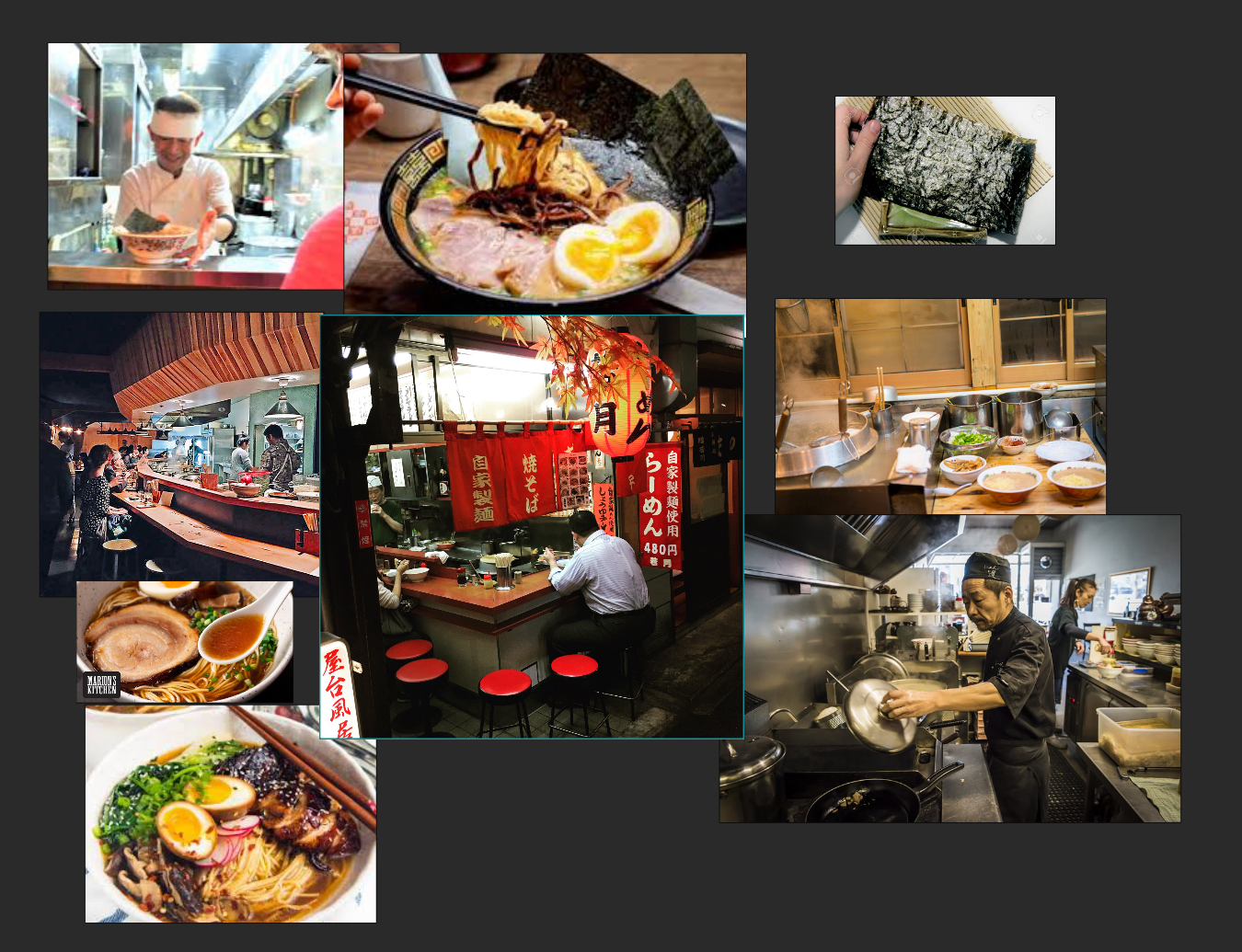
I started by compiling a huge mood board of all the places and things I remembered from Japan, and my favourite Ghibli stills. Along with individual blocks of reference for specific objects, I knew I needed to texture and model. Below, you can see my ‘roof tile’ reference compiled next to my early image exploration of ramen shops.
The more references, the better, as far as I’m concerned. So no matter how big or how small the element was, I wanted to make sure I had a good understanding of how it should actually look.
Process
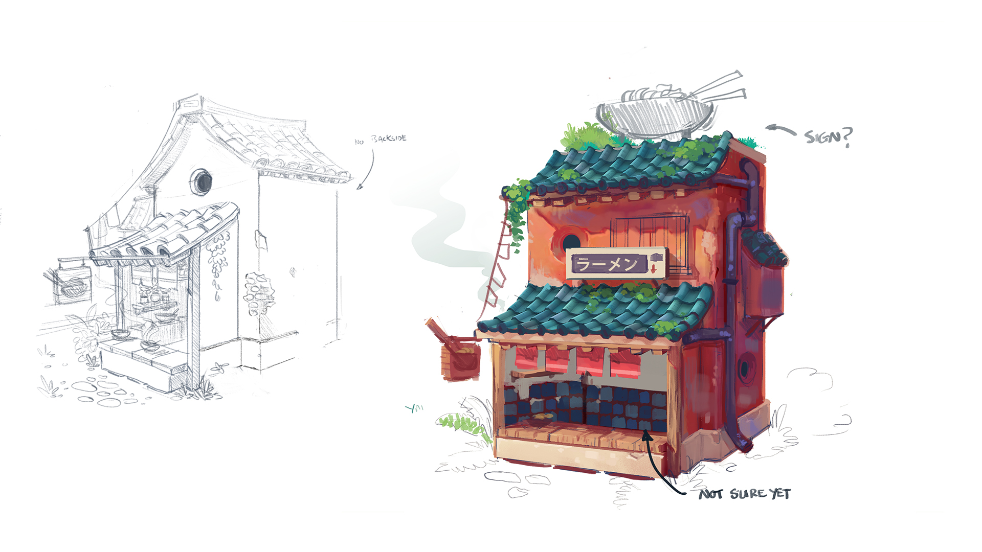
Thus I began my foray into painful concept painting time. It also happens that I’m pretty out of practice with 2D painting, so these are some rough concepts as I was trying to figure out the overall look of the shop. I knew I wanted it to be overgrown and relatively compact, but I didn’t know much of what I wanted outside of that. I eventually settled on an overall look that I was somewhat happy with and, as far as I was concerned, the concepts could be pretty ugly. Normally I far prefer actually finalizing the design before going ahead, but since I was under some serious time constraints, I decided I’d have to figure out the final composition in 3D.
The biggest and most weighty part of this model was just simply painting the textures. As per the requirements of the course, the entire model had to be handpainted. This meant that I had to refrain from using any kind of PBR workflow (or refrain from using tools like Substance Painter and ZBrush for normal maps and such). As a result, the actual modelling process was pretty straightforward and was all done in Maya.
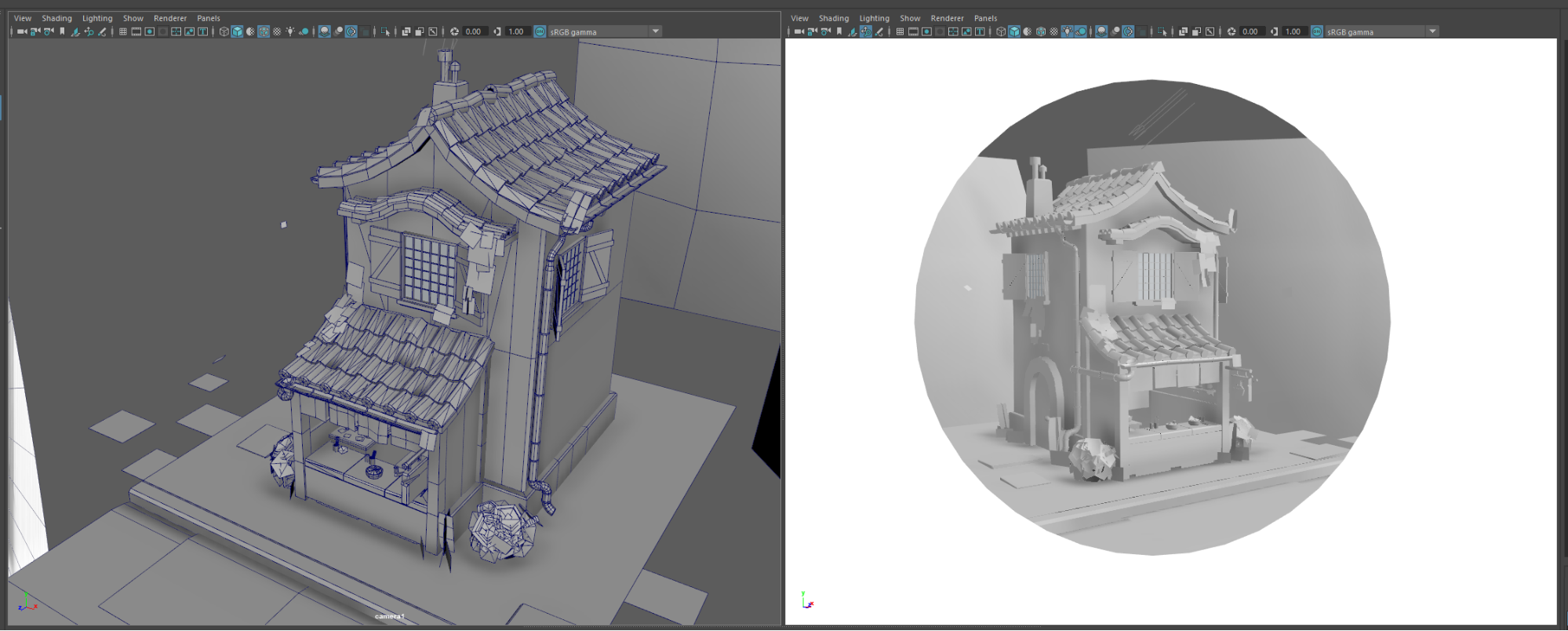
While modelling, I liked to have 2 views open. I had decided pretty early on how I wanted the model to be composed, so I could keep referencing back to my final composition with everything I did. This means that every so often I would jump back out of my main modelling camera view, and could see my camera setup on the right to ensure things still looked correct.
I had been trying to keep the model relatively low poly, while also not focusing too much on optimization. If I was preparing this as a final asset for a game, I would have absolutely cut things down a lot more, but since this was a kind of fun piece for myself, I decided I would give myself room for multiple texture maps, and some pretty non-optimal roof tiles.
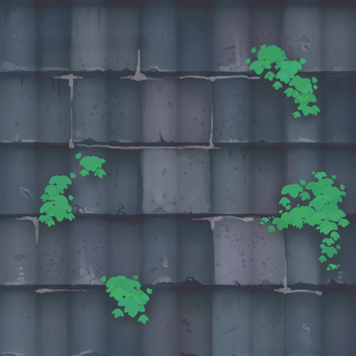
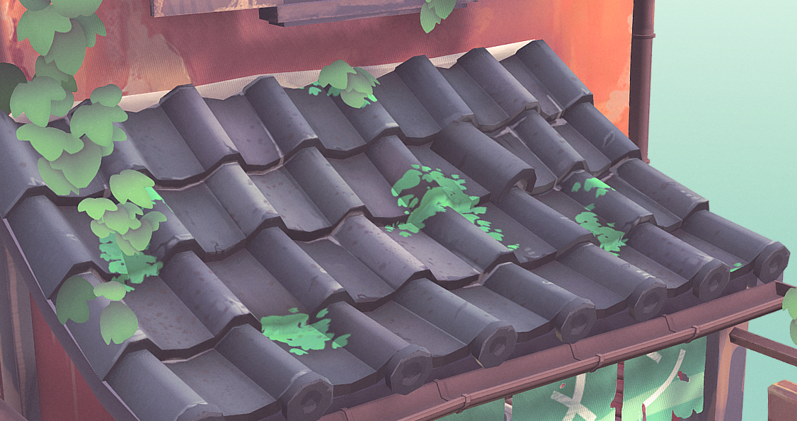
The roof tiles in the final version were made by creating a simple plane where I pulled out faces into a sort of ‘corrugated-iron’ shape. Then from there all I had to do was line up my tiling texture and place the occasional rotated tile on top for interest.
In practice the texture above then turned into this:
You can see off to the mid-right I have a single tile I modelled and rotated to help give it that feeling of being old and worn down. I also made sure to use a soft selection in Maya to help push and move all the tiles around for a similar kind of effect. If everything is too symmetrical and perfect then the scene will look off as a result.
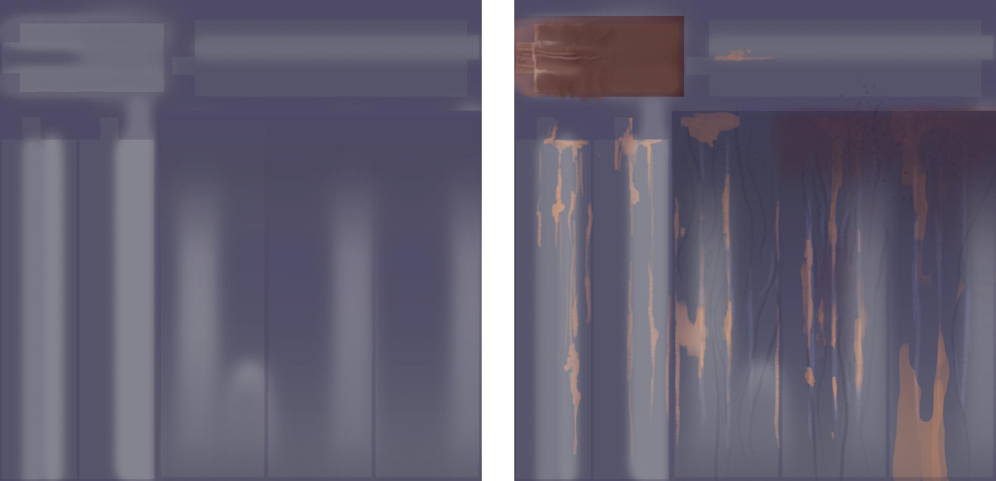
After finishing up my model, it was time to start the painting portion. Ashleigh had taught this in her course, but a great way to start was through baking AO and a vertical gradient map. These two things give you a pretty solid foundation from which to begin the painting process. From there I simply dumped everything into Photoshop and began painting away. The most important thing for me, however, was to never overwork an individual part of the model until I was completely happy with the overall colors.
This meant that, when starting the textures, I made sure to lay down the flat colours first to ensure that they were all reading well. That gave me the confidence that whatever I was going to be detailing would then look good overall. In a very similar way to how I create game art, I also like to do constant checks ‘in-engine’ to make sure the asset is working well. In this case, the ‘engine’ was Sketchfab, which meant that every time I reached another milestone I would re-upload the model to make sure it looked good. This is a really important part of the process that I find people often miss when creating game assets. They often wait till their model is complete before placing it in-engine, which means that they then have to waste time having to rework parts of the model that they could have caught much earlier in the process. I wish I had more pictures of this part of the process, though! I didn’t take screenshots till a good bit later.
Here you can see the wood texture on the left with the AO bake layered with the vertical gradient map. On the right is the final version where I painted in weathering and details underneath.
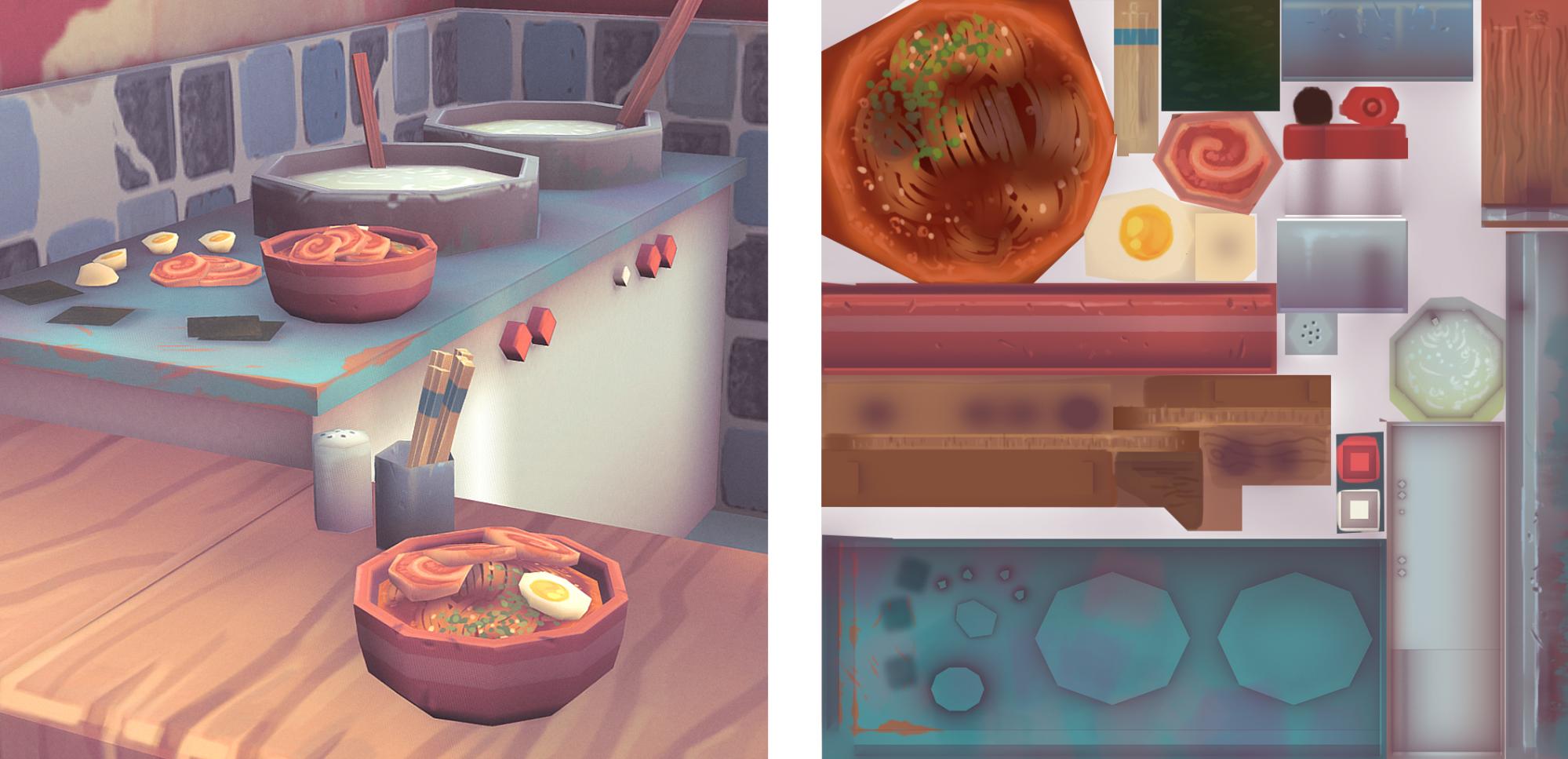
Here was another texture set done in the same way, for the small (barely viewable) indoor props. I wanted to keep these fairly low-poly, and since they were tiny I knew I didn’t have to go heavy on the textures here, but I also wanted to challenge myself and try to paint some food, which I hadn’t done yet.
This leads to a pretty important lesson of prop-making: pay attention to where the props are going to be seen. In my case, I had already uploaded my model to Sketchfab and decided on the final camera positioning and how people would be looking at the model. So even extremely early on, I had realised these indoor props were going to be barely seen, if not invisible, unless you rotated the camera around. This meant that I would dedicate a far smaller amount of poly and texture budget to this section of the model. In the case of a game, I would take the same approach, but with whatever the game camera/gameplay required.
Sketchfab
When uploading to Sketchfab I was quite aware that I wanted to utilize its tools to push the model a little bit further than where it was currently at. This meant fully using (and kinda abusing) the post-processing features.
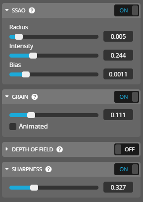
I knew I was going to push the film grain and sharpening effects a little bit further than normal to try and help me emulate a more 2D sort of look. Ghibli films have a good amount of texture and grain to their images and this was a nice way to emphasize that even further. Here were the post-processing settings I used to achieve the look I was after:
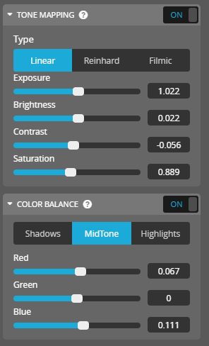
The colour correction settings I used were also far heavier than I would normally push them on a regular model. However, since this piece was more for fun, I let myself go nuts. Currently, I am obsessed with low contrast + pastel colour pieces of art, so I used the post-processing settings to push that as well.
Finally, I wanted a circle cutout window where you looked through to the model. I did a whole bunch of sneaky cheating to pull this off. From what I could tell, you could simply keep your model unlit and create the circle cutout as either a texture on a flat plane, or simply model it in. However I wanted lighting on my model, and I wanted this circular plane to be a single flat colour as though it was unlit. To get around this I gave the circular cutout plane a different material and made that material emissive (without using bloom) to help it stop picking up any shadow information in the scene. There’s probably a better way to pull this off, but hey! I got the effect I was after in the end.
Hopefully, there’s some useful information in there. Should you have any questions feel free to reach out to me either via email or via any of my social media links! Don’t be shy!

