Introduction
My name is Robin Lingmerth, I’m currently a student enrolled in the 3D art program at Futuregames in Stockholm, Sweden.
I started out doing 2D concept art/illustration, which has been very helpful when doing projects in 3D, as there is a lot of overlap.
After leaving art school I found a job working on a game called “Scrap Mechanic.” The team there helped me get started with 3D asset creation for games and I got a real taste for it. So when I later got the opportunity to attend Futuregames and really dive deep into 3D, I went for it.
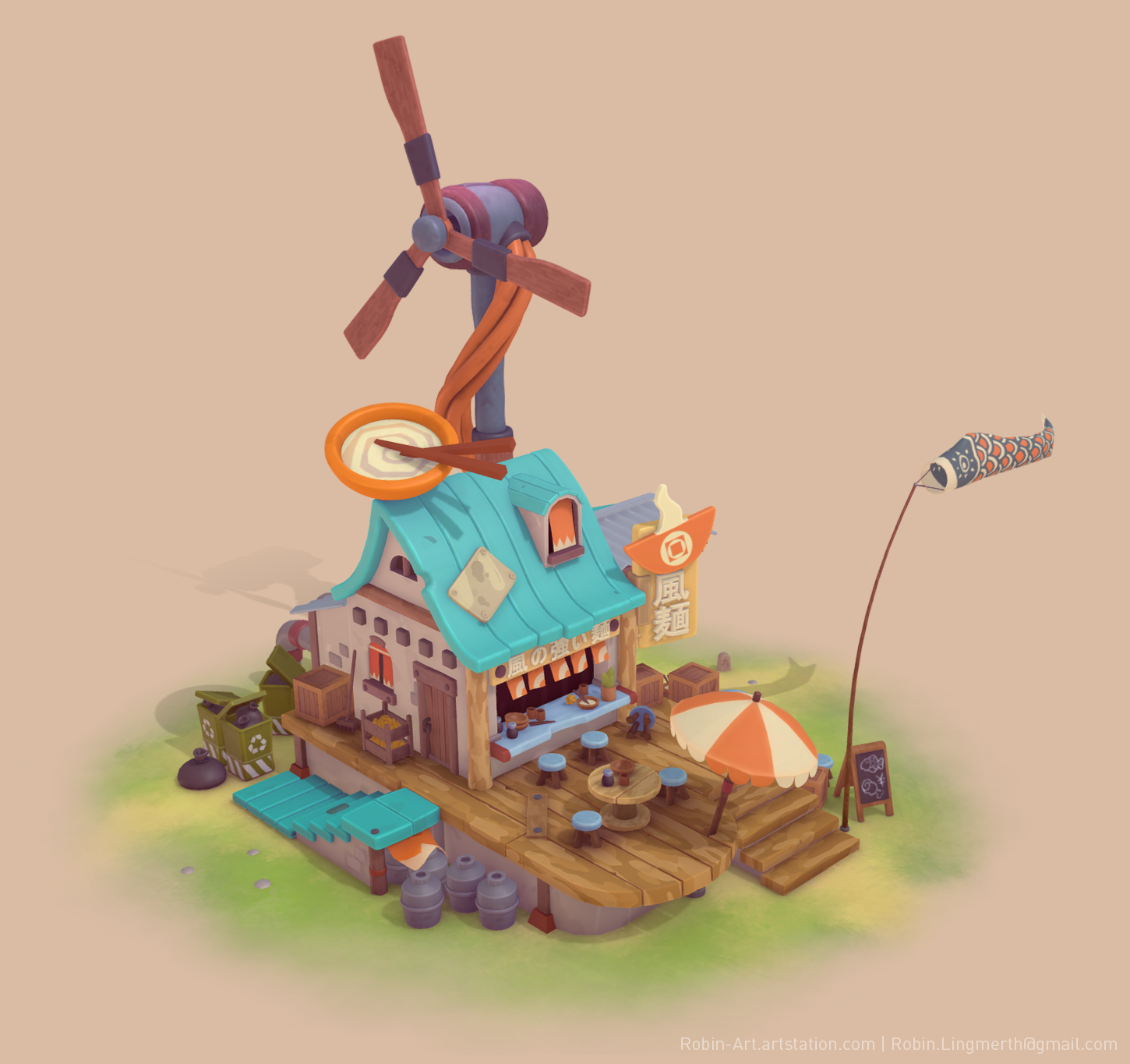
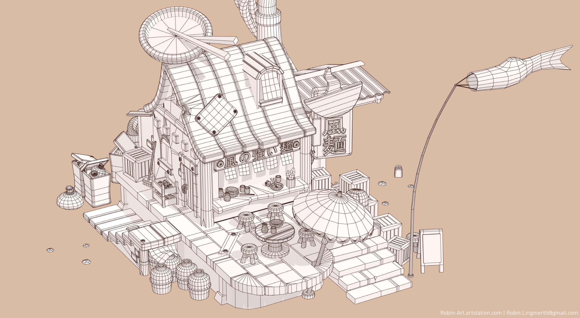
I’m going to give a breakdown of my “Noodle Bar” project, how it came to be and some of the things I’ve learned along the way. If you wish, you can check out the project on my ArtStation.
Brief
I wanted to create a project that would focus heavily on mood, composition, and color-use. It’s tricky because these are pretty ambiguous concepts, but I feel that these are some of my greatest strengths as an artist and I wanted to showcase that as part of my portfolio.
To make sure I could show the composition within 3D space I also knew I wanted the final project to be uploaded to Sketchfab.
Getting Started
ArtStation and Pinterest were really valuable sources for inspiration and gathering ideas and they are usually a great starting point.
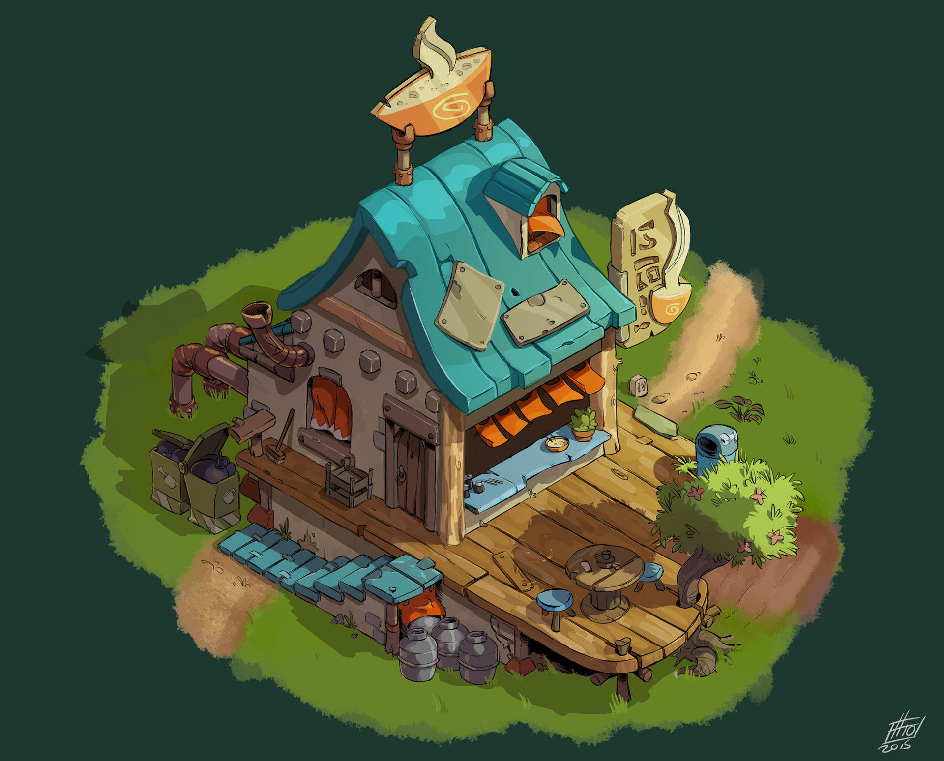
After looking through a lot of images, I felt particularly drawn to Emanuele Arnaldi’s concept of a restaurant with a lot of charm. The colorful cyan roof and quirky playfulness of the design really appealed to me.
Spending some time to reflect on why you feel drawn to certain pieces isn’t necessarily as easy as it sounds but it really pays off. In my case, the use of a warm color palette with use of strong accent colors like cyan and orange really made the piece pop and feel inviting.
The sloppy repairs, the chunky and slightly wonky shape-language, and the practical elements such as the trash bags by the back door really gave the scene a sense of story and a lived-in feel.
Expanding the Composition
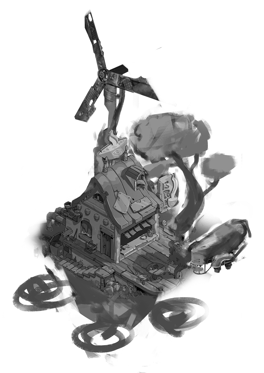
I wanted to add some more verticality to the initial concept and have objects expand outward in order to make the composition more interesting in 3D space.
So I did a very rough photo-bash/paintover in Photoshop. Some of the initial ideas I played with were to add a wind turbine, expand the verticality of the tree and to have the restaurant float around on rocks. I even added a flying car for good measure.
But as I started blocking this out in Maya, I realized I had strayed too far, so I trimmed some of the more outlandish additions. But I felt the wind turbine and the redesigned rooftop sign still fit within the world of the concept and added to the 3D-composition of the scene.
Modeling
Modeling is an iterative process and while Maya is a relatively destructive modeling application, plugins and scripts can help bring some more non-destructive functionality to Maya and there are still plenty of ways to refine your models as you work on them.
One of those scripts is “Shellmod” by Creative Case. It basically recreates the solidify modifier you can find in Blender, allowing you to procedurally add thickness to any face. This was particularly helpful in constructing the roof, allowing me to alter the shape without distorting the even thickness of it.
I also found that working with a reductive workflow worked well for me in this project; if I’m working with something that’s going to have a smooth/curvy shape, I prefer to make a high poly subdiv model and then reduce the poly loops. This helps me have clean surface curvature and evenly spaced edges. It also allows me to better see how little geometry I could get away with before it feels too noticeable.
The smaller props require fairly simple and straightforward modeling techniques. I started with basic geometric shapes and used extrude and bevel to get the shapes I needed. The small props are individually simple but added together they create a sense of detail and support the grounded lived-in feel of the scene.
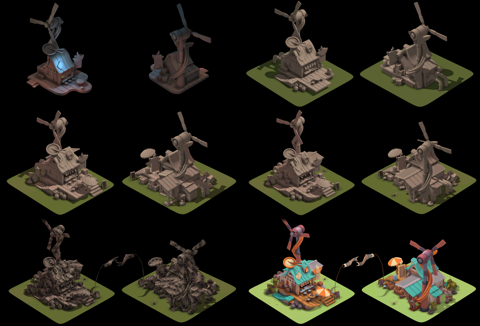
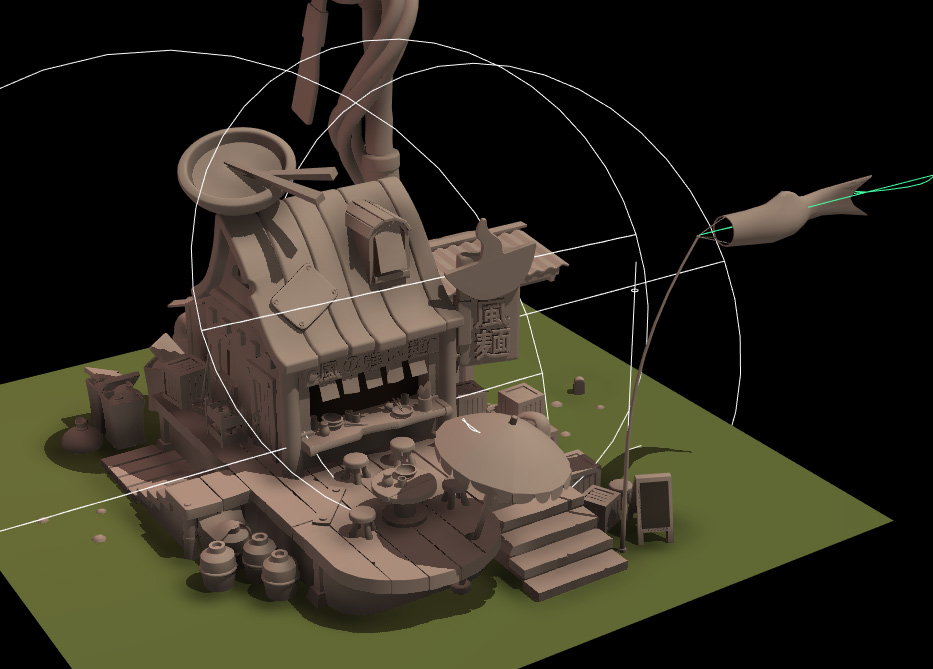
When working on a scene in Maya, it can be useful to create a simple lighting setup, just a couple of colored lights to help see how the shadows interact with the geometry. This approach also has the added benefit of giving you a nice looking progress gif at the end. Just bookmark a couple of camera angles and take screenshots of your progress.
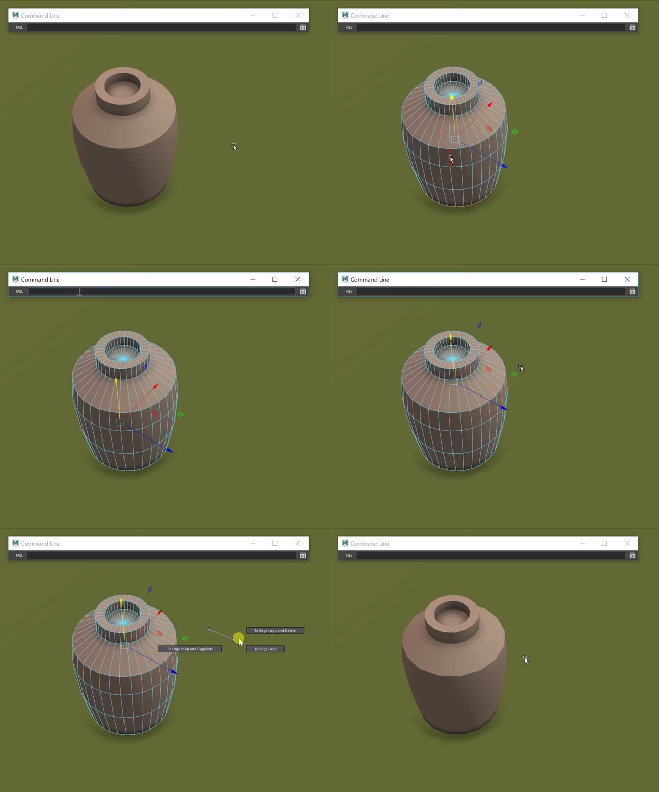
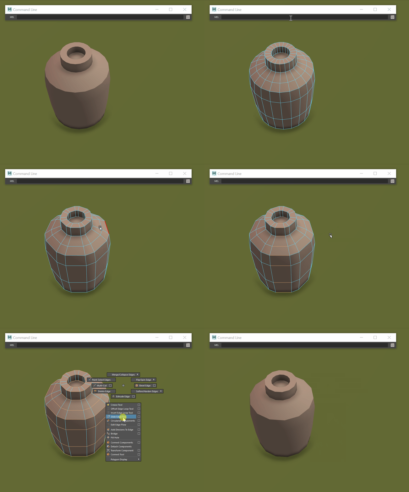
I often found myself wanting to reduce the polycount on circular objects as it can be hard to know in advance how many faces are appropriate. So I developed a technique that works for me:
Using a simple MEL script (polySelectEdgesEveryN “edgeRing” 2;) you can select every X-number of edges, every two edges, in this example. You can then use the Maya marking menu to automatically extend the selection to edge loops and delete.
Sometimes removing half the edge loops gives you the desired results, but other times you want something in between. You can use the same script to select every third or fourth edge, and after going through the same steps as before, you will end up with an uneven distribution of the edges. But this can be resolved by selecting all the edge loops and using the circularize command.
If you’re lucky, this will give you perfect results, but sometimes you need to rotate some of the edge loops to align them properly.
Animations
Because the scene has a stylized/illustrated look I wanted the animations to also reflect that. So rather than having everything properly simulated, I animated all the cloth in the scene with Maya’s non-linear wave and sine deformers, which also made it a lot easier to loop the animations.
For the umbrella, I painted the weights of the deformer influence and I painted out areas where the umbrella would have internal supports holding the fabric in place.
To preserve the ambiance of the scene, I made sure that the animations were subtle enough not to be distracting. I also made sure to take great care where I placed the animated elements.
Alembic Caching
I wanted the scene to be uploaded to Sketchfab, so I had to make sure that the animations would play correctly. It turned out that exporting deformer animations wasn’t as easy as I had initially thought. I had to do some research and I eventually found the answer in Alembic Caching.
The Alembic file format (.abc) allows you to essentially export vertices’ positions in space over time. Sketchfab supports this file format but you can only have one texture set per object, something I needed to take into account while texturing.
During early tests, I had a problem with normals not being preserved when uploaded to Sketchfab. The workaround I found for this was to open my files in Blender and export the Alembic files from there.
UV Mapping
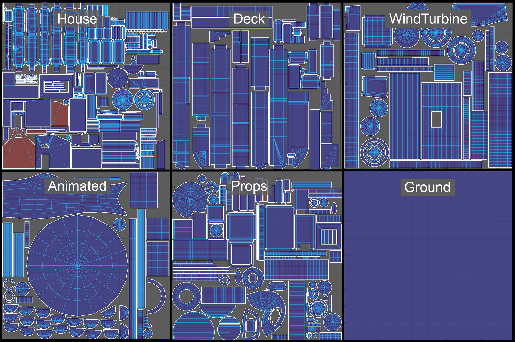
I wanted to make efficient use of texture space, so I took great care to overlap UVs as much as possible and I made sure that all repeated objects shared the same UV space.
Wherever possible I would also lay out the UVs in a grid, so most curved objects would end up having straight UVs. This helped a lot later in the texturing process and allowed me to save on UV space. Malcolm Andrieshyn’s “gridify script” really helped out throughout my texturing process and has turned out to be a valuable addition to my toolkit.
The final UV layout was mostly placed by hand since I wanted UV islands that belonged to the same objects placed next to each other. And since I knew I was going to work with a lot of wood textures, I also made sure that all UV islands were aligned in the same direction, so that the wood grain direction would be consistent.
Texturing
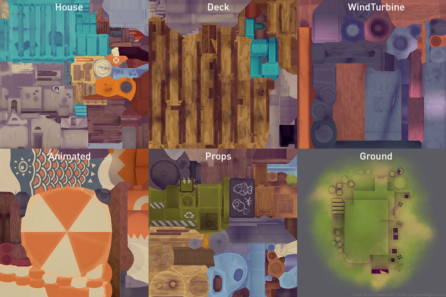
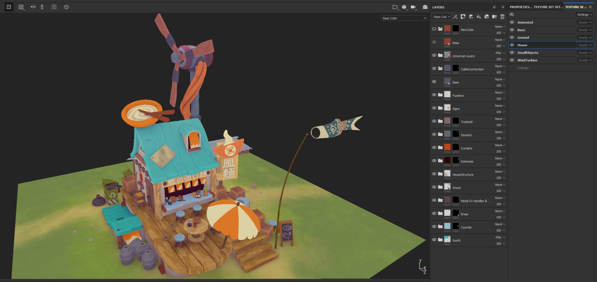
I did all the texturing for this project in Substance Painter and Substance Designer. I divided up the scene into 6 materials; House, Deck, Wind Turbine, Props, Ground and the Animated Elements.
My first step in texturing was to create a simple procedural material in Substance Designer to emulate the look of the brushstrokes used for the stylized wood look in the concept.
This ended up being a very simple material setup with only a couple of nodes, but is saved me a ton of time compared to having to make all these brushstrokes by hand in Substance Painter.
I was only focused on creating the albedo/base color and normal textures in Substance Painter since I knew I wanted to use Sketchfab to control the roughness and metallic properties.
I hand-painted the fish kite (Koinobori) and the ground texture, but the rest of the texturing process was fairly straightforward. My teacher taught me a very useful texture principle: you should strive towards being able to read the form of an object as much as possible without the help of any lighting.
One of the biggest contributions to the feel of the scene is actually having a purple-tinted ambient occlusion texture; it really helps bring all the colors together and gives it a much warmer feel compared to just having a black AO map.
When I uploaded my model to Sketchfab using the Alembic file format, the second UV channels wouldn’t be preserved, which meant that I couldn’t have a second UV channel without the overlapping elements, and Sketchfab doesn’t support having colored AO textures anyways.
My solution was to bake the AO into the albedo texture, allowing me to preserve the color information. The downside was that I had to work around the overlapping UVs. With some strategic masking, I could prevent any areas where the AO would look off, and I knew I could use Sketchfab’s screen space AO to make up for areas where too much of the AO had to be masked out.
Lighting and Setup
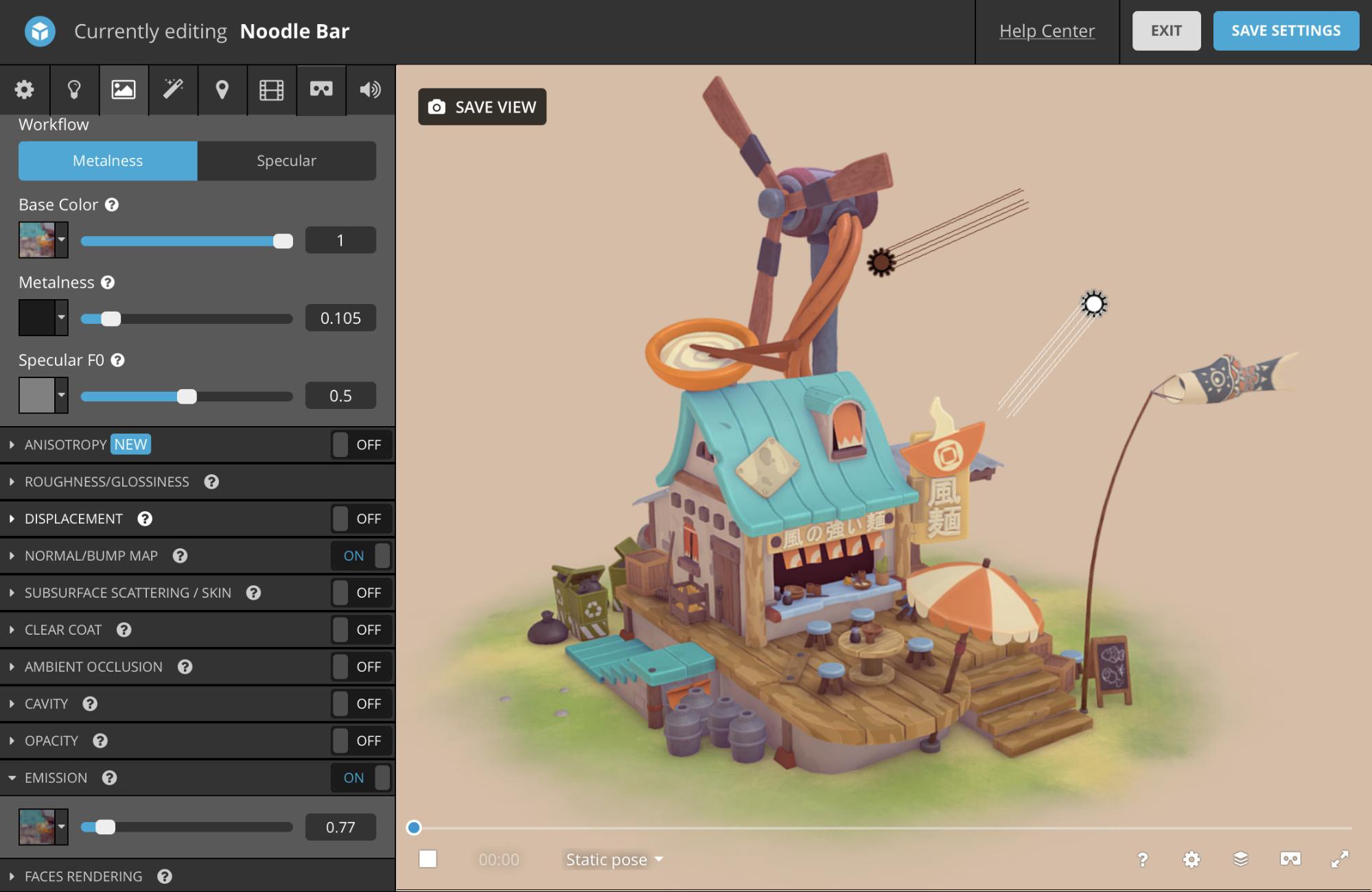
I did the final lighting and material setup in the Sketchfab editor.
The lighting setup is pretty straightforward with a single directional light matching the light direction from the concept and a fill light from the opposite direction to give the shadows some more warmth. I then also re-used my albedo textures as emissive textures, toning down the intensity to the desired level, which gave the appearance of fill/ambient light, but with a more illustrative look.
I took some time to hone in on the roughness and metallic values. This was just a trial-and-error approach, constantly evaluating the materials in relation to each other, even using some half-metallic values.
As final touches, I added a bit of sharpness and screen space AO in the post-processing.
Afterword
This has been my biggest personal project so far and it’s been an amazing culmination of all the things I’ve learned over the years. I was so happy to see it all come together as well as it did in the end. I really feel like my previous experience in illustration helped guide me to the final result.
When you work on a project for some time it can be really hard to step outside yourself and know if it actually still looks good, but I’m really grateful and overwhelmed by the positive response I’ve received for this project so far (especially here in the Sketchfab community), and it’s given me a lot more confidence in my own judgment.
Thank you so much for reading.
-Robin Lingmerth

