Hi, my name is Yaroslav. I’m 28 years old, I’m from Minsk (Belarus).
Until last year I had no experience in 3D. Last year I had enough free time to think about:
“I’ve always wanted to figure it out,” and “Why not?”.
I decided to take a course in 3D modeling. I wanted to understand how 3D models are made and be able to do everything by myself.
I decided to choose an uncomplicated model to go through the entire pipeline and assess my capabilities and speed.
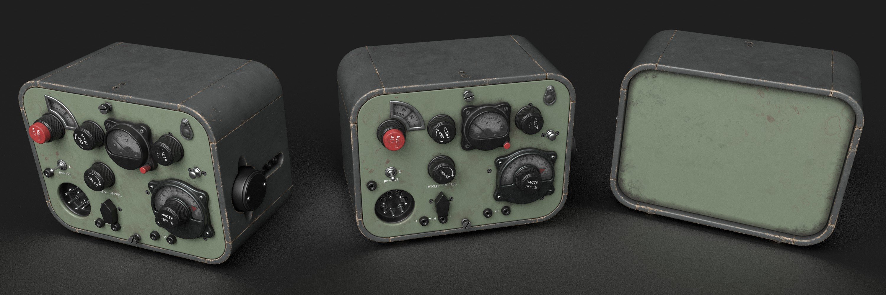
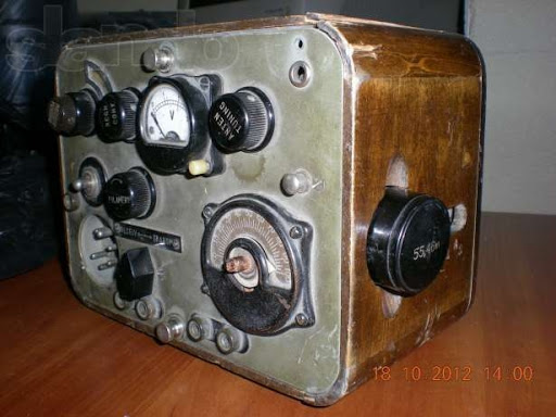
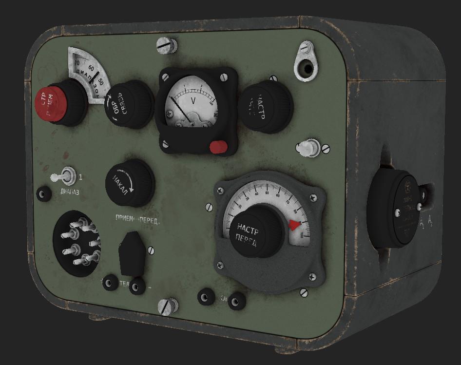
This Soviet radio is my first full pipeline, game-ready model, done at the end of the course.
The software that I used:
- Blender – modeling
- Marmoset – baking
- Photoshop – texture map correction
- Substance Painter – texturing
My pipeline consisted of several steps:
- Collecting references
- Blockout
- High-poly
- Low-poly
- UV mapping
- Bake
- Texturing
References
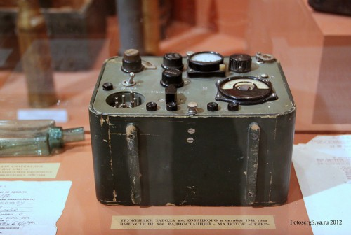
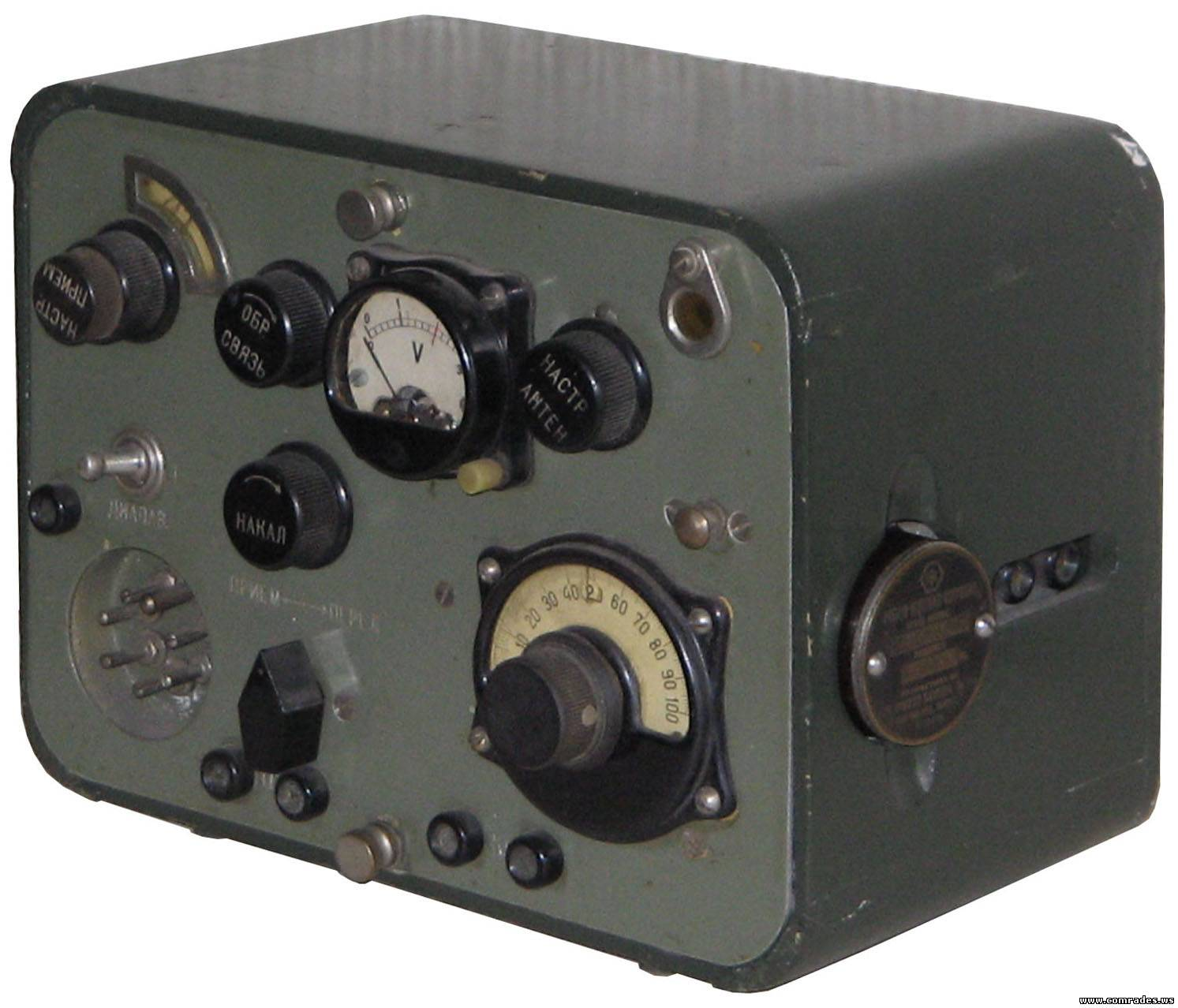
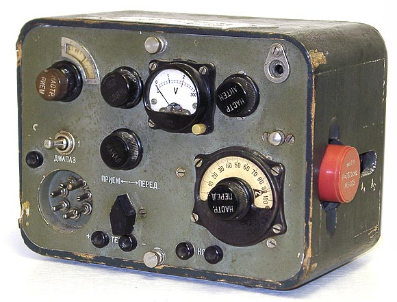
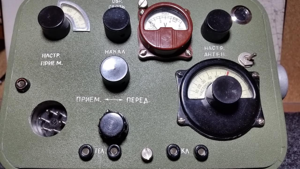
When I collected the references, I understood that the model is simple, but I wanted to make it expressive and “tasty”.
I realized that there are different versions of this radio model, so I wanted to make a mix of the most interesting options.
Draft
During the evening, I sketched out the proportions and color options. As I created the draft, I noted some interesting details that needed special attention.
In the process, I thought about what the final model would look like.
High-poly
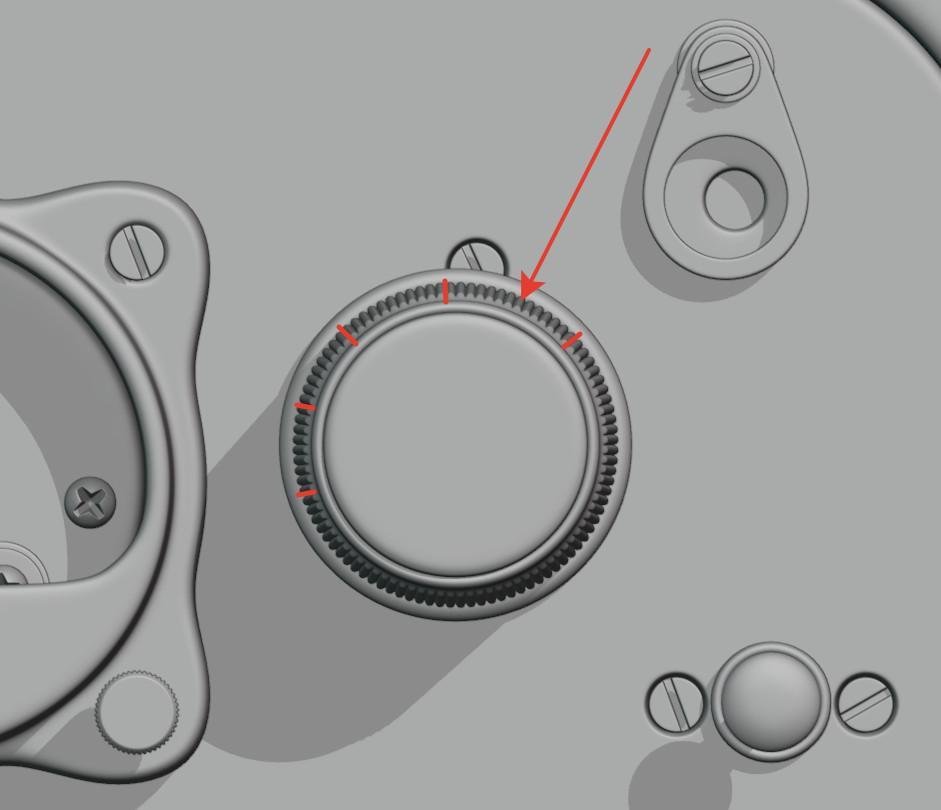
At this step, it was important to work out the details as much as possible. I neglected realistic details to achieve better expressiveness. Almost all of the elements are made with subdivision modeling.
I scaled some details and made them NOT parallel. This is how I made the model more engaging.
In the end, such exaggerated things won’t be too noticeable, but they will look good.
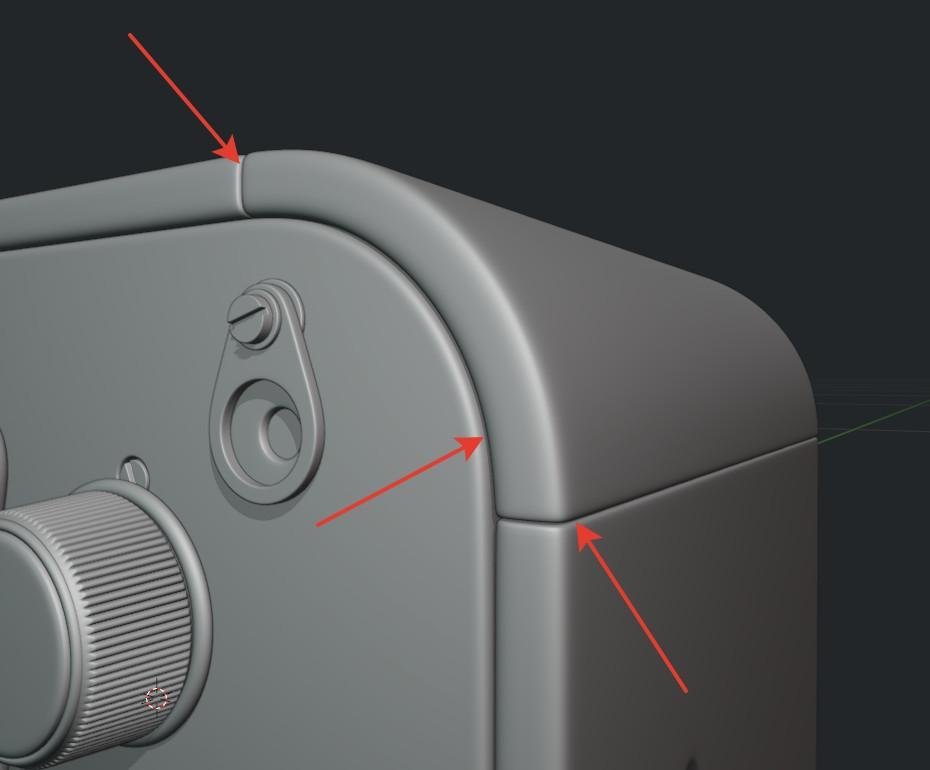
I also made the gaps between the different parts of the case more exaggerated. In reality, they should be very dense or should be absent.
It was necessary that they were well visible on the model and well baked into the normal map.
Low-poly
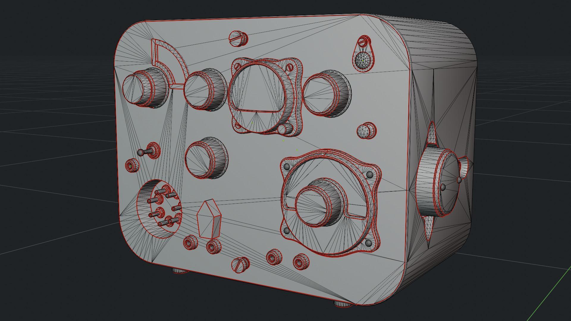
I didn’t skimp on the triangles at this stage. I wanted to avoid rough shapes when looking at the model in close-up.
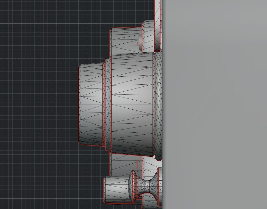
In the silhouette areas, I added a bevel. On the radio case, I made a bevel of two faces so that the baked normal map of the gaps between the case parts wouldn’t look sharp.
I set the number of faces on the bevels on the case high enough to prevent the model from looking clumsy. I did the same with all the smaller parts.
At the same time, in places where the silhouette is not visible, I did not create any chamfers; a normal map would be enough.
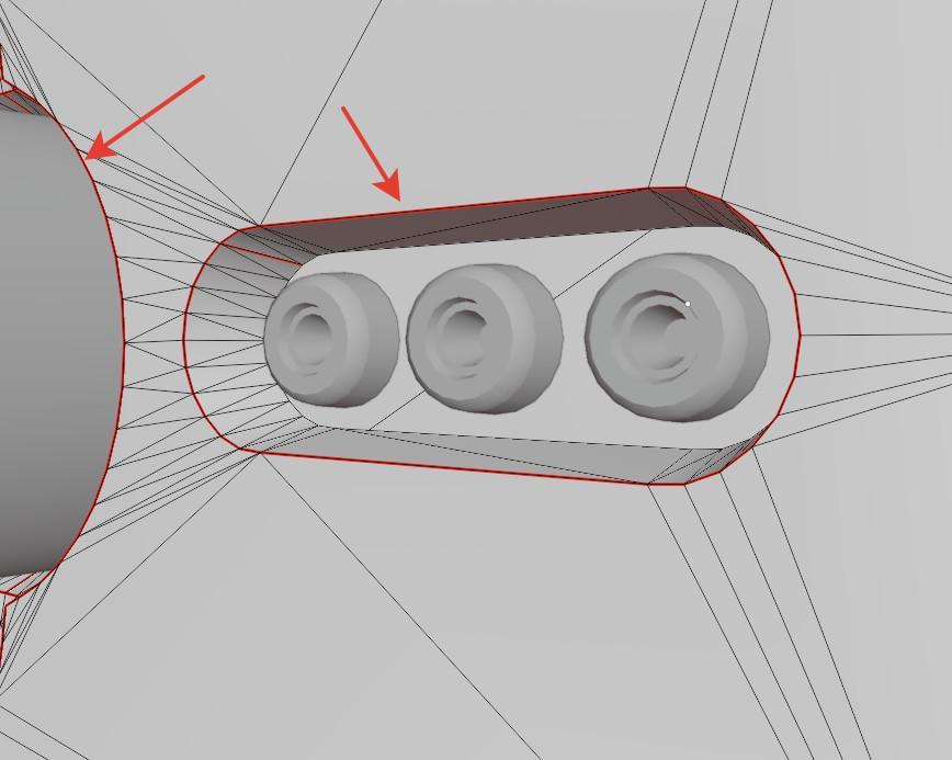
There is an interesting place where you can see “extra” vertexes forming “extra” triangles.
Initially, those vertices did not exist, but at the UV mapping stage, I could not unwrap these areas because of the holes within them.
The problem was solved only by creating new vertexes, slightly changing the mesh of the model.
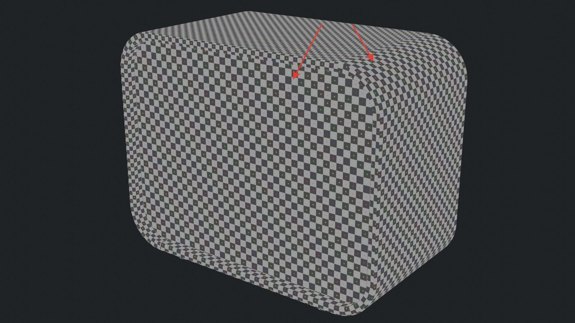
UV-mapping
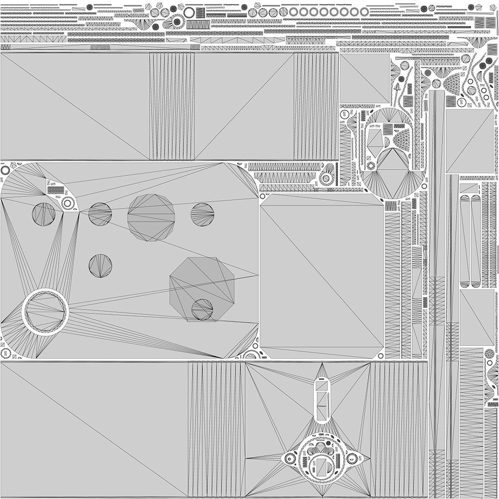
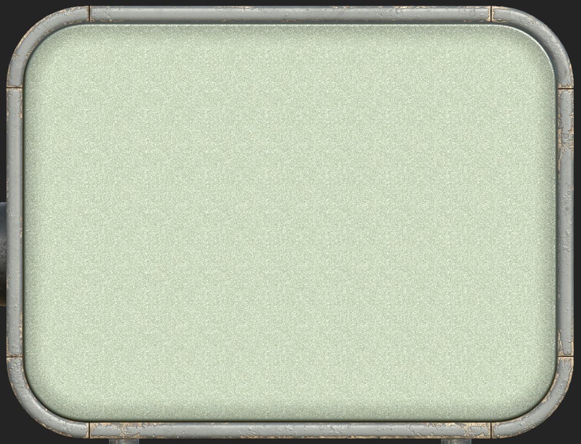
Overall, there’s nothing interesting here. I decided to split the model into two UV sets: glass and everything else.
The texel density is about the same everywhere. The texels on the back, bottom, and sides of the model are slightly less dense because these places don’t attract a lot of attention.
Bake
Baking was a difficult step for me because I knew I would have to work with Photoshop to correct the normal map and ambient occlusion or go back to the previous steps to change the geometry if Photoshop didn’t help me.
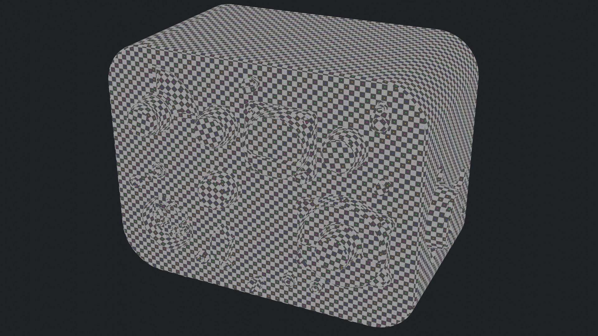
Here’s the model with the applied normal map and ambient occlusion:
The additional frames that I baked: Color ID, Curvature, Position, World space normal. I had no problems with them and I almost did not spend time on them.
Texturing
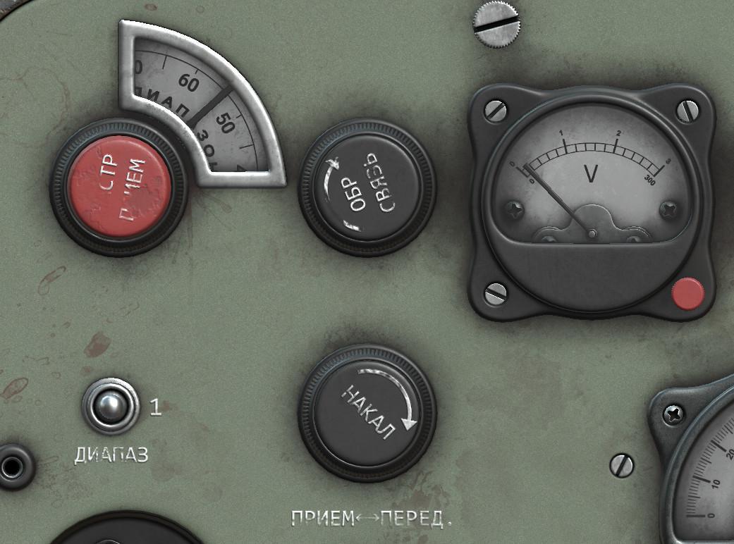
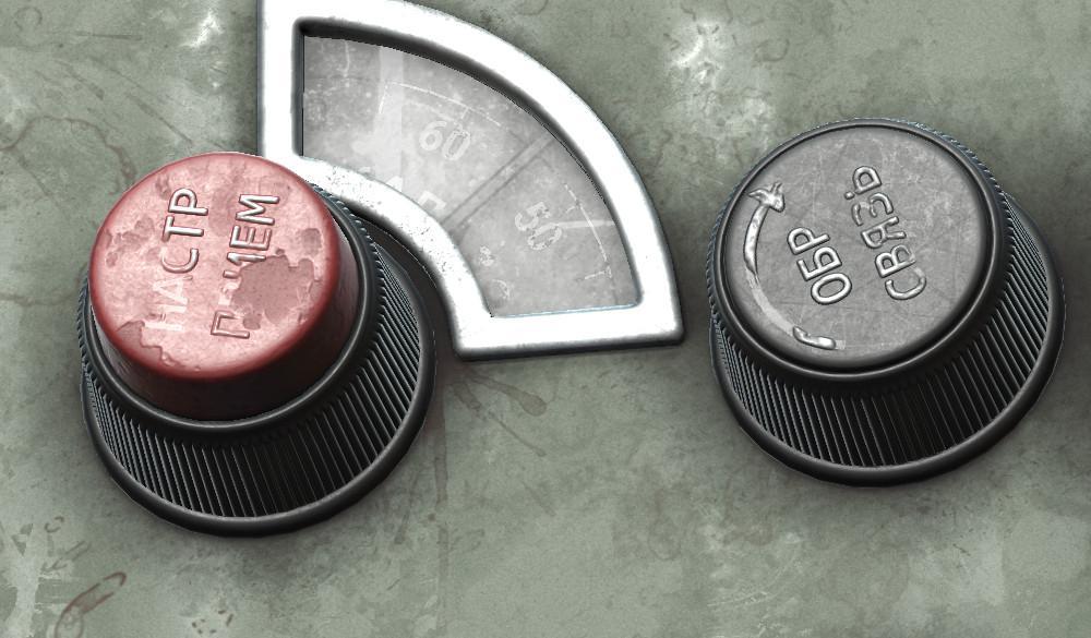
This step was one of the most interesting for me, and I spent a lot of time on it because at the same time I was getting to know the capabilities of Substance Painter. With this model, I wanted to focus on the textures because the model is quite simple. I planned to make the radio station slightly aged and time-tested.
When I colored the model, I relied on references and a little improvisation. The main colors here are the colors of the case, made in gray and green tones. I didn’t have to think about the color of the plastic and metal elements.
I wanted to make the dial color yellowish, but I decided to do it white, which would add a little freshness. Finally, I wanted to add some accent colors and I painted some parts in red.
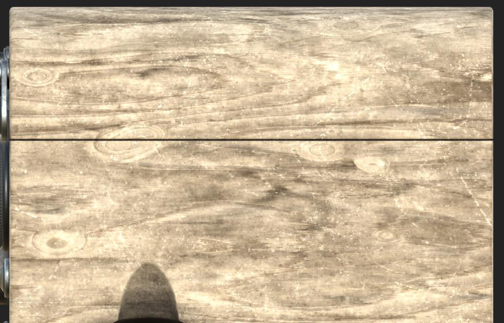
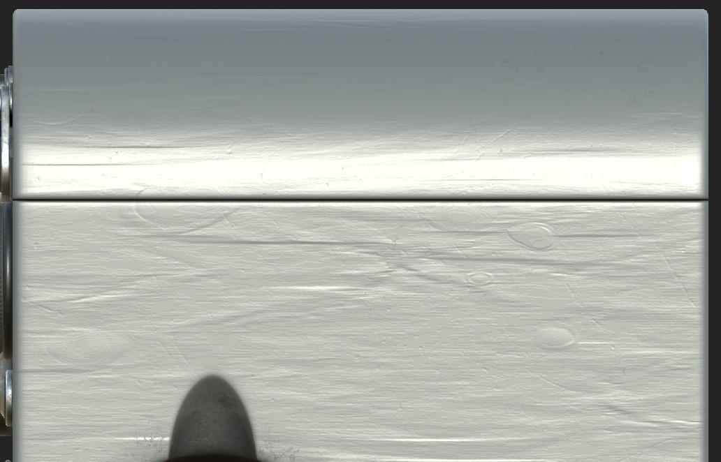
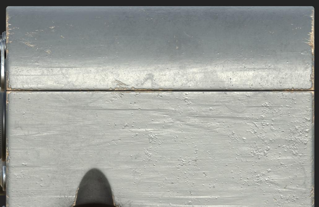
I really wanted to make the case out of painted wood, but it didn’t work right away.
To create the wood covered in paint, I used a wood material from the standard Substance materials. From that material, I used only texture, relief, and color.
Then I applied a layer of clear color for the paint that I would add and applied a couple of grunge textures to give the effect of scuffs and minor soiling. In some places I made the paint bubble by applying the texture and giving it relief with the height channel.
And finally, through modifiers and the Curvature map, I stripped the paint on the curves and left only the wood.
The process of creating the smudged and dirty radio case metal material consisted of mixing different grunge textures and applying dirt stains, both with generators and by hand.
I thought about how the model would reflect in the light. To vary the texture, I made not only stains and dirt in different shades but also different roughnesses in the same color.
The process of creating the plastic, metal, and glass is similar; it differs only in different textures in the form of scratches, stains, and dirt.
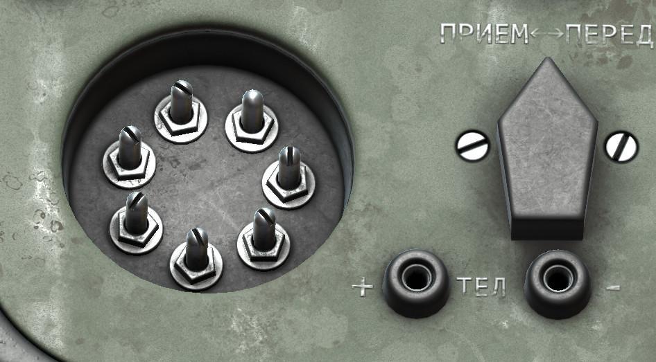
The text and dials were made in Photoshop and loaded into Substance as alphas for the brushes.
I wanted to create a scuffed text effect, with not enough scratches and dirt in place yet. For that, I had to create an additional layer with the text and subtract from it the percent of information with dirt and scratches.
I made an imitation of the holes in the connector plugs. I applied dirt and painted it black with maximum metallic and roughness values.
In the end, I tried to pay attention to each detail to make it better and more interesting.
Sketchfab
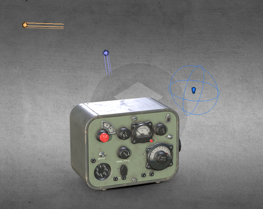
After loading the model on Sketchfab I threw in textures and set up 3 light sources so the model would be illuminated from all sides. I set the field of view to 20. The post-processing effects that I used were sharpness and vignette.
This model was a kind of practice and I’m sure there are still a lot of things that could be improved.
There is a lot to work on!
Check out my ArtStation and Instagram. ?
Bye, everyone!
