About
My name is Jeremy Baker and I am an Assistant Professor in Animation at the Columbus College of Art and Design. I teach a variety of classes at all levels including 2D and Experimental animation, 3D Fundamentals, Character Animation and Simulation, and others. I’ve been teaching for 7 years now, 4 full time at CCAD. I teach mostly out of Maya, ZBrush, the Allegorithmic Suite and use UE4 for our rendering.
I am located in Columbus, OH and have been living here since 2003. Originally I am from North Kingsville, which is small town of about 3,000 in NE Ohio.
I spent about 9 years in total at The Ohio State University (I realize “The” sounds ridiculous but have been conditioned to use it) for my degree work. It took me a long time to figure out what I wanted to do and spent the first couple of years dabbling in biology, physics and the idea of becoming a high school science teacher, but was doing really poorly in my classes.
I switched my major to Art and Technology after my second year at Ohio State and my family was incredibly supportive. It was an interesting hybrid major where I learned digital art in Photoshop and Premiere, 3D in Cinema 4D, robotics with programming and basic stamps, sculpture with clay, wire, and found objects, as well as the other traditional mediums. I was loving it and doing really well but really fell in love with 3D.
I graduated having only taken a single 3D production course and knew I needed more training, so after taking a year off and living at home I went back to Ohio State for graduate school where I focused on Digital Animation and Interactive Media.
After graduating for a second time with an MFA in 2012, I started teaching part time at CCAD in downtown Columbus as well as freelancing; I worked on Augmented Reality for retail, built an interactive chemistry game for kids, an app for spine research, a mobile consumer level projection mapping solution and on and on and on. Finally in 2015 a full time position opened up in the Animation Department at CCAD and I have been teaching there since!
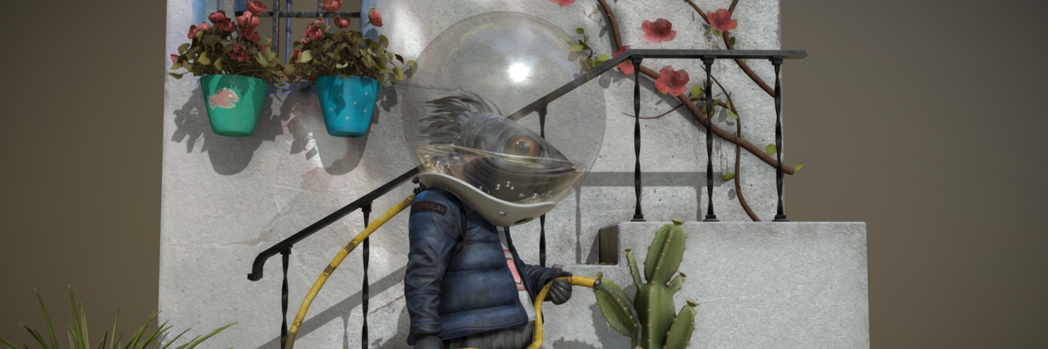
First off and foremost a big thank you to Nacho Yague for the incredible art that he produces. His art has inspired so many artists to create and his is the reference artwork that I modeled from in this project.
This past year my 3D production had started to drag outside of class work and preparation. I was feeling anxious and struggling with not creating and needed something to get me back on track. My Chair and Head of the Animation Department Charlotte Belland, is a creation machine and puts out new work daily. I met with her and discussed my situation and she made it real simple for me. Make what you love. Duh right?! Sometimes you just need a supportive outside voice to straighten you out. I love the outdoors and more specifically I love to fish. It is a bit of an obsession if I’m being honest and the concept art created by Nacho Yague fit that theme in both content and mood.
Modeling
Let me start off by saying that I am a bit of a hack and slash 3D artist. I think it’s a combination of my impatience and my love for problem solving. So I traditionally find or make a concept that speaks to me in a meaningful way, then dive in and figure out how the heck I’m going to make it.
For this project I started in Maya. I do most of my work in Maya, actually. My students raz me constantly about ZBrush and how amazing it is (as if I am unaware!). I play along and push the opposite way though I fully understand and utilize what ZBrush does best. When it comes down to it I’m just faster in Maya…and stubborn.
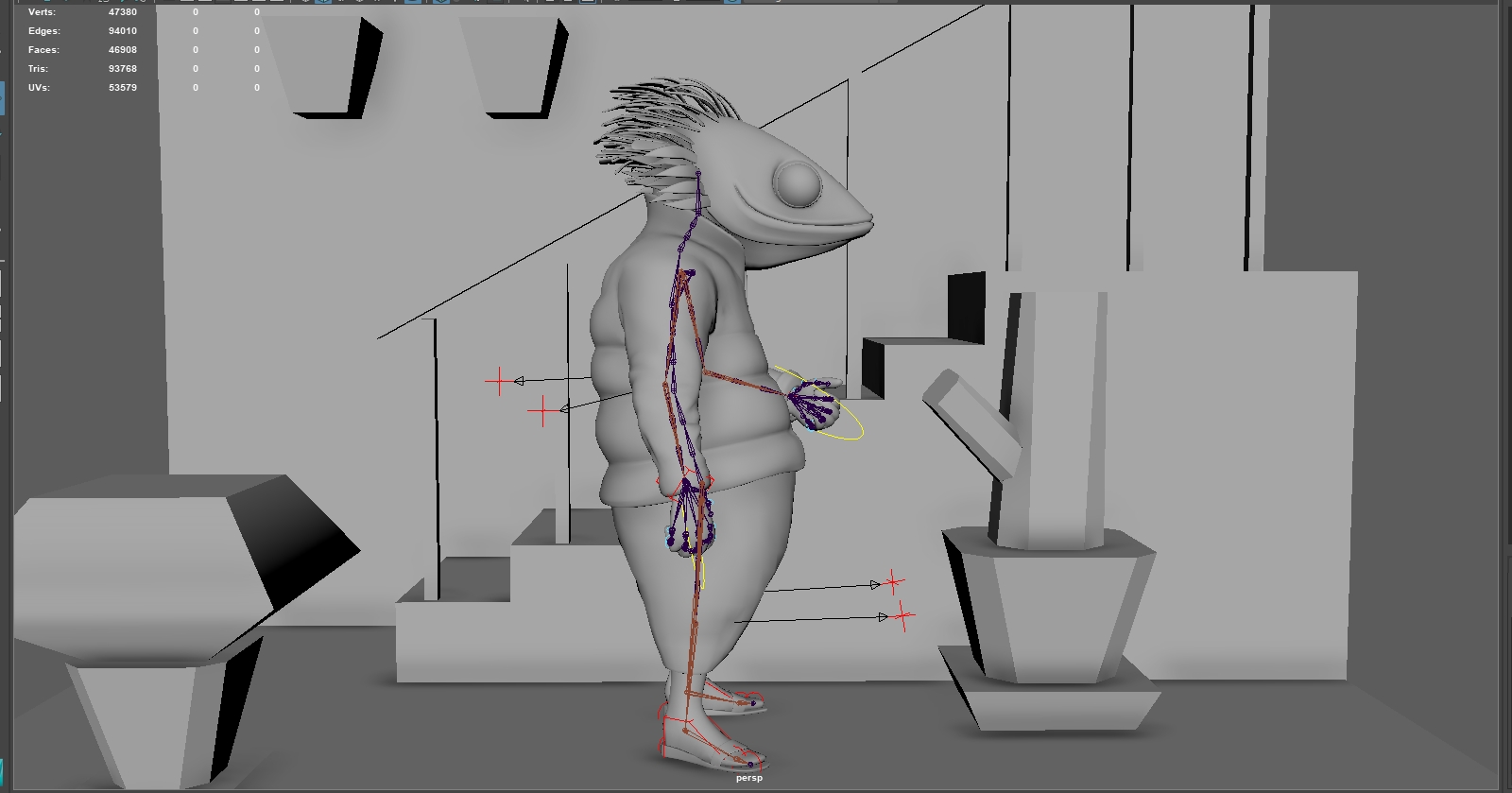
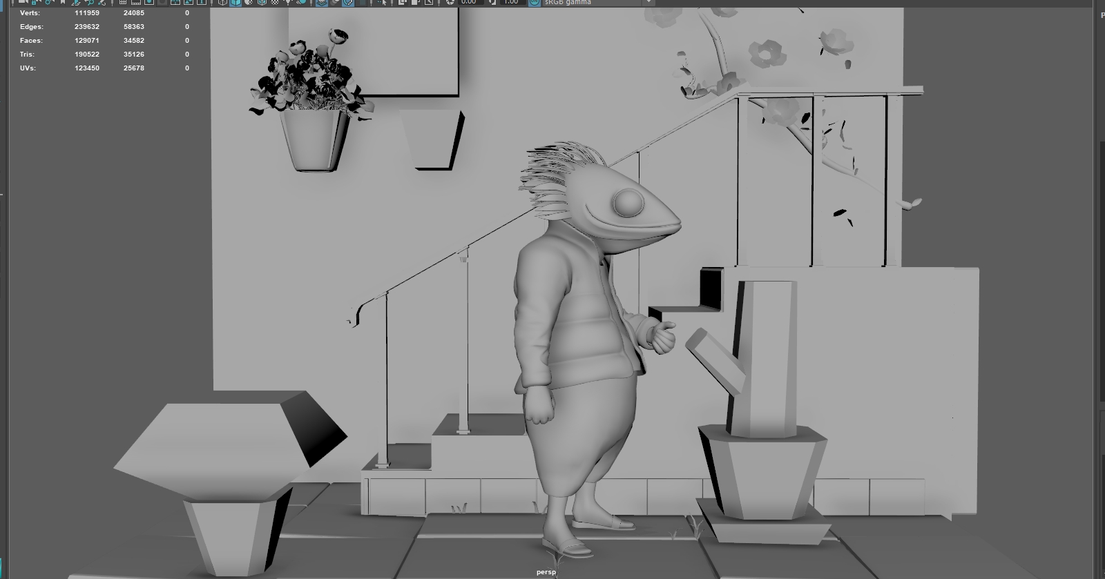
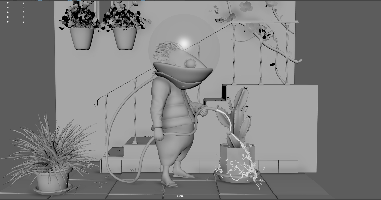
First always comes the blocking pass with basic geometry. Scale and composition were most important as I was creating a miniature set piece. This process also helps me diagnose areas that could be a problem and start to form a plan on how to approach the model.
In this case I went with character first because he was the focal point. The first pass for me is always pretty sloppy. I knew at some point I’d have to retopo anyway and since this character has clothing, all I would really need was a base with accurate volume.
From there I can use the quad draw tool to build the clothing on top of that shape. I like working this way early as it gives me a lot of control over edge flow and overall topology.
I work with the head in a similar way. First with basic volumes, quick and dirty. Then I move on to quad draw, building important facial features first and filling in the gaps.
I then block out the hands, feet, helmet and other accessories. If I’m happy with the overall shape I export over to ZBrush for detailing. Because of the way that I work, often I will create UV’s at this stage as well. I’ve built in the topology I need and am fairly confident I won’t be retopoing again, but I can always lay the UV’s out later if needed or use ZBrush and have it use existing UV’s when calculating.
One of my major goals with this project was to experiment and push myself outside of my comfort zone. I wanted to try and create something that felt a little hand painted and constructed, like a real world miniature or painting. Knowing I was going to rely heavily on Substance Painter to create that type of texture detail, I didn’t spend a lot of time in ZBrush for this character. Just some quick wrinkles, folds and jacket puffiness.
From here I exported out High and Low poly models of each of my subtools so I could bake them later on. Before I got into Substance Painter though, I needed to pose my character and create my set pieces. I won’t show much of my environment process as it’s pretty simple and straightforward. I do, however, want to show a quick trick I use all the time when modeling repeating objects like wood paneling or, in this case, tiles. Because programs like Maya create such clean and neat geometry, it is often necessary to go in and create the imperfections by hand to break up the consistent patterning. It could be adjusting scale, rotation, translation or slightly deforming one tile at a time. These can all be pretty time consuming tasks and in such cases I almost always go to a Texture Deformer in Maya.
First I created a single tile and laid out it’s UV’s. Texture deformers use image files and proper UV’s are necessary to get a predictable result. Also, it saves time when making repeated objects as I really only have to do UV’s once and they get duplicated with the object.
Next I duplicate and distribute as needed.
Then I lay out the UV’s for all tiles so that none are overlapping. I want each tile to get a unique deformation from the texture.
I then select all of the tiles and add a Texture Deformer under the deformers tab on top. I usually use the cloth preset but really you could use anything you wanted here.
First results are pretty jarring. The strength is way to high in this case so I had to bump it down.
Below you can see the with and without Texture Deformer images. If you don’t like the default results, try tweaking the cloth settings in the deformer. When you are done, delete history to get rid of the deformer and keep the changes. You can always hand tweak afterward, if needed.
Last note. The number of polygons in the mesh you are deforming will affect the result. Too low and the mesh won’t have enough geometry to deform, too high and you will severely slow things down.
Rigging
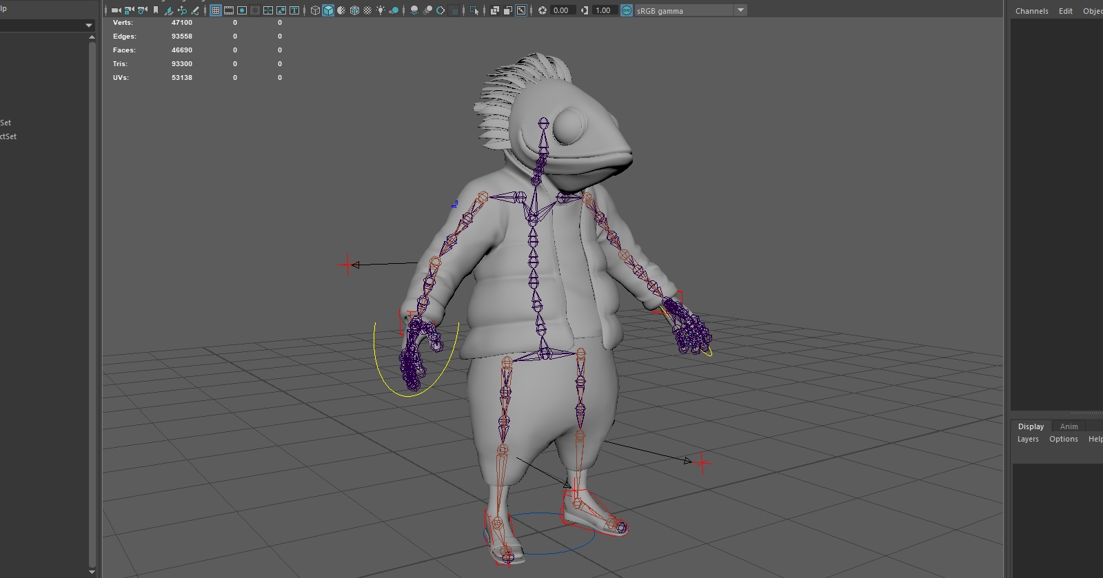
For posing my character, I usually use an autorigger of some sort with some quick weight painting to get my character into a workable place. For this project, I used Advanced Skeleton. I threw in a basic biped base and matched as close I could the initial pose in my blocked set.
I duplicated the character’s mesh and hid the skeleton in case I needed to change poses later. I then started to model the environment assets around the main character.
For the water, I used nParticles to create a quick simulation to get a more natural flow and interaction with the environment. I converted the particles to a mesh so I could texture them later on.
Texturing
After UV’ing all the remaining assets, I split them into a dozen or so texture sets before moving to Substance Painter. I usually don’t work with that many, but since this wasn’t meant to be optimized or used outside of a still render I wanted to get as high quality textures as I could. I exported as a single FBX and moved into Substance.
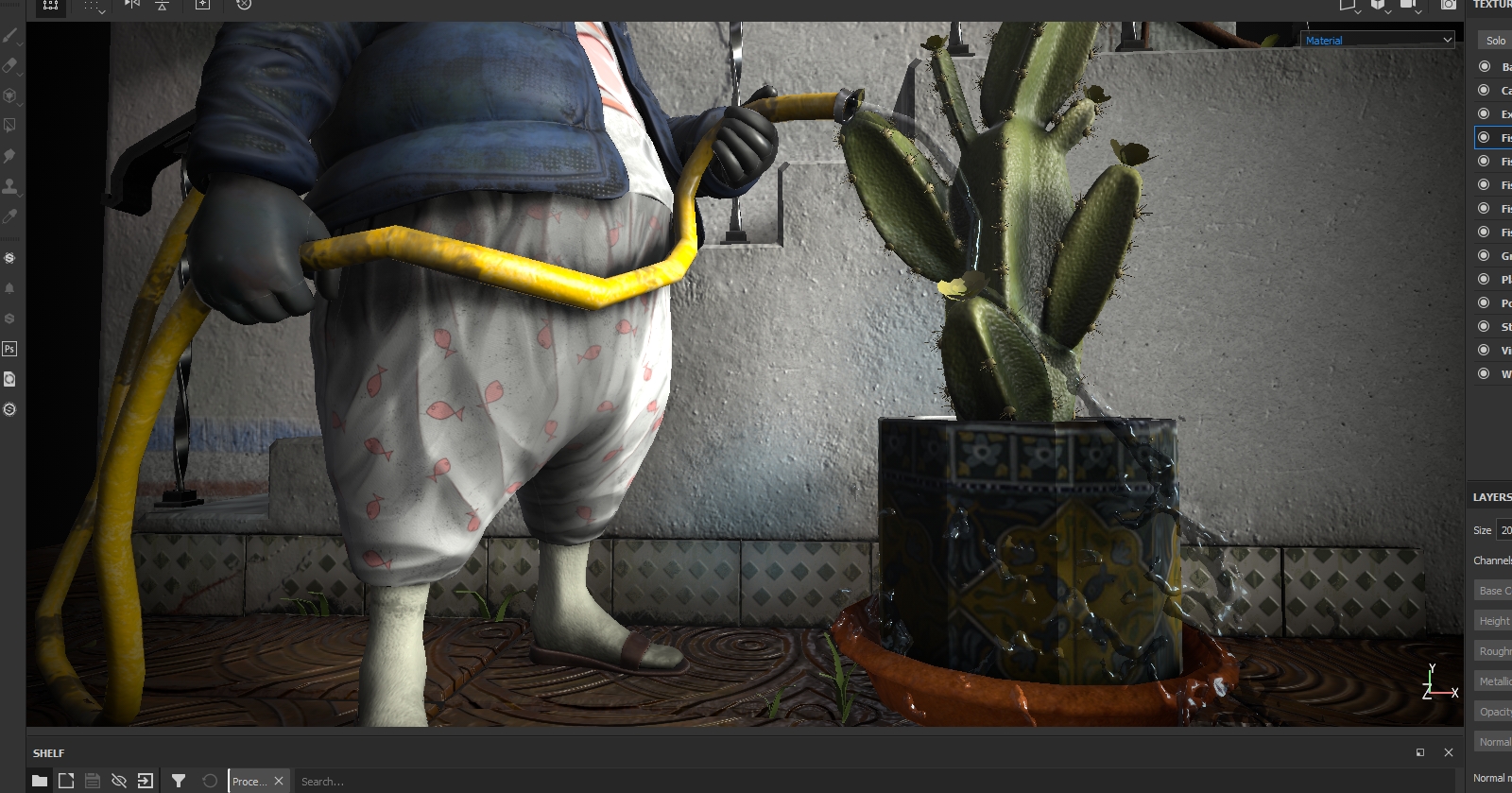
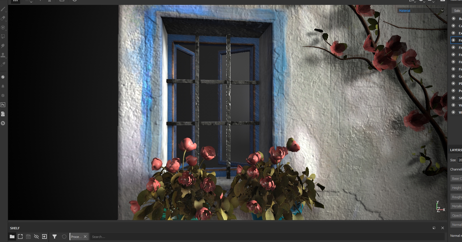
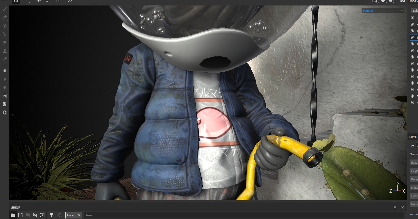
My first pass is almost always identifying material types and using basic materials to define them. Terracotta for the tiles, ceramic for the cactus pot, concrete for the wall, etc. I found it’s best not to get into smart materials too early especially when working with 14 texture sets. I think it’s also important not to use the smart materials as a crutch, as the default result is rarely the best and creating custom layer stacks allows for a bit more control. Also, because I didn’t sculpt hi res detail for my environment assets in ZBrush, I needed to do a height pass before I continued texturing. I used fill layers and painted masks using the alphas provided in Substance for creating detail on the concrete elements and used procedurals for patterning on the tiles. After finishing my height pass I exported out normal maps for all of my assets. I reimported them and mapped them to the appropriate normal slots in the texture set settings and baked the rest of the maps so I could utilize the height detail in my smart masks.
Through a process of custom fill layers, smart masks and painted detail and shadows, I was able to achieve a result somewhere in between realism and the hand painted style of the original concept art.
Uploading to Sketchfab
Getting everything into Sketchfab was a breeze. I simply used the Sketchfab export and all the heavy lifting was done in the background. I’ve actually started using it for most of my class critiques. The students love it and it makes critiquing and analyzing models straightforward and easy. For this model I used Environment Lighting and the Glazed Patio by Restaurant HDRI for my lighting. In post processing I used screen space reflections, SSAO and Vignette to help focus the viewer’s eye a little bit.
That’s it! Thanks for reading, if you’ve made it this far, and thanks to the talented Sketchfab community that provides so much of my inspiration!
