Sketchfab viewer settings
Field of view
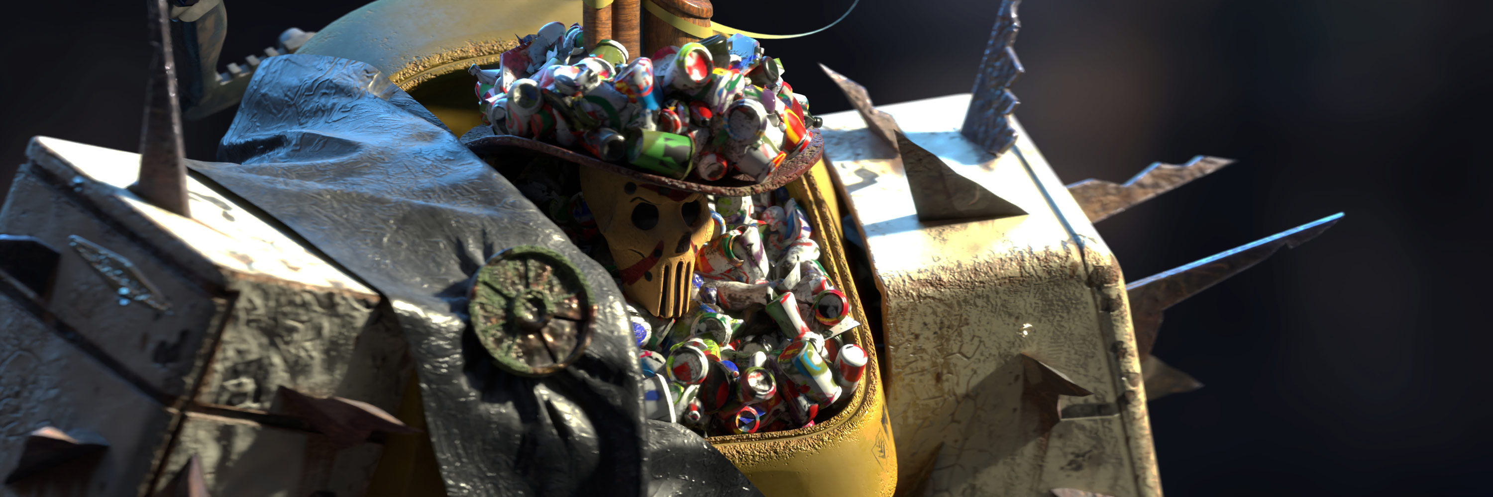
First, and probably the most important step was setting up the Field of View (FOV). You might ask: where’s the part about setting up the materials? The Sketchfab Viewer, fortunately, already took care of that, automatically assigning textures to the materials due to their naming—except the material on the ground plane, but more about that later. So that’s why the real first step, in this case, will be editing a Field of View. It’s a camera setting that defines the intensity of the perspective distortion. In my case, since it’s a character, a very narrow field of view is most suitable. It still allows for visible perspective distortion, but without making it too pronounced.
The FOV you choose all depends on the story. If the idea was to depict this model as a huge object, a single claw of which could grab the viewer, then I’d choose a wider FOV (illustrated above on the right).
Initial view
Naturally, after setting up the camera lens, it was a good moment to set up the initial view for the camera. The Rule of Thirds grid is a nice guide, but don’t get hung up on it for too long as I did. After setting the camera up, I recommend saving the project and looking at the preview on your model page, where a small preview will be visible.
Background
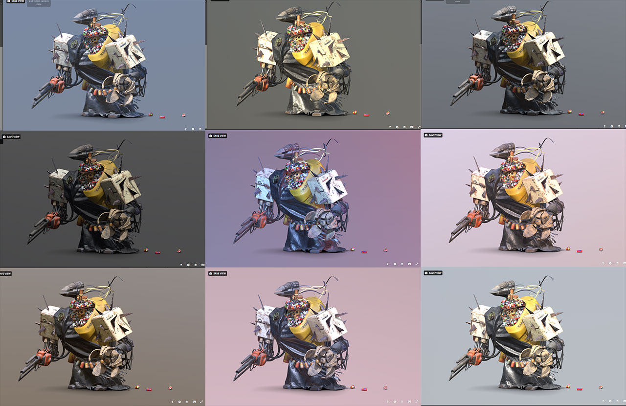
The next stage was choosing an HDRI. It’s a lengthy process to click and rotate the environments in pursuit of the best one, only to be overshadowed by light sources in the next few steps. At this stage, it can be difficult to make the model look like it did in your texturing or modeling package. To make things simpler, I recommend using the same HDRI that you intend to use on Sketchfab early on in your modeling or texturing software.
The background on all of the above renderings was set to Ambient, just to be uniform. The different HDRIs added slight variations here and there so that the background would look a tiny bit more dynamic than just a solid color.
Post-processing
The next step in Golem’s journey was setting up the post-processing effects, a powerful set of tools in the Sketchfab Viewer, the main purpose of which is to enhance model presentation, but not obscure it. Unfortunately, cranking these settings up to 11 will hide your model behind the effects. In this section, I’ll try to explain my post-processing philosophy.
We’ll start with probably the simplest, but one of the most influential effects: the Vignette. In this project, probably, like in most of the rest, it’s used to simulate light fading to the corners of the frame. Artistically, I use it to guide the viewer’s eyes to the most contrasting point in the center, where the focus of the scene is located. I prefer a tiny and a very light touch by it, so it won’t take too much of the attention from the model. As you can see below, it can change the perception of the image drastically, from mundane and frankly boring, to almost aggressive.
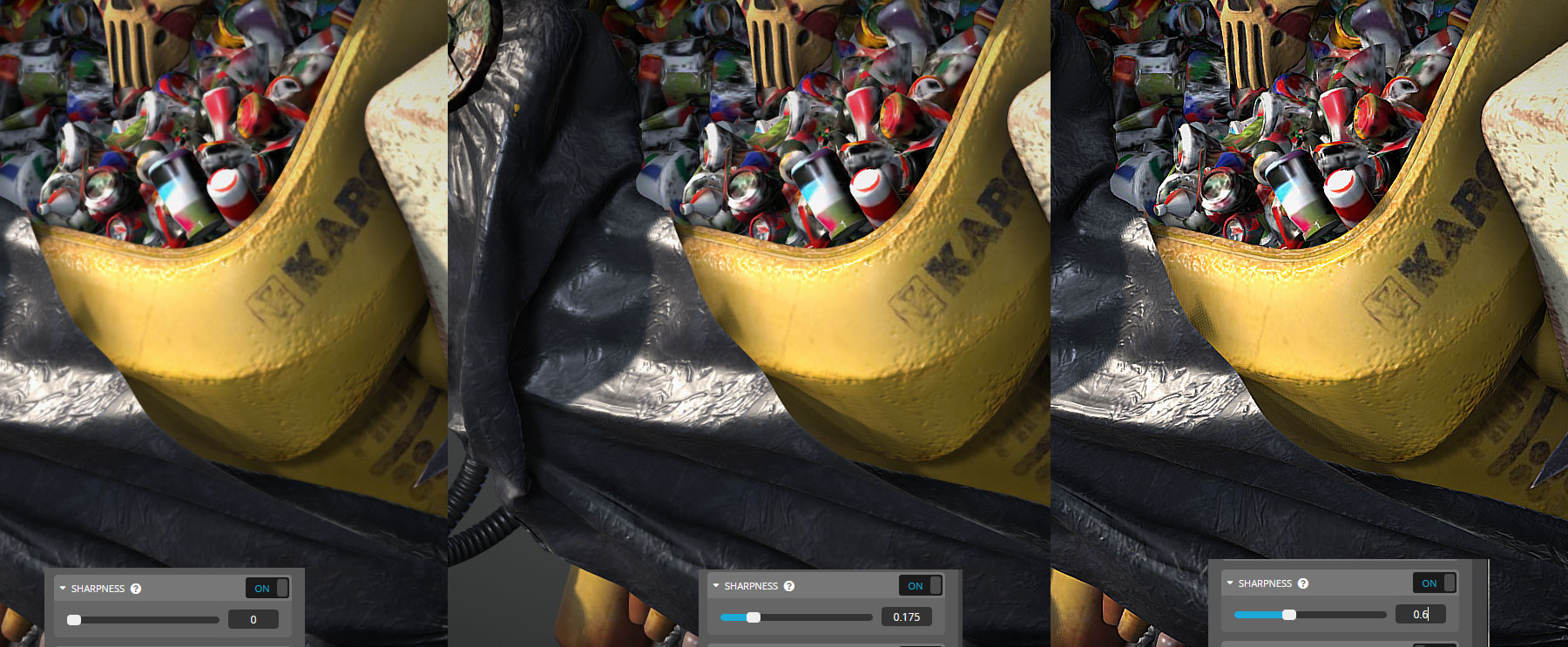
The next thing is Sharpness. In my personal toolbox that’s a universal tool to compensate for overly filtered or low-resolution textures. It’s a very powerful tool, so it has to be handled with much care. There’s a fine balance between sharpening the model and blowing it out of the sky; consider the contrast of the scene, its materials, and lights. Remember, too much of a good thing makes it not that good of a thing.
SSAO is Screen Space Ambient Occlusion. As with all the effects and AO itself, it should be used wisely, unless the idea is to make it look like the model was on fire. Generally, the motivation behind the usage of that effect is to make all of the elements sit together, like they really exist in the same space and affect each other. This is a trick that generations of 3D artists used, and so should you! And since Sketchfab doesn’t support Global Illumination just yet, SSAO is the only available option serving that purpose for now. That or baking GI directly onto the maps, but that’s totally not PBR!
And now, the most important and popular effect of them all: The Bloom.
Unsurprisingly, bloom makes it look impressive, fast. It would be nice, though, to be able to use local color or at least take into account the metallicity of the materials, because now all the materials under bloom look like dielectrics.
Getting back on track.
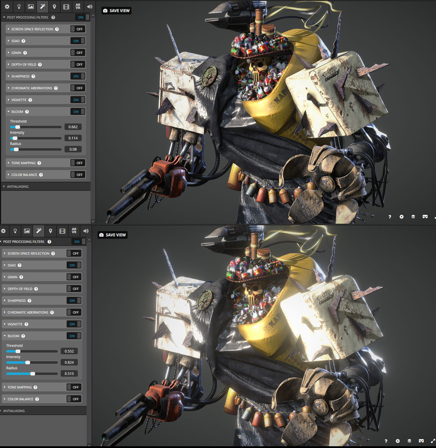
Bloom is awesome, but it has to be used with extreme caution because it can literally hide the model. For example, the same model under two different bloom settings:
As clearly seen, in the first image the bloom is barely visible—it just blurs the details a bit on the surfaces that directly face the light source. Kind of how exposure works in cameras. In the second image, the numbers are not cranked up that high, but the bloom is obliterating all of the details and it’s really hard to make something out of this mess, except, well, the bloom itself. Those settings render all the hard work put into making the model absolutely useless and hurts the project rather than helps it. The same thing goes for depth of field (DOF). I did not use it for this project simply because of the scale concerns, but that’s another effect that gets overused all the time.
I had planned to use some effects, namely Chromatic Aberrations, but they didn’t make it to the final iteration since Sharpness combined with contrasting edges on the textures produced too much noise, and then if turned down, the effect was almost invisible, which defied the whole purpose.
The same thing happened with SSR—it was sort of visible on some parts, but since the model, in general, was not very shiny, it was too much of a hit on the performance for that little use.
And that’s it with the effects. This time I didn’t use Tone Mapping or Color Balance, but it’s worth mentioning that if there’s a plan to use them, it’s better to set these effects up as early as possible.
Lighting
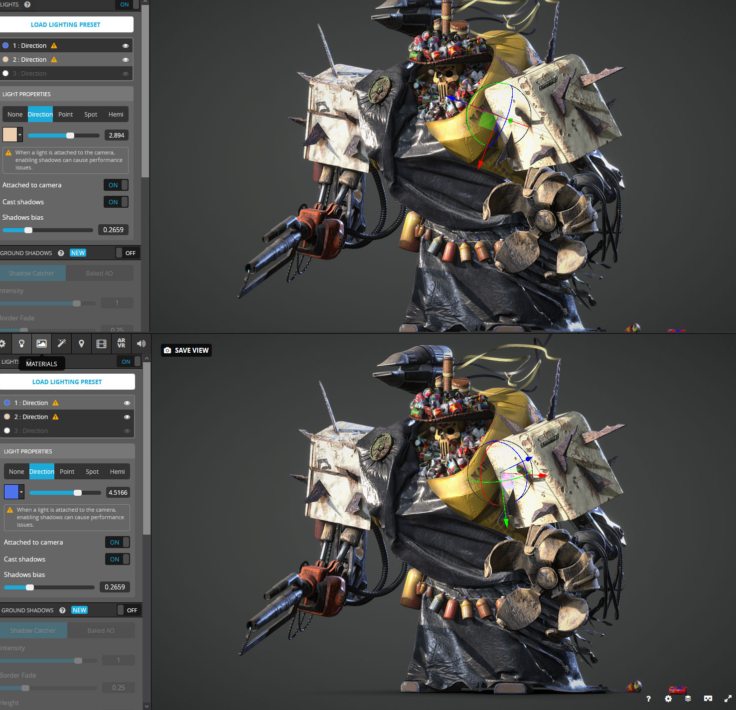
Now to the heart of the matter, the reason why human beings, in general, are able to see anything…to the light setup. This time it was as classical as it can get: one single warm main light and a counter light set to a bluish color with the intention of better showing the silhouette. Both are directional, have shadows, and are attached to the camera. It’s a performance nightmare, but looks too good to not use it!
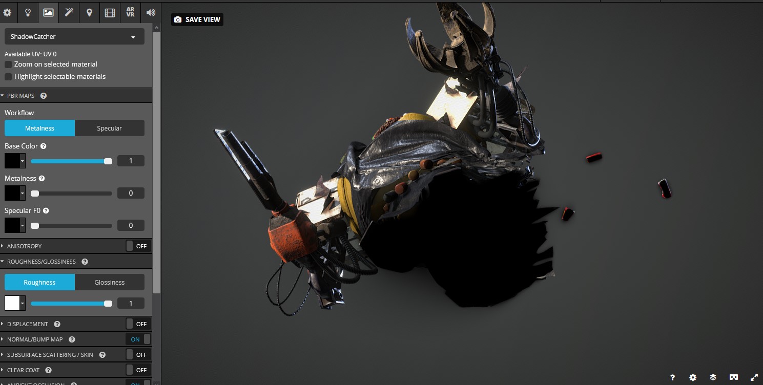
As you can see in both images above, the ground plane is disabled, but there’s clearly a shadow underneath the character. Weird, ha?
Nah, of course, there’s nothing weird about it—this is how we did it back in the old days when Sketchfab didn’t have procedural ground shadows! Besides allowing us to grumble about how things aren’t as they used to be, it has a few actually useful features that Ground Plane is not providing. First of all, it’s two-sided, which adds a nice omnidirectional shadow from the one side, and from the other, it allows me, as an artist, to hide a giant hole and all the emptiness that this model has under the skirt. Furthermore, it’s possible to set up the material as it’s shown in the picture below, so that it won’t receive any light. Thus, the scene won’t have any cast shadows from the lights, which is exactly what I needed in this project. These shadows were made using an ancient and rightfully forgotten technique of baking Ambient Occlusion and putting the bake into Opacity socket.
This brilliant and elegant solution saved thousands of artists from exposing nothingness underneath the models for years, and only more to come.
And that’s it. Now it was time to fill out the description, put tags in the tag bar and press the big yellow PUBLISH button, so this trash dude could freely sail onto pages of the internets to the end of time itself.
Time limit and closing thoughts
This article is almost finished, but only almost, so brace yourself for the last chapter with conclusions. Writing this article probably took more time than making the actual model, so that’s where I am now.
Reviewing my own process during writing made me realize that in that small time frame, far more events were actually packed than I’d realized initially and that’s a whole adventure on its own. This dashing to the finish line gave me a whole new workflow and the most important thing: a better understanding of how complicated things can be made with ease. Of course, there was a bit of a lost opportunity, since the initial plan included proper retopology, baking GI due to the shininess of some materials, and even a simple animation of drapes waving on the wind and the character breathing in idle pose, but if it didn’t hurt the final result, maybe all those features weren’t that necessary?
So, I reckon, that’s the most valuable part of these challenges—a chance to see your own approach and workflow from a completely new angle because only realizing pitfalls and mistakes in it will open the path for change and betterment.
That’s why everybody should participate in challenges, no matter what skill level and even what amount of free time the participant has.
Special thanks to Abby Crawford who invited me to write about the project and made all of this mess of a text readable!
If you want even more content like this, follow me everywhere:
Blender Artists / ArtStation / Facebook / Instagram
