About
Hi everybody! I’m Enrico Labarile, a 3D game artist from Spoleto, Italy. Since I was a kid, I wanted to become a videogame artist. At the moment I’m trying to land my first job in the industry.
Since videogame development is something relatively new in Italy I always struggled finding a way into this field. The prejudices against videogame culture in general are still very strong and I believe that many people like me had their parents preferring a safer career path for their son/daughter.
For this reason, I began studying 3D roughly 4 years ago as an autodidact, during my free time from university, where I was studying industrial design. Eventually I graduated from university and had a few months break where I tried to look for a job in the videogame industry: it was in that moment that I realized that what I had learnt as a self taught artist just wasn’t enough to start my career.
So I started searching for videogame courses in Italy and found BigRock, a computer graphics school that offered an intensive 6 month course on videogame development, approaching both artistic and technical sides. In those few months I learnt way more than I ever could studying 3 years as a self-taught student, and for this I’ll always be thankful to my teachers, especially Cosimo Grujic, Saverio Trapasso, and Martino Ballestrin.
Check out these guys because they’re really talented!
It was there that I realized that game art was all I ever wanted. I studied hard and managed to get into the R&D team of the school, being able to stay there 6 months more.
After I finished my experience at BigRock in January 2019, I started working on my environment art reel, which the Ecosphere project is part of.
Inspiration
The Echosphere is part of this larger environment art project based on some of Simon Stålenhag’s works (mainly from his books Tales From The Loop and Things From The Flood); he is without a doubt one of my favourite illustrators, and for this reason I decided to create what is basically a quite dedicated fan art piece to improve my 3D environment art skills.
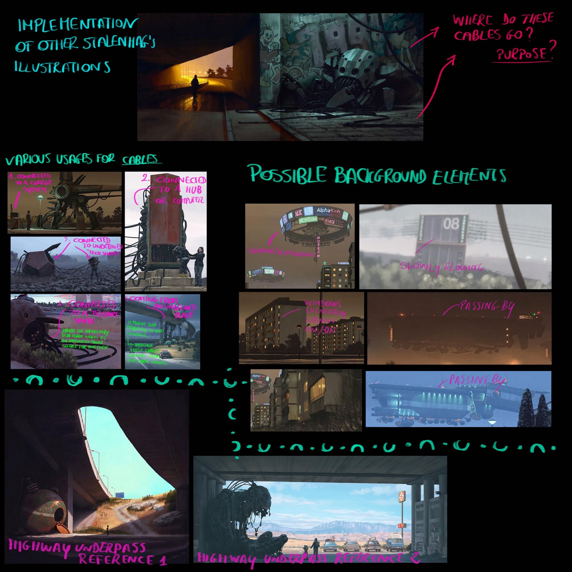
Starting from one particular piece I studied a bit to see how I could create a full environment, imagining what could have been the direct surroundings that made up the suburban area depicted in the illustration. Here is a study that shows some other references, even though not all of them made it into the final piece.
Tools
The main softwares I used to create this project are: ZBrush and Maya, respectively for Sculpting and UV unwrapping, Substance Painter for texturing and finally Sketchfab and Unreal Engine for rendering.
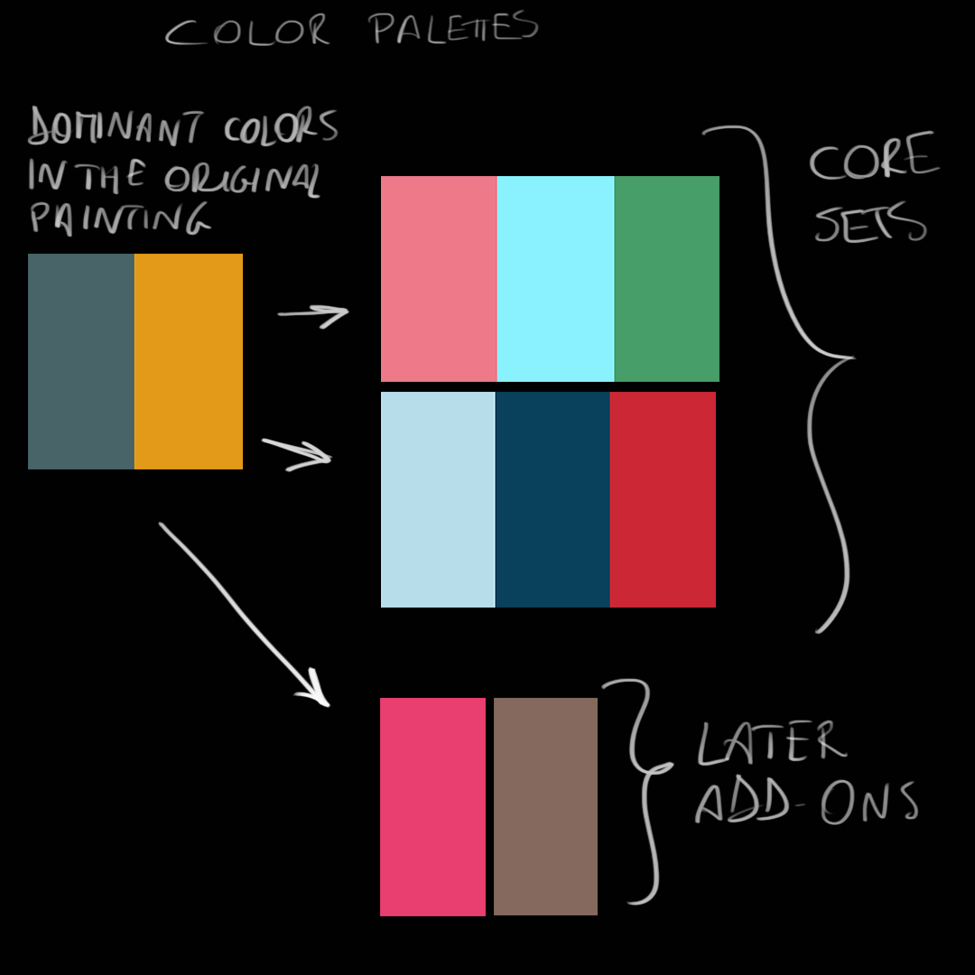
I also used the website coolors.co to extract a color palette from the main reference illustration, and PureRef, essential to have my reference photos always under my eyes while working.
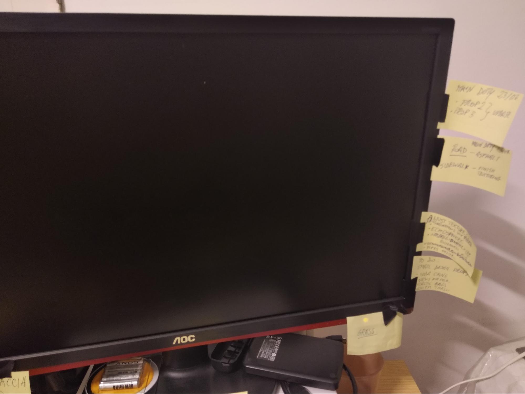
Also these made a huge impact on the organization of the whole work, setting a priority to each task.
Workflow
Since I took this project as a chance of improving my ZBrush hard surface modeling skills, the workflow looks like this:
- Instead of blocking out in Maya, as I usually did before, I used ZBrush for the whole modeling part since I found it very easy to work with hard-surfaces using booleans without having to worry about topology. This was especially useful for the other prop I was modeling for the environment, the spider robot, which is way more complex to model than this one.
- Once the model was ready I brought it to Maya to be sure that scaling was correct and to retopo the model using a mix of standard modeling from primitives and the quad-draw function of Maya for some parts.
- Speaking of UV layout, since the model is fairly big and relevant in the scene, I decided to give it a full UDIM, in order to have some good quality textures, instead of packing it with other props in the name of the optimization.
- Texturing, I believe, was the most interesting part, since I had the chance to truly give the echosphere a more unique style without, of course, getting too much out of context. At this point I wasn’t sure about how much emphasis I would have to put on the ecosphere, since the hero prop of the scene had to be the spider mech.
During the early phases of the environment project I decided to give a first pass of texturing to the echosphere, and the result was honestly bland and anonymous.
Being that this a fairly dominant element in the scene, I needed it to contribute to the storytelling, so I got back to studying Stålenhag’s books.
A recurring theme in Stålenhag’s works is the presence of toon characters painted onto robots, war machines and other sci-fi structures, which creates an obvious but effective contrast on the viewer’s mind. Old school science fiction sees technology as some abstract superior force, not part of everyday life. Stålenhag’s vision, I believe, narrates a future where consumerism and pop culture permeates every aspect of society. It is a bit like what happens today with our smartphones, which are basically small personal computers we often decorate with fashion covers, wallpapers, and danglings.
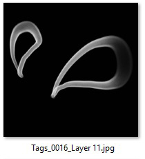
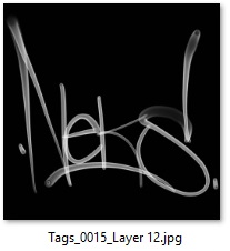
For this reason I went for the cartoony look, trying to imagine the ecosphere, an iconic element of Stålenhag’s work, as if it were a living cartoon character, transforming the main entrance of the object into an open mouth, adding stylized features and those iconic retro eyes. I would like to thank and credit “neks_one”, an Instagram friend who liked my works and decided to kindly donate some tags to me to play with in my project. In this case, I used these:
Last, I would like to talk about the color palette, an element which has been essential to give the whole scene a consistent color scheme. As previously said, I used coolors.co to extract a palette of correlated colors. I tried to be faithful to this palette as much as I could during the texturing phase, so that all the props used roughly the same main colors.
As you can see, since I wanted the scene to look realistic enough, I preferred having a wider color palette. All the colors I chose have a common pair of related colors, which are the dominant colors of the original painting.
Sketchfab
Speaking of the rendering in Sketchfab, I want to say that since I first used this wonderful software I fell in love with it; it’s very straightforward to use and the overall quality is impressive.
Furthermore, when I publish my environment projects on Artstation, I now always use a Sketchfab embed to let anyone analyze (directly on my project’s page) some of the props a little bit further, thanks also to the texture inspector.
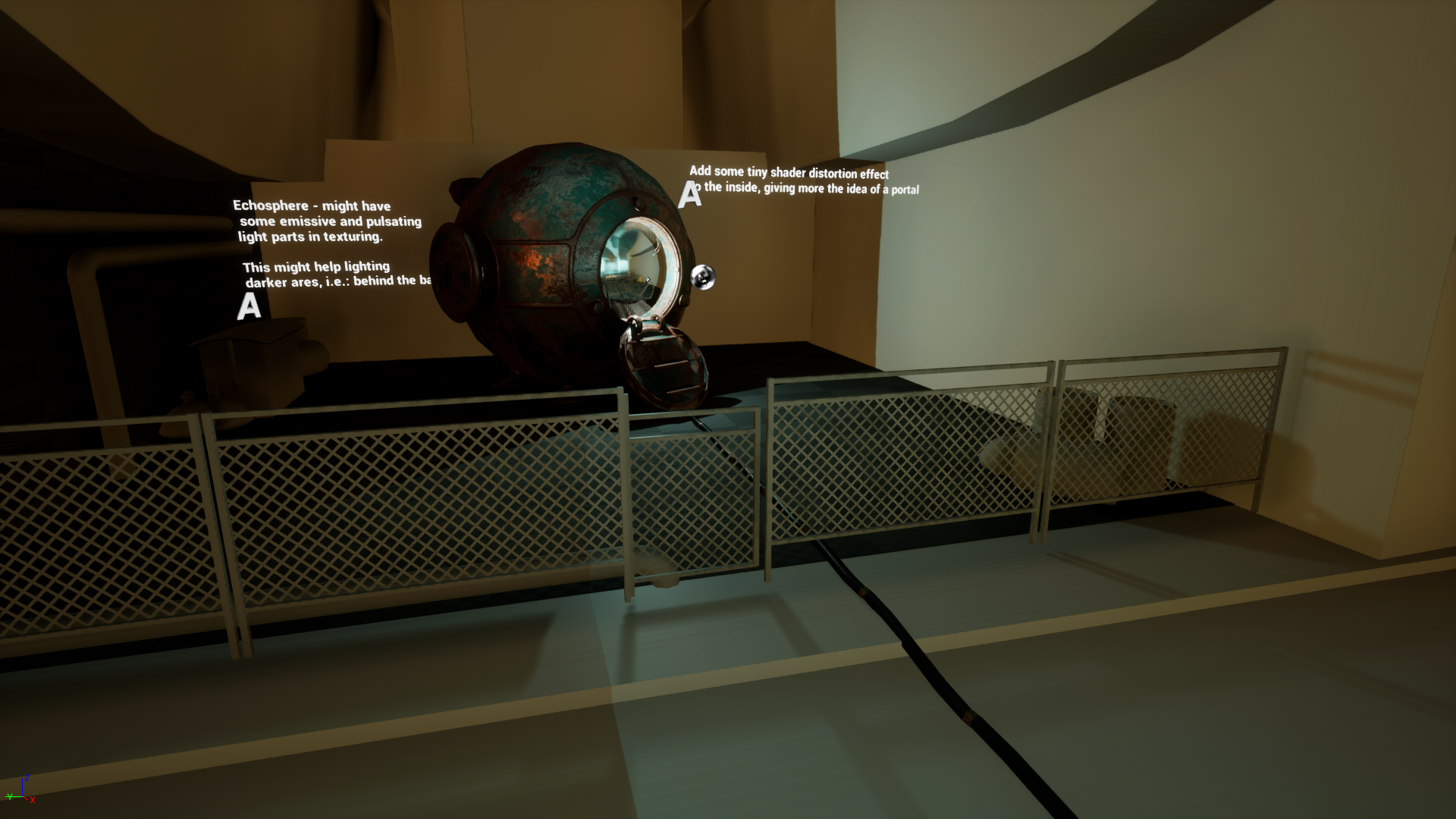
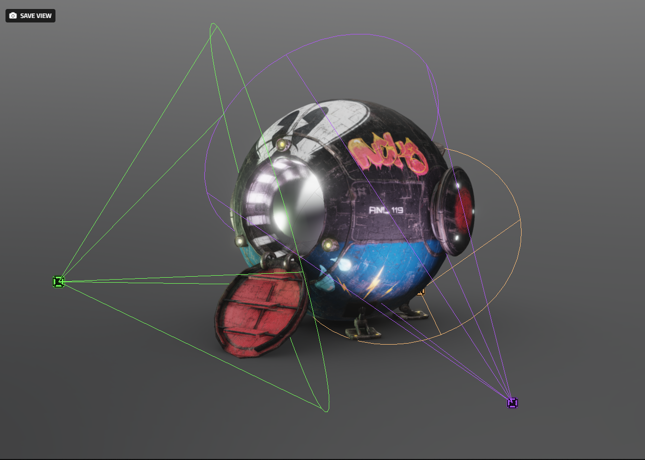
About the lighting, the setup was fairly easy, I needed something quite neutral since the echosphere has very vivid colors, but still not something that looked too much like a studio setup. I put in a trio of spotlights characterized by dull tones of green, purple, and orange to give a rather artificial and sci-fi feel, which is harder to get with a simple teal and orange transition. As for post-processing, SSAO, Screen Space Reflections and Bloom really helped to add detail to the final image.
Also, I used a “filmic” Tone Mapping with a value of -0.033 on contrast, since the filmic often tends to darken and burn the image.
Final result:
Also, you can find more insights on the complete project on ArtStation.
And here’s a cinematic video:
ArtStation / Instagram / LinkedIn

